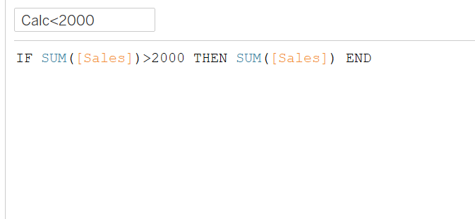
Changing tooltip colours based on conditions. One thing I wish I knew during my initial application was how to manually change the colour within the tooltip for certain variables so if the number is above a certain value it shows green and if it does not then red. To do this I needed to create a calculated field to split the values to be above or below 2000.
1.(IF SUM(sales)<2000 THEN SUM(SALES) END)
2.(IF SUM(sales)>2000 THEN SUM(SALES) END)
I added both calculations into the tooltip and gave them each separate colours, which aligned with the findings of my data.
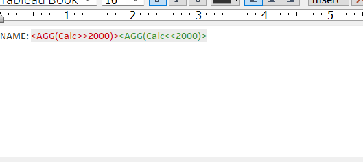
This meant that when I hovered over the values above 2000 they showed green and when they were below, red.
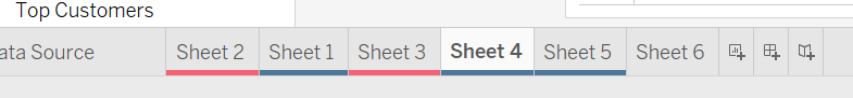
Changing the tab colours in Tableau. Another thing that would have saved me a lot of time during my application was adding colours to the sheets and grouping them accordingly. I spend a lot of time finding the exact sheets when adding filters to the relevant ones. To do this, right click on the sheet and click on colour. Group the different sheets according to your data.