


Nested sorting in Power BI refers to the process of sorting data within multiple levels of a hierarchy or within multiple columns simultaneously and can be useful in loads of different scenarios.
How nested sorting works:
- Primary Sort: The data is first sorted by the primary column. This sets the main order of the data
- Secondary Sort: Within each group of the primary sorted data, the data is further sorted by a secondary column. This adds a second level of organization.
- Tertiary Sort (and beyond): If needed, data can be sorted by additional columns within the secondary sorted groups.
Nested Sorting In Tables:
- In the Visualizations pane, select the visual you want to sort and click on the "More options" (three dots) menu in the top-right corner of the visual.
- After the visual updates, repeat the process and select the secondary column (e.g., Subcategory) to apply the secondary sort. This approach allows Power BI to sort your data in layers, first by the primary column and then by the secondary column within each group of the primary column.
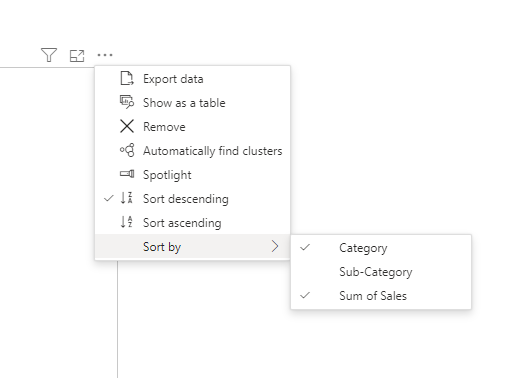
- Choose "Sort by" and first select the primary column (e.g., Category).
- To Apply Nested Sorting: Hold down the Shift key and then click on the header of the second column you want to sort by. This will apply the secondary sort while retaining the primary sort.
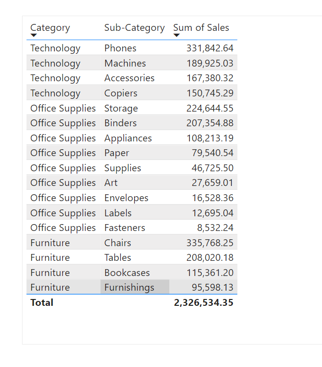
Using a fixed category total sales
- you can create a custom measure that calculates the total sales for each category, ignoring the subcategory level.
- This formula calculates the total sales for each category by removing any filters applied at the subcategory level but retaining filters for category and city. This fixed total can then be used as a basis for sorting your data.
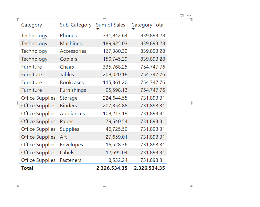
To implement nested sorting:
- Create the Measure: Add the above DAX formula as a new measure in your data model.
- Apply Sorting: In your visual (such as a table or matrix), use the "Category Total" measure to sort your categories. Then, use the "Sum of Sales" to sort within each category, ensuring that the overall category order remains fixed while subcategories are sorted based on their individual sales.
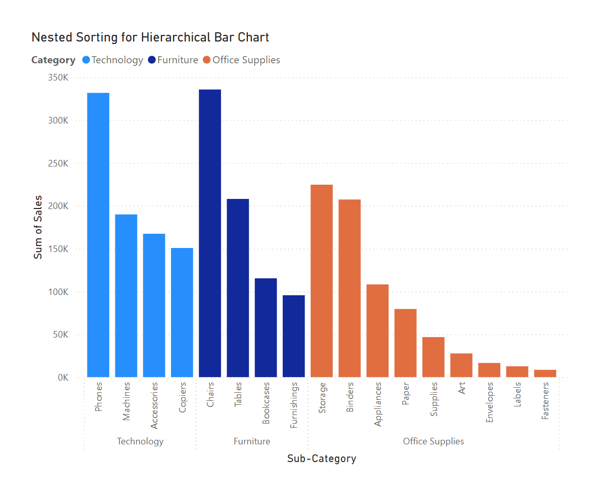
Nested sorting bar charts
When working with bar charts in Power BI, it's important to note that the Shift + Click method for nested sorting does not work as it does with tables or matrices. Instead, to achieve nested sorting in a bar chart, you can use calculated columns or measures to define a custom sort order. This involves creating a calculated field that combines the relevant sorting criteria (e.g., category and subcategory) or using a ranking measure to define the order. Once this field or measure is created, apply it to your bar chart to control the hierarchical sorting. This approach ensures that your bar chart reflects the desired nested sorting even without the Shift + Click functionality.
Create an Initial Bar Chart
- Task: Create a bar chart in Power BI with no initial sorting.
- X-Axis: Drag
CategoryandSub-Categoryfrom theOrderstable onto the X-axis. - Y-Axis: Drag
Sales(sum of sales) onto the Y-axis. - Legend: Set
Categoryas the legend to differentiate the colors. - Color: Customize the colors according to your preference.
- X-Axis: Drag
- Expected Outcome: You should see a clustered bar chart with the
CategoryandSub-Categoryon the X-axis and the sum ofSaleson the Y-axis. Each category should be color-coded.
Create a New Measure for Category Total
- Task: Create a new measure called
Category Totalto calculate the total sales per category.- Go to the
Orderstable. - Create a new measure with the following DAX formula:
- Go to the
- Purpose: This measure helps you fix the sales total onto each category, allowing for better sorting based on total category sales.
Action:
DAXCopy code
Category Total = CALCULATE(SUM(Orders[Sales]), ALLEXCEPT(Orders, Orders[Category], Orders[City]))
Create a New Table for Calculations
- Task: Create a new table called
Keythat will hold the calculations for sorting. - Action:
- In Power BI, go to the
Modelingtab and selectNew Table. - Name the table
Keyand leave it empty for now.
- In Power BI, go to the
Create a Sales Calculation in the Key Table
- Task: Create a new measure in the
Keytable to calculate total sales.- Click on the
Keytable and then create a new measure with the following formula:
- Click on the
- Purpose: This measure will be used in subsequent calculations for sorting.
Action:
DAXCopy code
S@ales = SUM(Orders[Sales])
Create new Measures
- Task: Create a complex measure called
m2that helps in defining the order of sorting.- Create a new measure in the
Keytable with the following DAX formula:
- Create a new measure in the
- Purpose: This measure calculates the row numbers based on the sorting of sales, taking into account whether the data is filtered by
Sub-Category.
Action:
DAXCopy code
m2 =
IF(
    NOT(ISFILTERED(Orders[Sub-Category])),
    ROWNUMBER(
        ADDCOLUMNS(
            SUMMARIZE(
                ALLSELECTED('Orders'),
                'Orders'[Category]),
            "@Sales", [S@ales]),
        ORDERBY([@Sales], DESC)),
    IF(
        ISFILTERED(Orders[Sub-Category]),
        ROWNUMBER(
            ADDCOLUMNS(
                SUMMARIZE(
                    ALLSELECTED('Orders'),
                    'Orders'[Category],
                    'Orders'[Sub-Category]),
                "@Sales", [S@ales]),
            ORDERBY(
                [@Sales], DESC),
            DEFAULT,
            PARTITIONBY('Orders'[Category])
        )
    )
)
- Task: Create a new measure called
sortto handle the actual sorting logic.- Create another measure in the
Keytable with the following formula:
- Create another measure in the
- Purpose: This measure combines the calculated row numbers to establish a custom sort order.
Action:
DAXCopy code
sort = VALUE(CALCULATE([m2], ALLSELECTED(Orders[Sub-Category])) & [m2])
Step 8: Add Measures to Tooltips and Apply Sorting
- Task: Add the
Category Totalandsortmeasures to the tooltips and sort the chart. - Action:
- Go to the
Visualizationspane and dragCategory Totalandsortto theTooltipsfield well of the bar chart. - Click the three dots (more options) on the top right of the chart.
- Select
Sort axis>Sort by>Sort Descending.
- Go to the
- Purpose: This final step sorts your bar chart based on the calculated sorting order, displaying the data in the desired nested sorted order.
Final Outcome:
Your bar chart should now be organized with categories and sub-categories sorted by their total sales, presenting a visually coherent and sorted data representation. This solution showcases how advanced DAX measures and nested sorting can be used in Power BI to enhance data visualization and analysis.