The first step when making a donut chart is creating a normal pie chart. Drag your desired fields and change your mark type to pie.

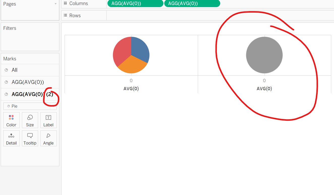
The next step is to create 2 dummy fields in the column by typing in 'avg(0.0)' and duplicating it.

The next step is to remove any fields from one of the pie chart marks to create the inner section of the donut. Then change the colour to white and decrease the size of the circle.

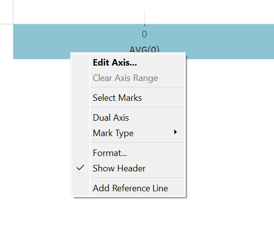
Then right click on the axis and click on dual axis.


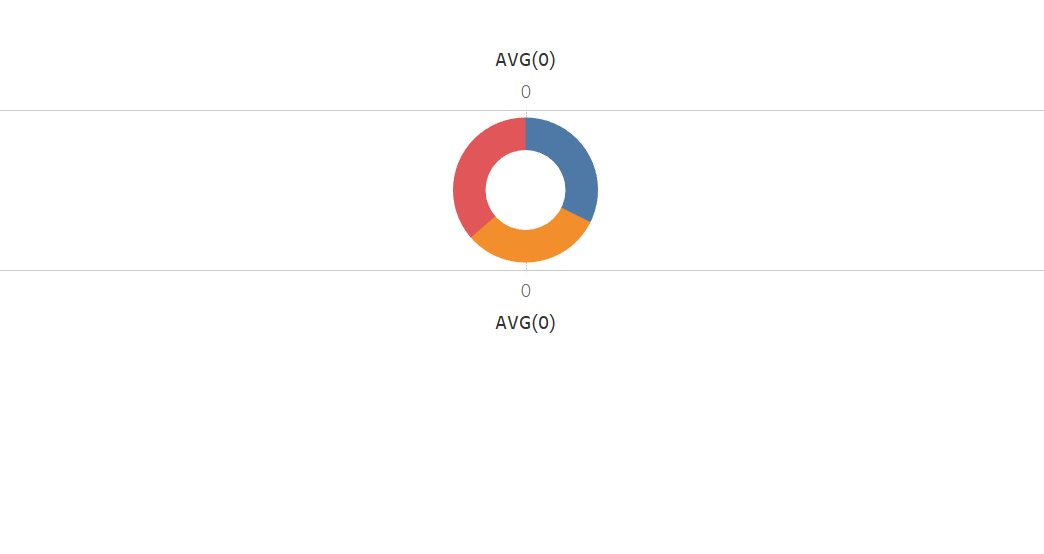
You are then left with a donut chart. You can now edit the view to remove any grid lines and average labels by clicking on the format section and removing any lines.
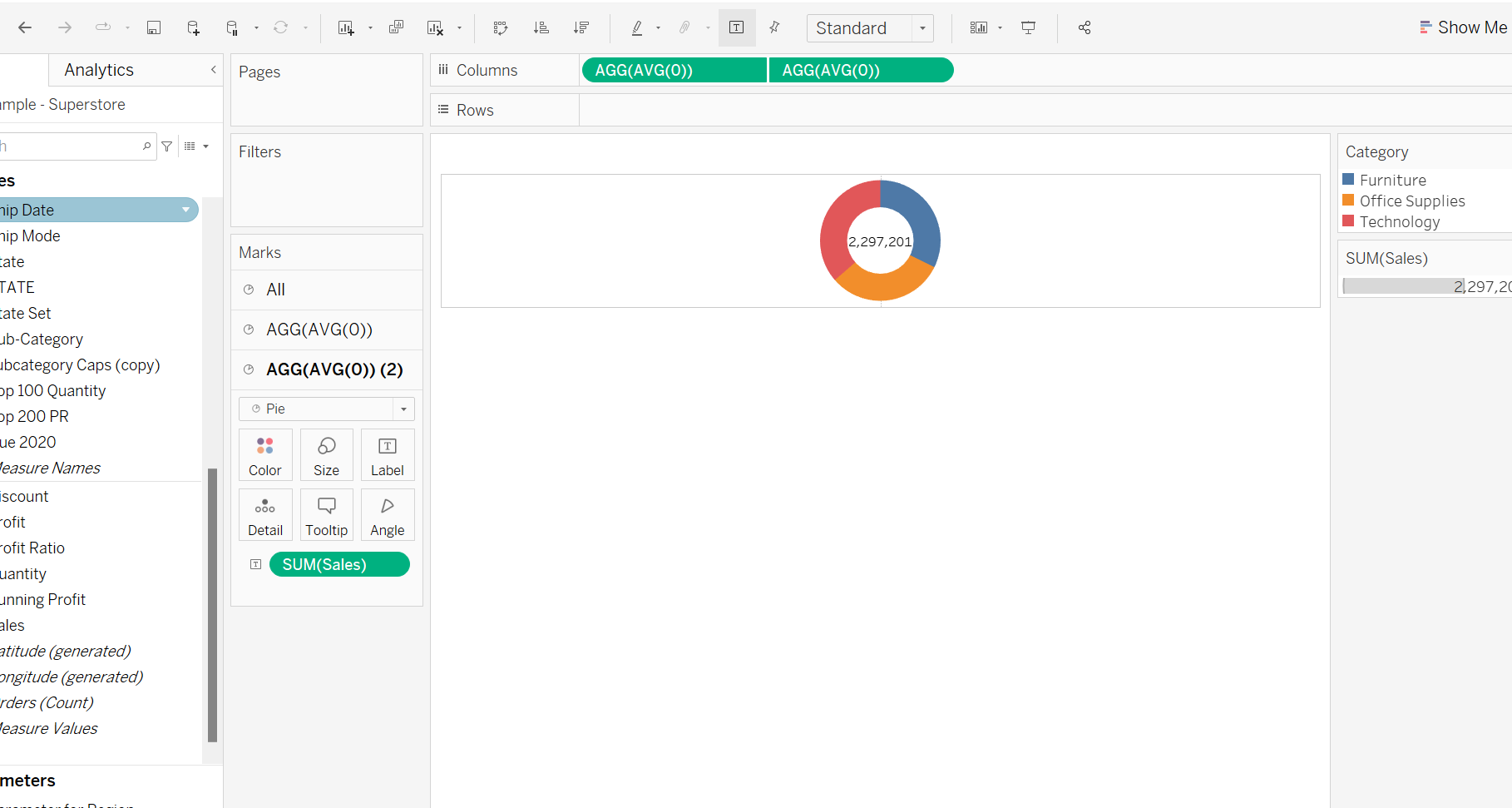
You can also drag on fields to the text mark to add values to the middle section of your donut chart.

