


Todays challenge was to analyze data from the tv show survival. The data was relatively clean so it gave us a lot of time for creativity. However, the way that the presentation is planned involves providing explanations and justifying why we chose each chart.
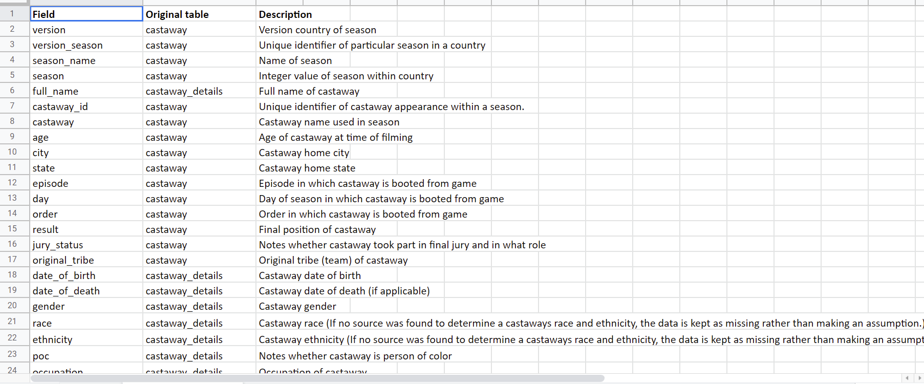
The first thing I did was gain an understanding of what the data shows. Luckily there was a detailed data dictionary which clearly explained each field.
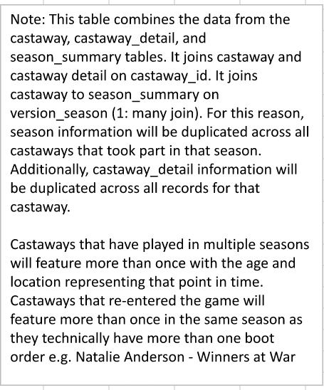
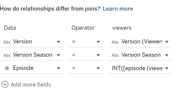
However, due to the way the data was joined we had to keep in mind any duplication that may occur. (See below)
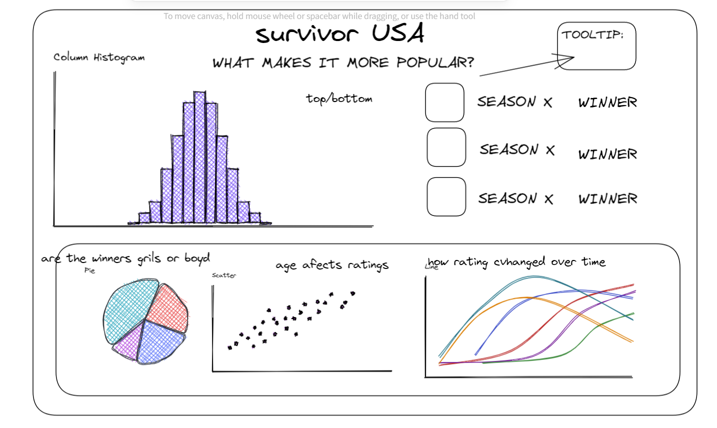
Once I had an understanding of what my data shows, I started planning what I wanted my dashboard to look like using excalidraw.
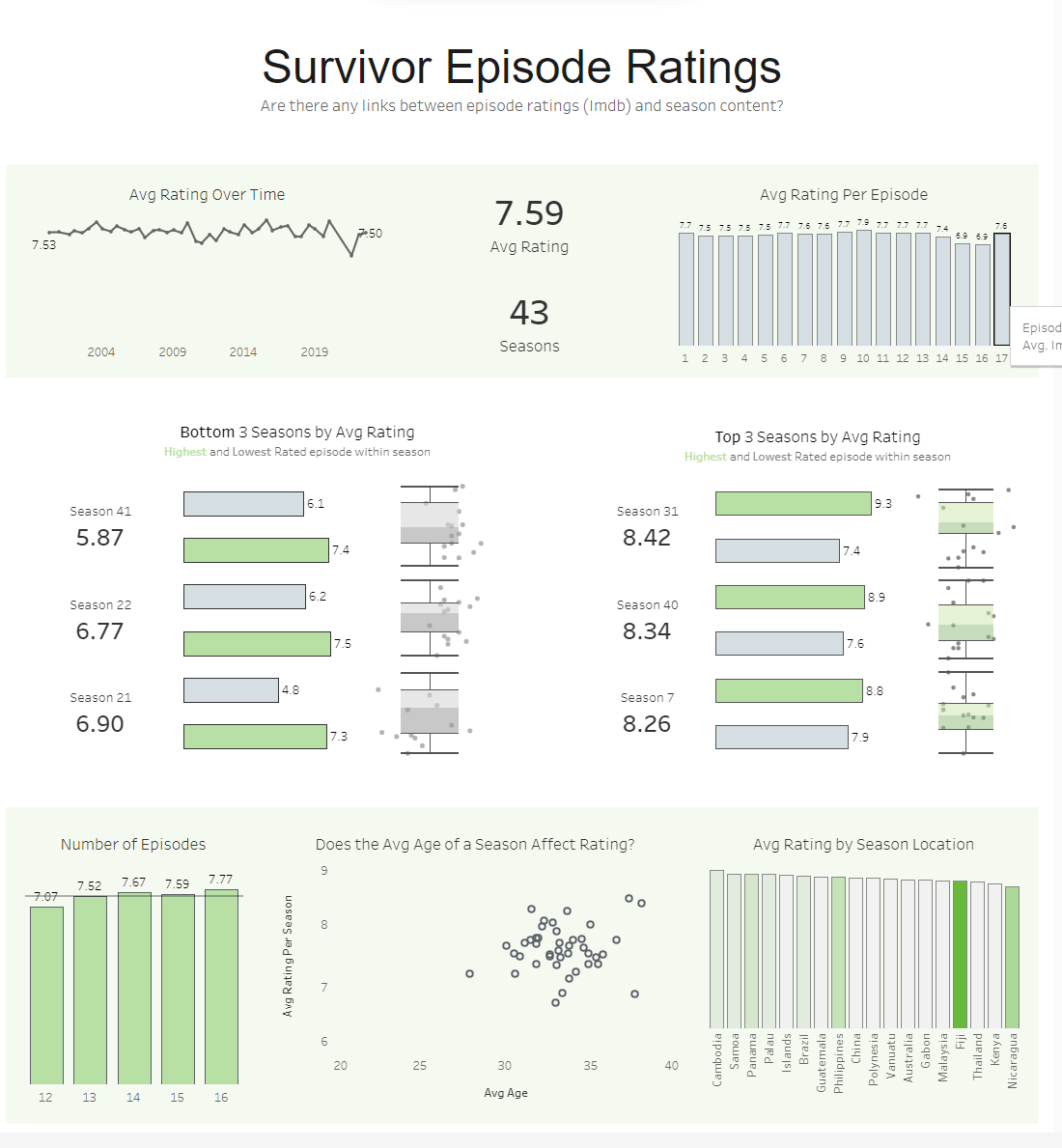
I decided to join additional data to my table which had information on the imdb ratings which is what I would base my dashboard on.
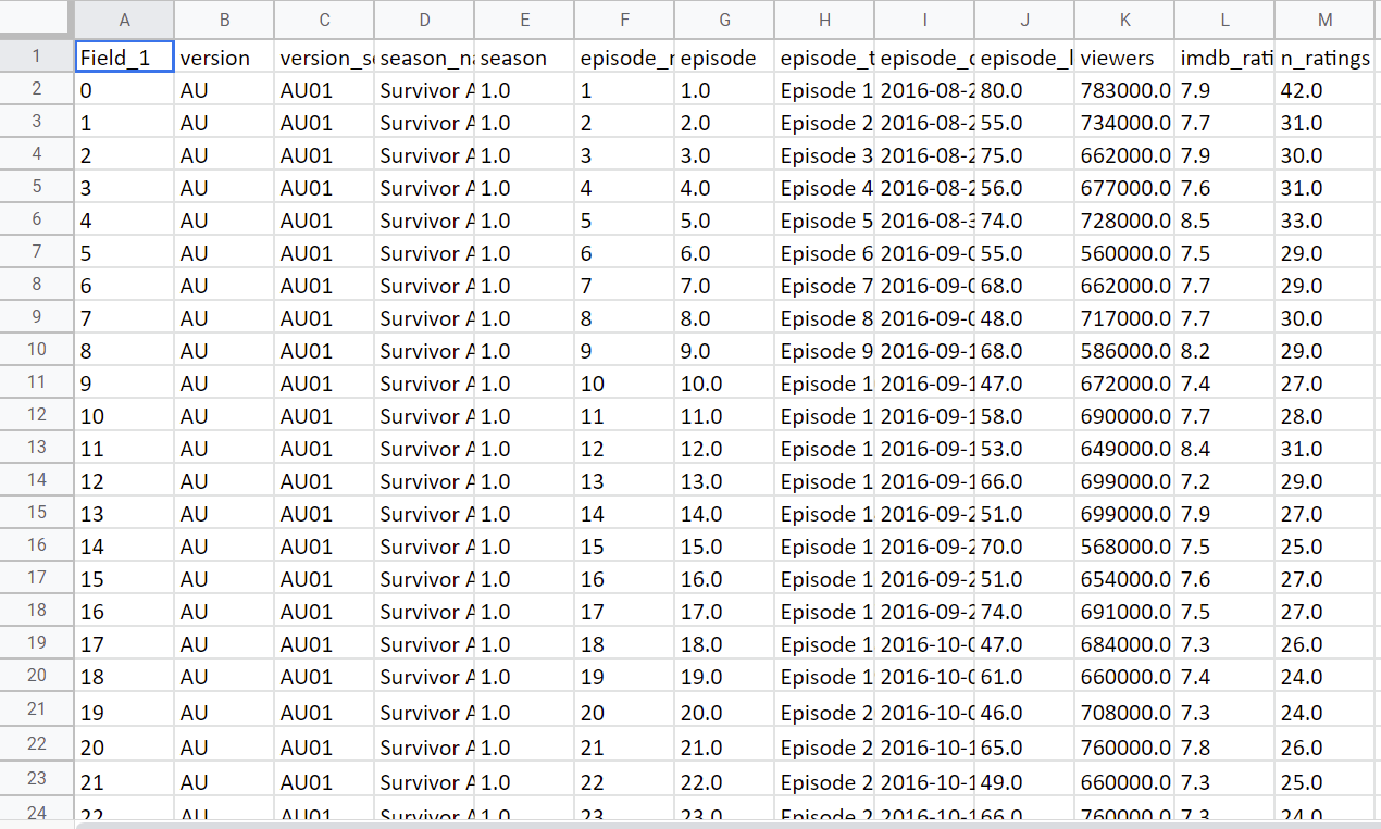
I joined them based on the following:
Once I joined my tables I started creating my chart. I quickly realized that the charts would take longer than I expected as there would be repeated measures which would need to be changed using LODS.
Overall, it was a difficult challenge but I enjoyed seeing what I could come up with in the short time we had!