


Today we learned all about data accessibility. We were given information on all the considerations and techniques we can use to accommodate as much of the population as possible.
We were tasked with creating a dashboard with the vision of it being accessible to people with additional needs when interacting with a dashboard. Here are the steps we took to create this dashboard focusing on COVID-19 cases and deaths in the UK.
After having the introduction session and reading the WCAG guidelines for the department of health and social care we made a list of some features we wanted to consider:
- Using High contrast colours: this will make the dashboard as clear as possible.
- Colour blindness; using colour blind friendly colour palette.
- Not using too many filters/parameters: making the dashboard as clear and concise as we can.
- Adding captions to the graphs: for those who use voice narration or find it easier to read descriptions.
- Large font sizes (>=12)
- Consistency of colours/sizes.
- Be able to use the voice narrator on all values: Limiting the number of sheets helps users who use the voice narrator read all the information as easily as possible.
- Clear axis labels
- Labeling certain points in the charts (e.g. labelling the most recent data point on a line chart as it is often the most relevant)
After discussing the different features we wanted to implement, we started to look at the data and created an excalidraw sketch with what we wanted to show on our dashboard. We wanted to make the dashboard as simple yet informative as possible so we decided to only focus on the UK rather the breaking down into separate countries.
We wanted to add detailed descriptions on each of the charts for users using the voice narrator, who would also be able to understand any trends in the charts. Likewise, we wanted to add BANs and the descriptions into one sheet making it easier for any users using voice narration.
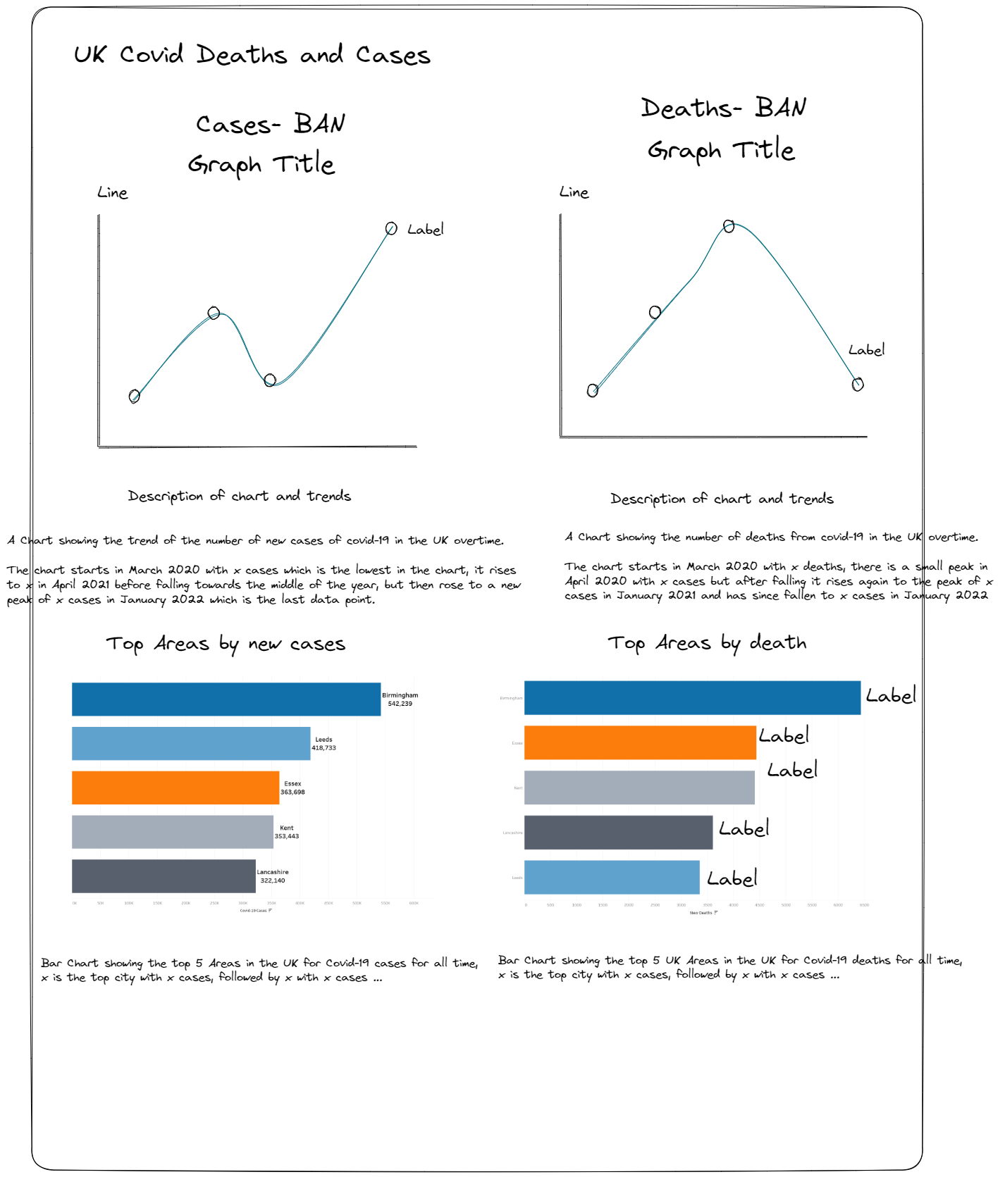
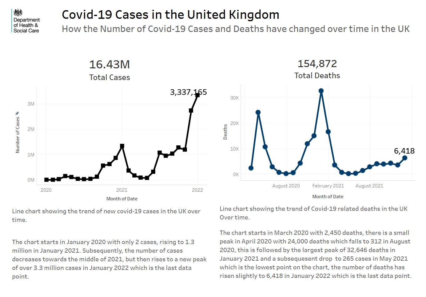
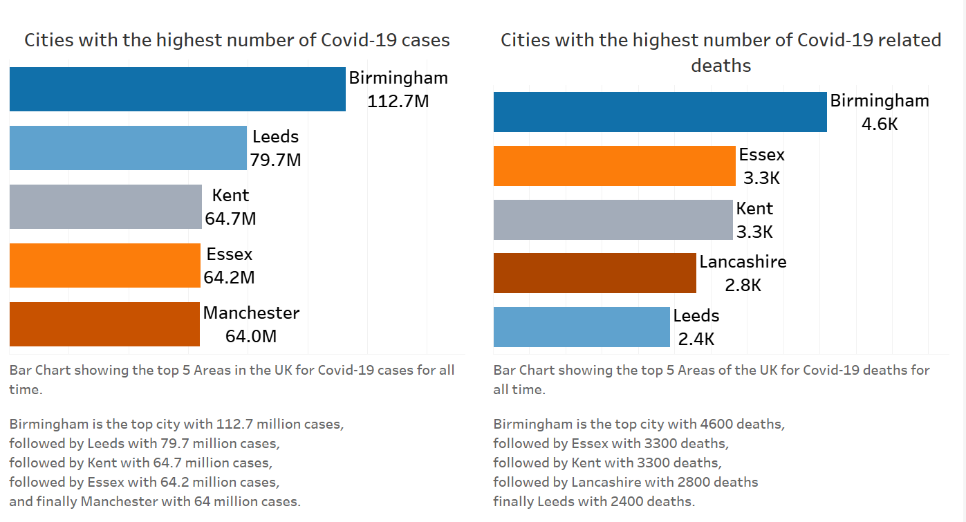
We made sure to have clear concise titles with large bold text, with informative captions below our charts. The captions provide clear summaries of our data and any trends in the graphs.
Our colours used for the bar charts used a colour blind friendly palette, also with high contrast.
Feedback:
What went well:
- We used high contrast colours in the dashboard which make the dashboard very clear
- Our descriptions were done in the captions making it easy for voice narrator users to hear
- We used as few sheets as possible
Limitations:
- We provided no information on how to interact with the dashboard.
- Our BANs don't say the exact number; the voice narrator says 'M' not 'Millions' which could be confusing for some users.
- We did not have a download button for the data which could have been beneficial for some users and easy to add to the dashboard.
Final Thoughts:
This session gave me a different perspective on data accessibility, highlighting it's importance and relevance. I was not aware of the number of factors to consider before designing a dashboard. I hope to use/consider these features more in the future and make sure to make my dashboard as accessible as possible for as many users as I can.