A candlestick chart can be a useful way of displaying two values side-by-side while comparing their difference. Making them in Tableau requires some trickery involving measure names and measure values. In this post I will use the Superstore sample data and compare 2024 to 2023 sales.
The first thing to do is to create two aggregated fields; 2023 sales and 2024 sales. These can be done with If statements as below:


These will be our measures to create a paired bar chart, with each pair looking something like this (after dragging measure names onto colour):

If an order was made in a year outside this limit, Tableau will read all values as Null, allowing us to sum these individual years. Next is to create an aggregation calculating the difference between our yearly sales.

The next step is to make use of measure values. Firstly, drag Sub-category and measure names into the rows shelf.

Drag Measure Values into the Columns shelf. Now every measure value will appear in your marks card. Use the filter pane to remove the unnecessary marks until you have the two desired marks (2024 and 2023 Sales).
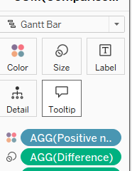
Next we want to make a Gantt bar chart. To start, Drag 2023 sales onto your columns shelf to create a second axis. Switch the mark type to Gantt and you should have notches indicating the sum of sales in 2023. By now dragging 2024 minus 2023 (named difference below) onto the size card in your Gantt's marks shelf.

You should have the difference between 2024 and 2023 lined up nicely to show either positive or negative differences.

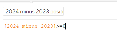
Create a highlighter using a calculated field and drag that onto the colour card of your Gantt chart.

Now you should have a candlestick chart which you can format to your heart's desire!
