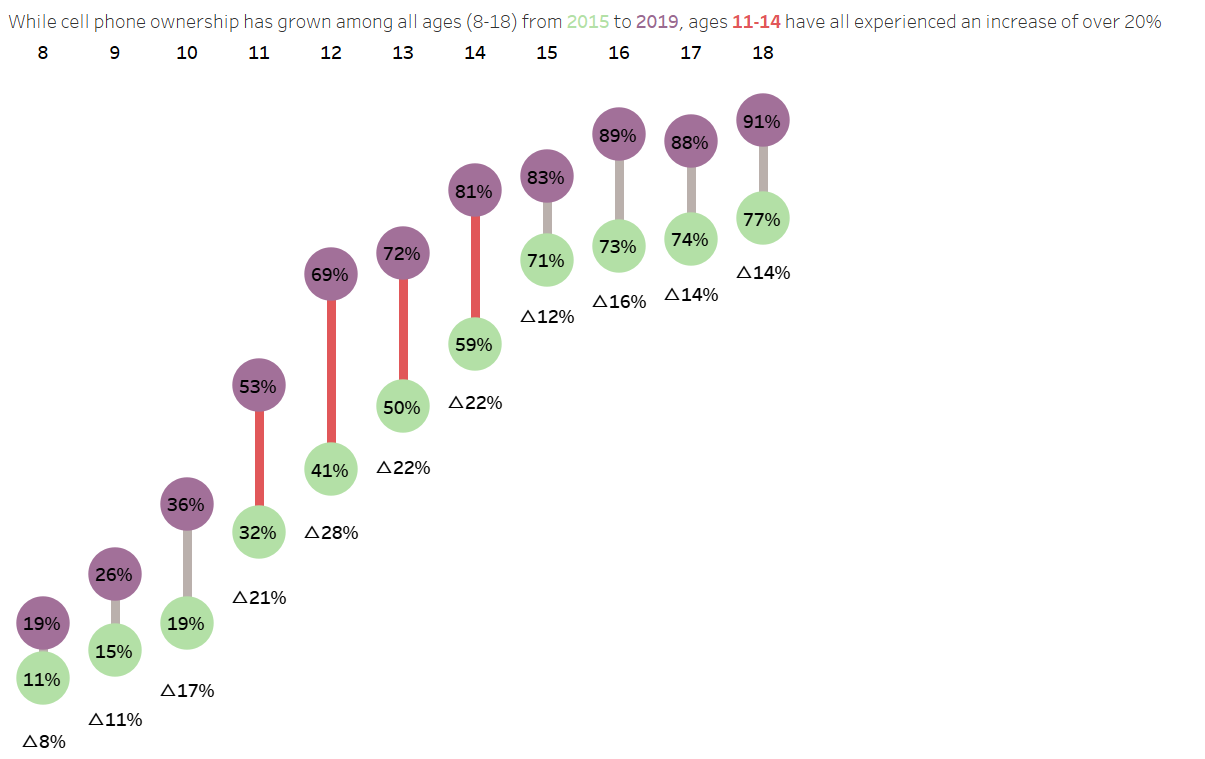
Today we tried a Workout Wednesday challenge and tasked with creating a dumbbell chart (https://workout-wednesday.com/2022w32tab/).
Donut charts can be useful for comparing measures with respect to two categories and allows extra detail in the labels for further information. To create a donut chart, we can make use of the dual axis function in Tableau. The data we used was found here and refers to smartphone usage between 2015 and 2019.
The first step is to create one axis comparing smartphone usage between the two years. Drag age to the columns shelf as a dimension. We will sum ownership in the rows shelf and add year to the marks shelf. Changing our marks type to circle should give two circles for each age, one representing usage in 2015 and one in 2019.
If we create a calculated field (Year=2015), we can use that to colour circles representing 2015 usage one colour and 2019 entries another colour. By right clicking on the usage field on the left hand side, we can convert the data type to a percentage. We can then drag that onto labels to provide the percentage of usage for each circle on the chart.
Next, we can create the connective rods 0f our dumbbells. If we hold control and drag the SUM(ownership) pill, we can copy the chart we have onto a second axis. For simplicity, remove everything except for Year from the marks card. By choosing a line for our marks type, and then dragging year onto our path button, it should display lines connecting the two usage rates between 2015 and 2019, categorised by age as in the previous chart. Now we can create a dual axis to combine our two charts and send the marks representing the bars to the back.
At this point we want to highlight the years with the greatest change, which is between 11 and 14 years of age. Create a calculated field: "Age >=11 AND Age<=14", and drag this field onto the colour button of our line graph's marks card to highlight these lines on the chart.
At this point we would like to add the change in usage onto our chart. Let us hold control and drag our second SUM(Ownership) pill to create another axis. Right click to select quick table calculation, and choose difference. Right click this table calculation pill again to compute using specific dimensions, year and sort by descending. Now drag this pill onto the label button in our line graph's marks card.
This gives us negative values, so let's change them to positive. Drag this pill onto the left hand data pane, then right click to edit the calculation. Put everything in brackets and add a - symbol to change each value to positive. If needed, convert the value to a percentage by formatting the number type.
Now format the positioning of your labels, adding in extra lines into its text editor to shift them downwards if needed, and you should be done! Below is the chart I ended up with by the end of the challenge for reference.

