In this blog I will go through a beginners guide to what dynamic zone visibility is and how to use it.
This blog is going to touch on the simple way to use Dynamic Zone Visibility. Stay tuned for a more advanced version in the coming days.
What is Dynamic Zone Visibility?
One thing I noticed when I start building my dashboards is how little space I have for the amount of information/objects I want to include. Version 2019.2 of Tableau seen the introduction of show/hide containers. This introduction allowed you to show or hide a container, along with any objects within it, all with the click of a button, cool right?
Well with the release of 2022.3, this concept has been taken to a whole new level with the introduction of Dynamic Zone Visibility. With Dynamic Zone Visibility, you can hide or reveal zones based on the value of a field or parameter. As you interact, zones on your dashboard appear or disappear. The result is a dynamic dashboard that doesn’t compromise your desired layout and makes your dashboard clutter free. In simple terms, you can now tidy up your dashboard quicker and easier than ever before - without any hacks!
How do you use this new capability?
The most straightforward way to do this is by identifying which sheets you would like to use, and which sheets you want to hide/reveal. In this example I am going to use bar graphs I made from Week 52's Makeover Monday in order to allow the user to dig into the chart a bit more in order to see a breakdown of how much money Americans spend on Christmas Presents every year.
To start, I built my dashboard and included whatever sheets I want the user to view. Next I went into the below sheet which shows an overall view of the amount of money spent by Americans at Christmas time.
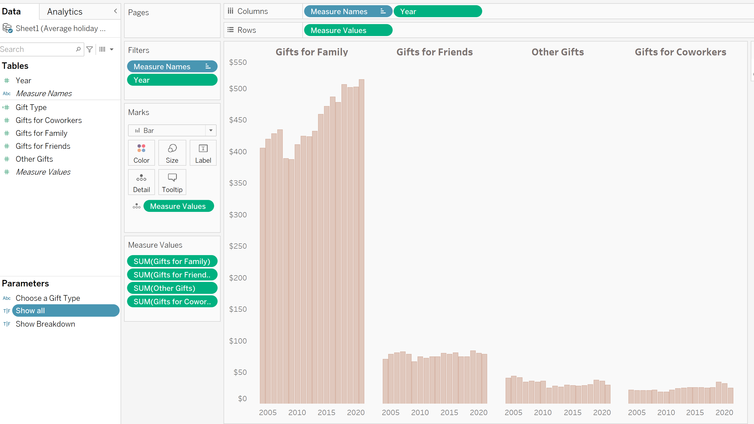
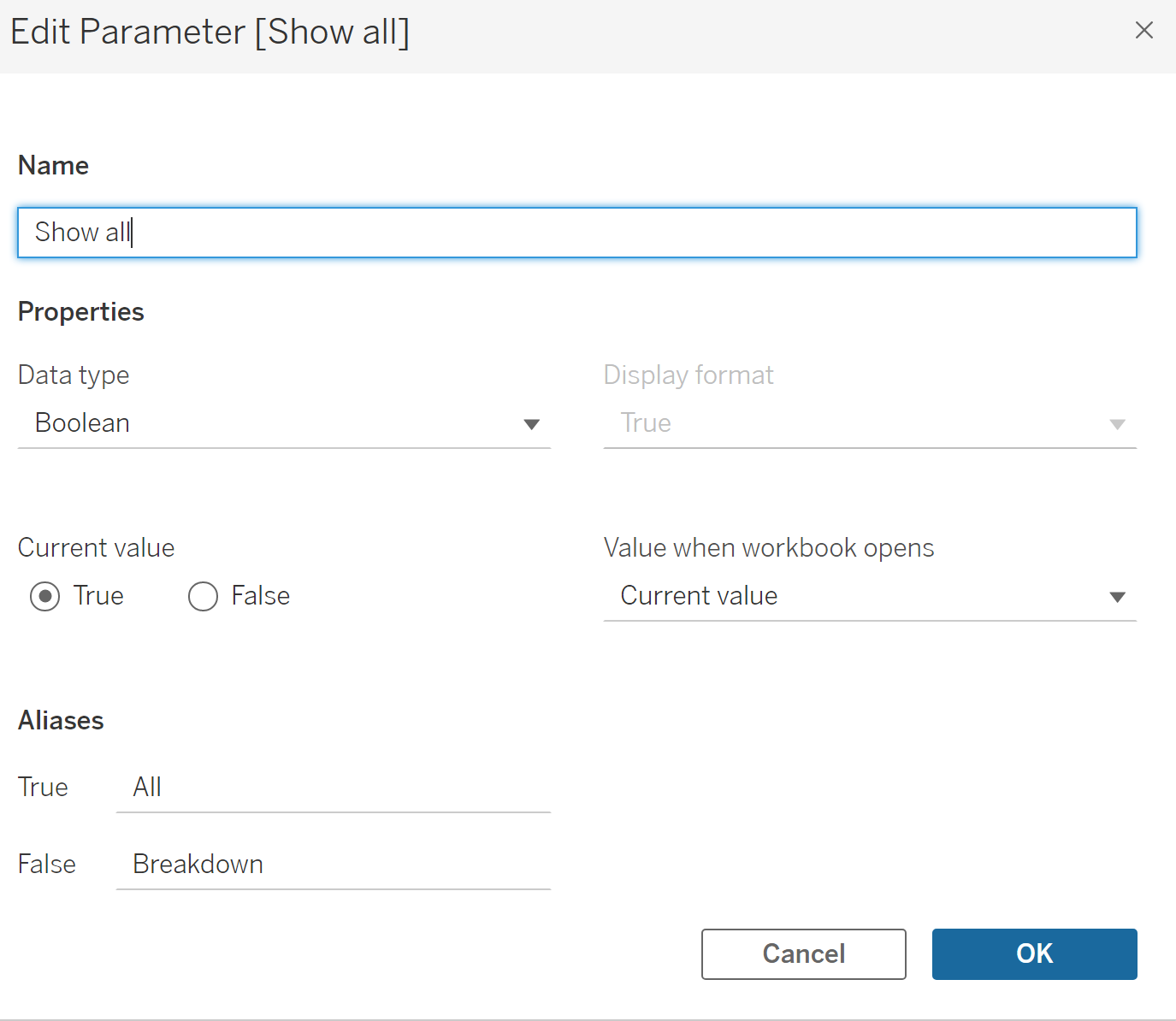
I then made a Parameter called 'Show all', to say if I want the sheet to be hidden or revealed. When this is selected, the user will be able to see all categories (shown above) or a breakdown of each type of gift.
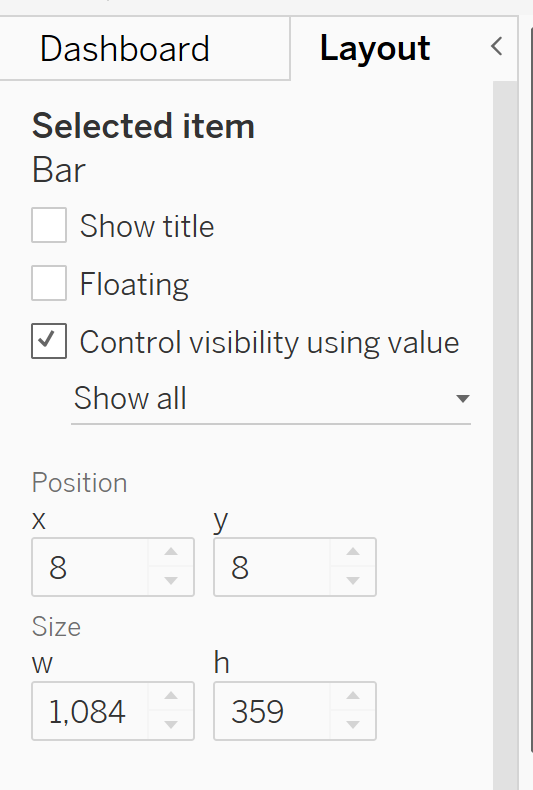
Once this is complete, you can go back to your dashboard and click on the Bar Chart shown above. Then, click on the Layout tab located in the top left of your dashboard. There is now a new option called 'Control Visibility using Value'. Click this and you should see an option to select the Parameter you just made!
Once clicked, you can then go back to the bar chart within the dashboard and show the parameter. As we have selected the data type as Boolean, the Parameter will be shown as true or false. When true is selected, the Bar Chart with the overall view will be shown, and when false is selected, the Bar Chart with the overall view will be hidden.
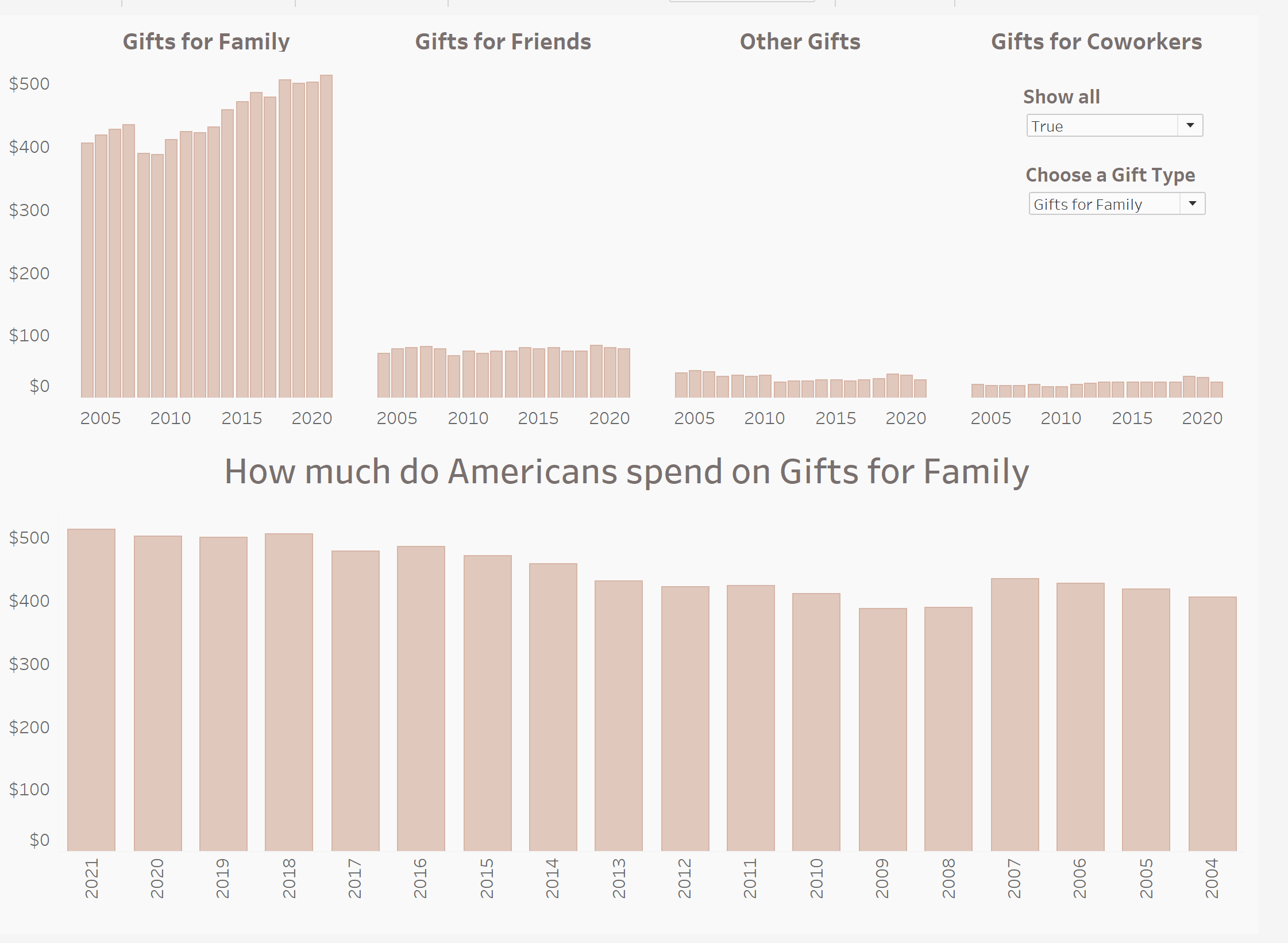
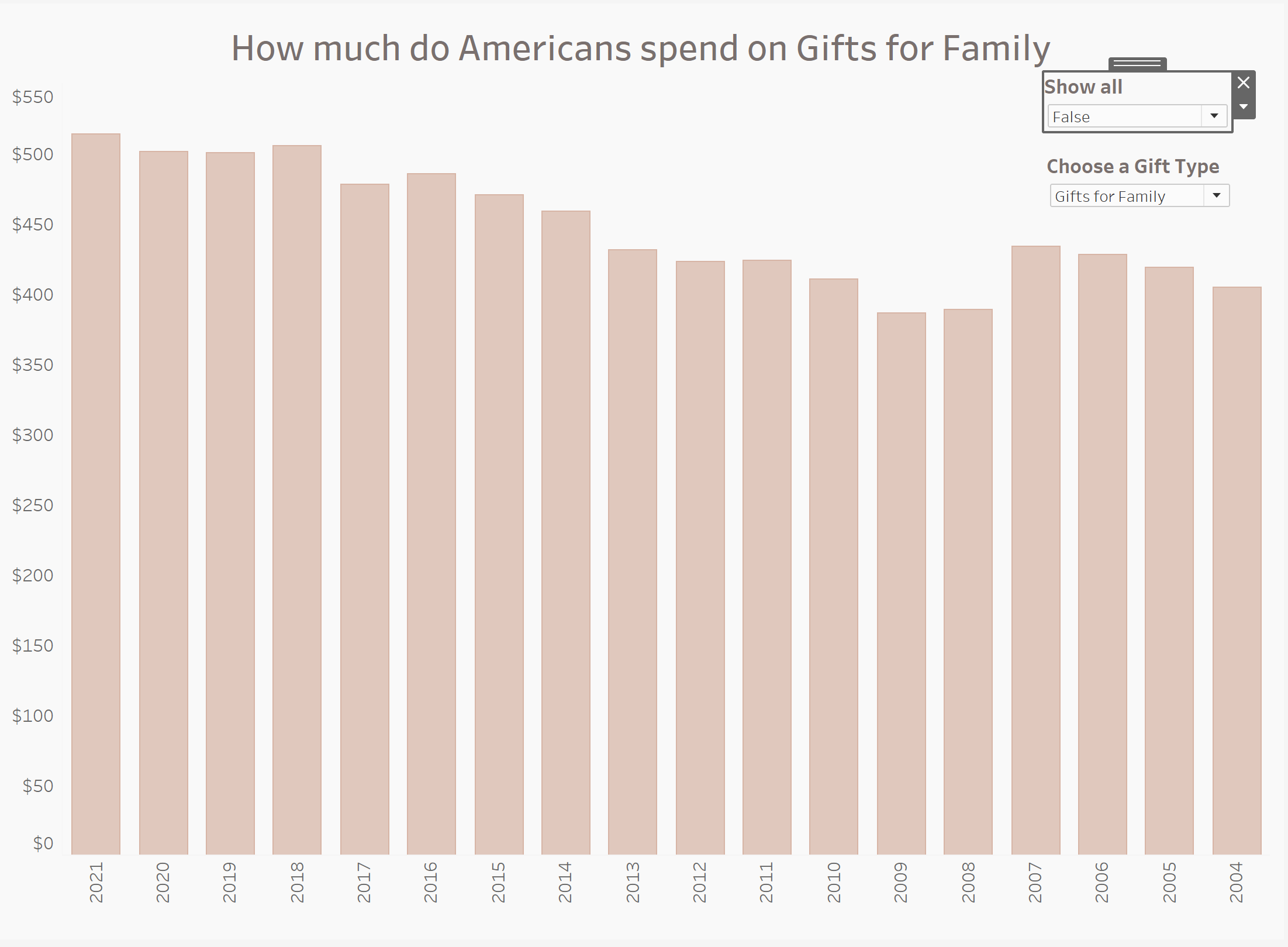
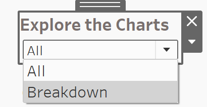
That is it! Very straightforward, and fun to do. One thing you may want to do, which I did, is rename your Parameter to make it more user friendly. This now informs the user that they can select to see all of the Dashboard, or just a breakdown.
