


On the first day of Dashboard week, we were given data bout Golf Courses in Portugal. I've only ever played golf at Top Golf. So, my knowledge about the data's topic is minimal. I decided to dive into the data and found that there were quite a few fields that might be helpful for planning group trips.
Family's may need a balance of golfing and other amenities. Companies could be looking for a place with meeting rooms. Or, an older, solo traveler may care about having a medical facility on site. I try to address these audiences with my dashboard.
This blog explains my build process and includes:
- Data & Requirements
- Data Prep
- Dashboard Design
- Final Dashboard
- Areas of Improvement
The image for this blog contains a Bingo card with all tools I used. No bingo today./
At the end of this blog, I reflect on Areas of Improvement for this project and the next.
Data & Requirements
Few requirements means a lot of exploration
The data came in two forms:
.csvfile with details about each golf course- a folder containing spatial data
All field names and categorical values were in Portuguese. I used this prompt:
I have a dataset about Campos de Golf Existentes (Golf Courses) in Portugal.

Please take your time translating the list of column names from Portuguese to English.

Return the list with the Portuguese column name, followed by the English translation in parentheses, and a short description of the column in the context of the entire dataset. It should look like this:

1. coluna (column): this is a short description about the column.
This list served as a data dictionary. Since my data prep tools had trouble identifying data types, I was able to highlight the fields I wanted based on the following:
- Categorical Variables
- Boolean Values
- Numerical Values
- Spatial Information
Data Prep
89 records displayed, 62 fields, 76 KB
One hot encoding fields in Alteryx
Since I only provided ChatGPT with field names, the categorical variables also needed translating. I split each course's list of facilities by their varying delimiters. That part of my Alteryx flow looked like this:
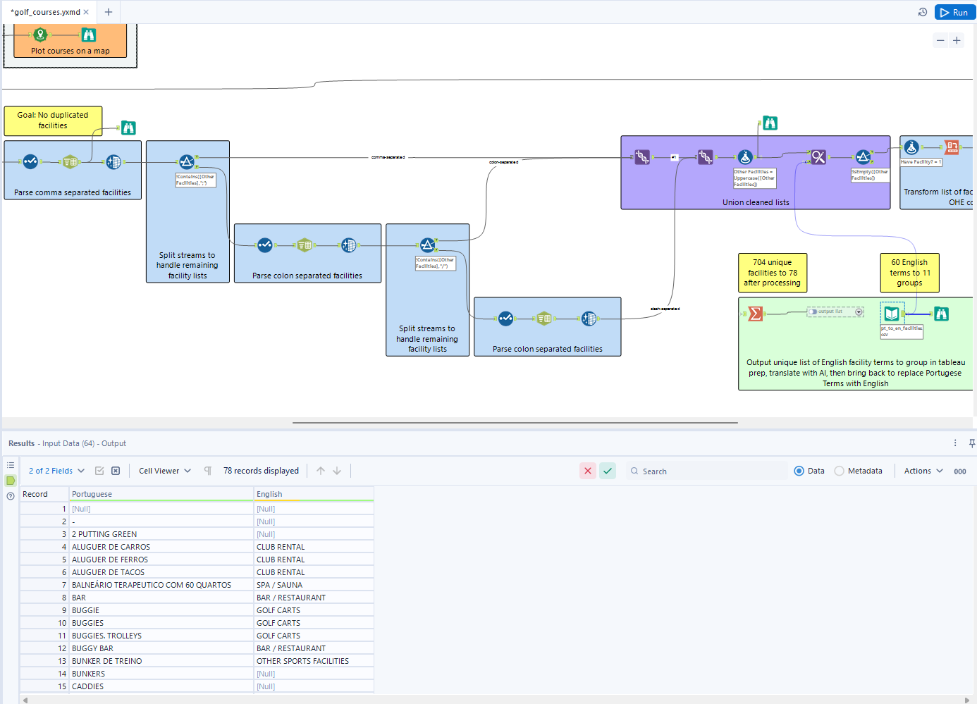
There were 78 unique values in Portuguese from this flow. Simlar to the column names, I asked ChatGPT to help with translation:
Return this list as a table:

Portuguese | English

<copy/paste list of portuguese terms>
Grouping data in Tableau Prep
I used Tableau's group by spelling and common characters to get 78 unique values to 60. Then I did some manual grouping to get down to 12 grouped fields. Some facilities that did not relate to my main users were grouped into nulls.
Dashboard Design
My first idea for the dashboard
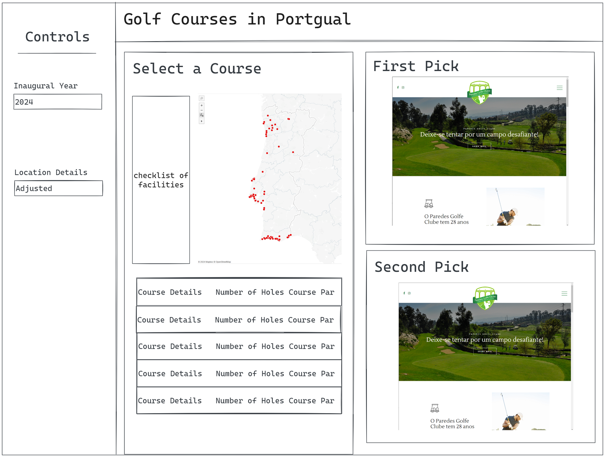
Most of the ideas from this dashboard were built. There were the exceptions of the Table and two web preview pages. This was due to space and time constraints.
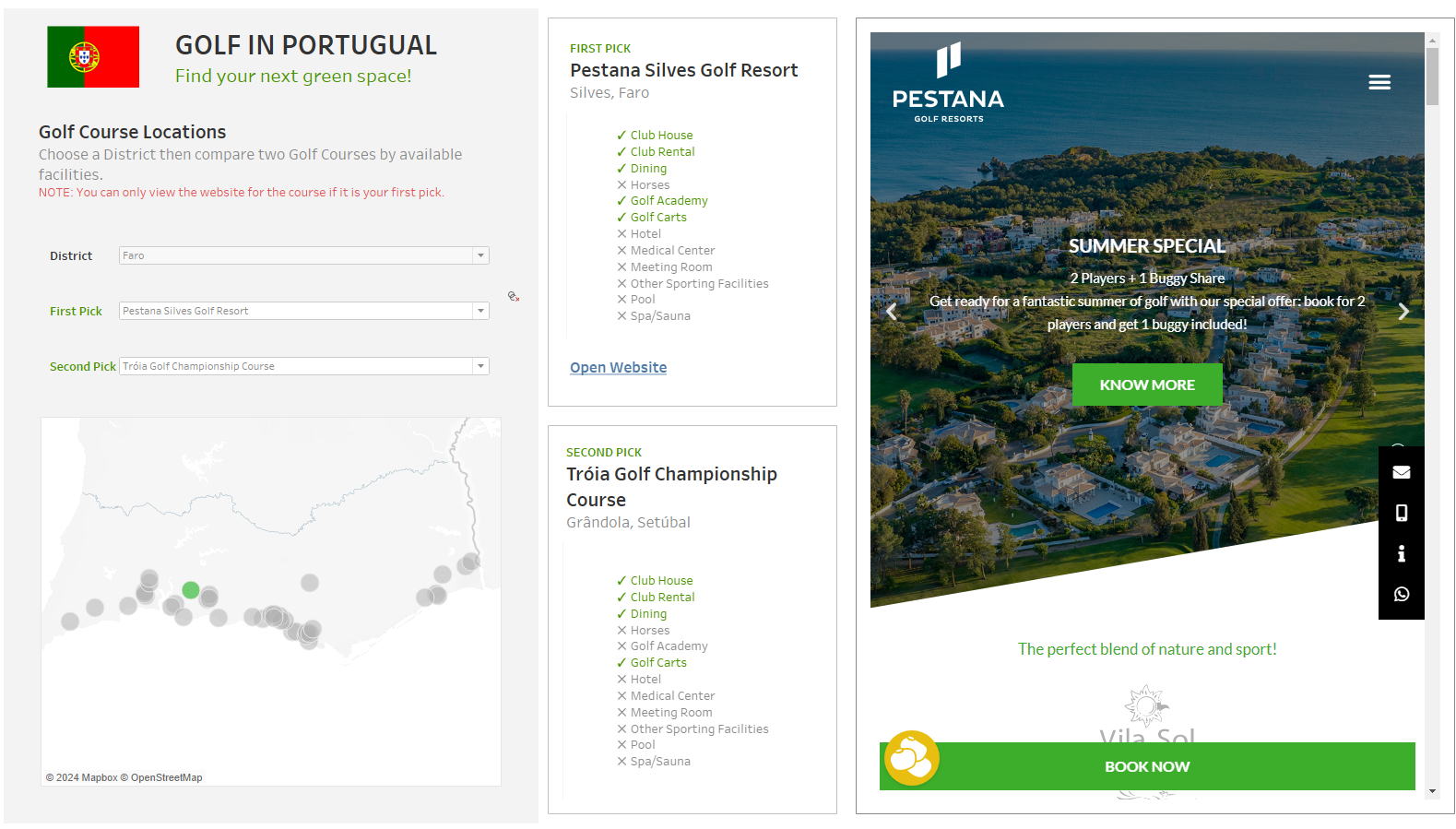
Final Dashboard
Link to dashboard: https://public.tableau.com/app/profile/kait.crawford/viz/GolfCoursesinPortugal/GolfCoursesinPortugal
Areas of Improvement
Setting goals for this project and the next
If I were to return to this project, I would...
- Include distance between the first and second pick.
- Lower the opacity of the data points on the map to better understand density.
- In the First and Second pick dropdowns, filter out Courses that are not in the selected district.
- Add location and course details to the map tooltip, so the user can see more details about the course before seeing the other facilities and amenities.
- Give the user the ability to select which amenities they care about.
NOTE: After presenting, I made some of theses fixes.
Things that I learned that I will do for Dashboard Day Two are...
- Stop working in the last half hour of project time to write the blog.
- Remember to include all Sets and Filters in the controls panel.
- Continue to keep the user in mind.
- Have fun!