


On the fourth and final day of Dashboard week, we were given a familiar dataset but an new task -- build a mobile dashboard. That's right. We set out to build a dashboard designed for phones in a day.
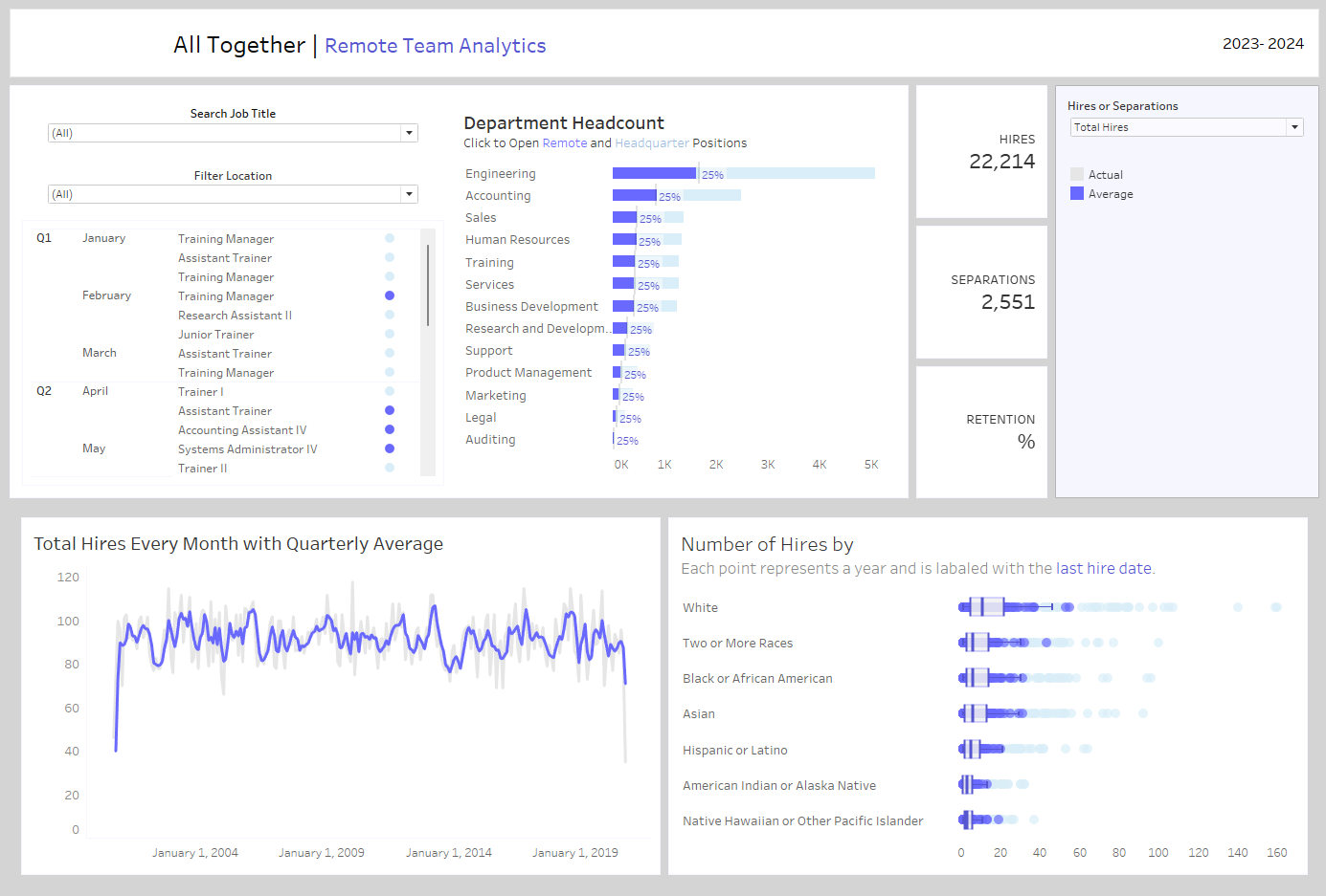
My data came from sons of hierarchies and included human resource information. The first dashboard I made with this data looked like this:
This go around, I wanted a more purposeful dashboard. Something designed with the user in mind. For this specific case, I chose the following user story:
As a People Leader, what information will help me support my current team members day to day while also keeping tab on the future?
This blog tells of how I approached this question:
- Asking Questions
- Data Prep
- Building the Dashboard
- Lessons Learned
The tools I used to do this:
- Tableau Desktop
- Alteryx Designer
At the end of this blog, I reflect on Areas of Improvement for this project and the next.
Asking Questions
Brainstorming with Figma
I started by finding inspiration for mobile app wireframes and HR specific applications. I turned to Figma's Design Community for mobile display specs, layouts, and icons.
Then, I turned to the data. Based on the available fields, what would make someone open their phone everyday to check in on this data? Well, the first thing that stood out were people's birthdays. So, I made a section of the app that would tell you who's birthday is coming up.
Then, I brainstormed other questions related to upcoming new hires, terminations, and demographics.
Data Prep
Alteryx and Tableau
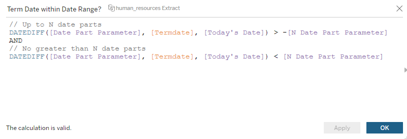
For the birthday message, I started by When I put everyone's full names into a view organized by their birthday, the view was s-l-o-w. That's when I realized that I needed to filter people out people who are not currently employed with the company in this current year.
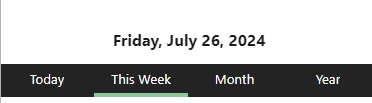
I forgot that some termination dates are in the future. I decided to do the calculation in Tableau so it can be more dynamic. I created a dynamic data feature with a parameter for Today's date, date part, and N date parts. This was used to the tell the following:
- Is the person currently at the company based on the selected time period?
- How far ahead in the future do you want to look at terminations for headcount planning?
This date structure for terminations drove filtering for the remaining sheets. It was flexible enough to add date part selection bar at the top of the page, like so:
Here is how I set up the parameter for the select-based action:
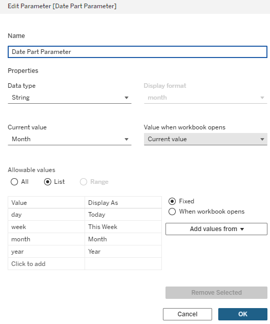
You can only access the active parameter value in the view. This means I could only see one value one at a time. To create a parameter action that updated the parameter with the selected value, I created a new dataset with the Parameter Values, using Alteryx's Text Input Tool. After adding this new datasource in Tableau, I aliased those Date Parts with the Parameter Display As value.
To add the colored bar beneath the selected Date Part, I added a continuous AGG(AVG(1)) to Columns next to the discrete Date Part pill. Then, I created a T/F pill testing if Date Partis equal to the Date Part Parameter.
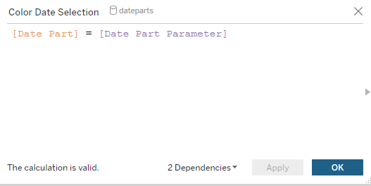
The True value was the highlight color and the False value was the same as the background color.
Finally, calculated fields for date ranges were created and added to the relevant sheets:
This was repeated for filtering the Gantt chart for termination dates, demographics charts, and BANs.
Building the Dashboard
Demo Video
Demo Video of HR Dashboard from July 2024.
Lessons Learned
About Building Mobile Views in Tableau
For building mobile views:
- Use Tableau fonts because most typefaces are not downloaded on servers and mobile devices.
- Phone Dashboards require that all controls and sheets to be in the Default Dashboard. However, the Phone Layout will not be dependent on the Default Layout, unless is the Phone view is auto-generated locking the view.
For this specific dashboard:
- Colors for consistent branding
- Add more insights to demographics views
- Build a new visualization to show new hires
And, with that, my DSNY Training comes to an end. It's been a great four months of training and four days of dashboarding. Learning Continues!