Knowing the difference between measure names and measure values is helpful to making more complex charts in Tableau. The Data pane generates these fields, which can be used in different ways:
- Measure Values are continuous fields that create an axis in the view.
- Measure Names represent the actual names of Measure Values and can be used to make headers.
- Both can be used to create marks, legends, titles, and tooltips.
- Measure Names and Values cannot be be used in calculated fields, parameters, or actions.
Combined Axis
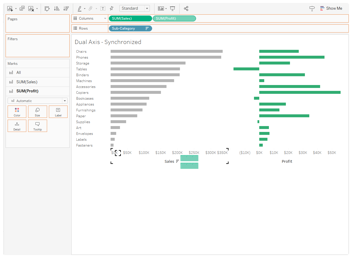
- Two or more measures with the same scales, like sales and profit.
- Drag two measures onto columns.
- Drag one measure onto the other measure’s axis.
- Tableau will generate Measure Names and Measure Values pills. Drag Measure Names to Color.
Dual Axis
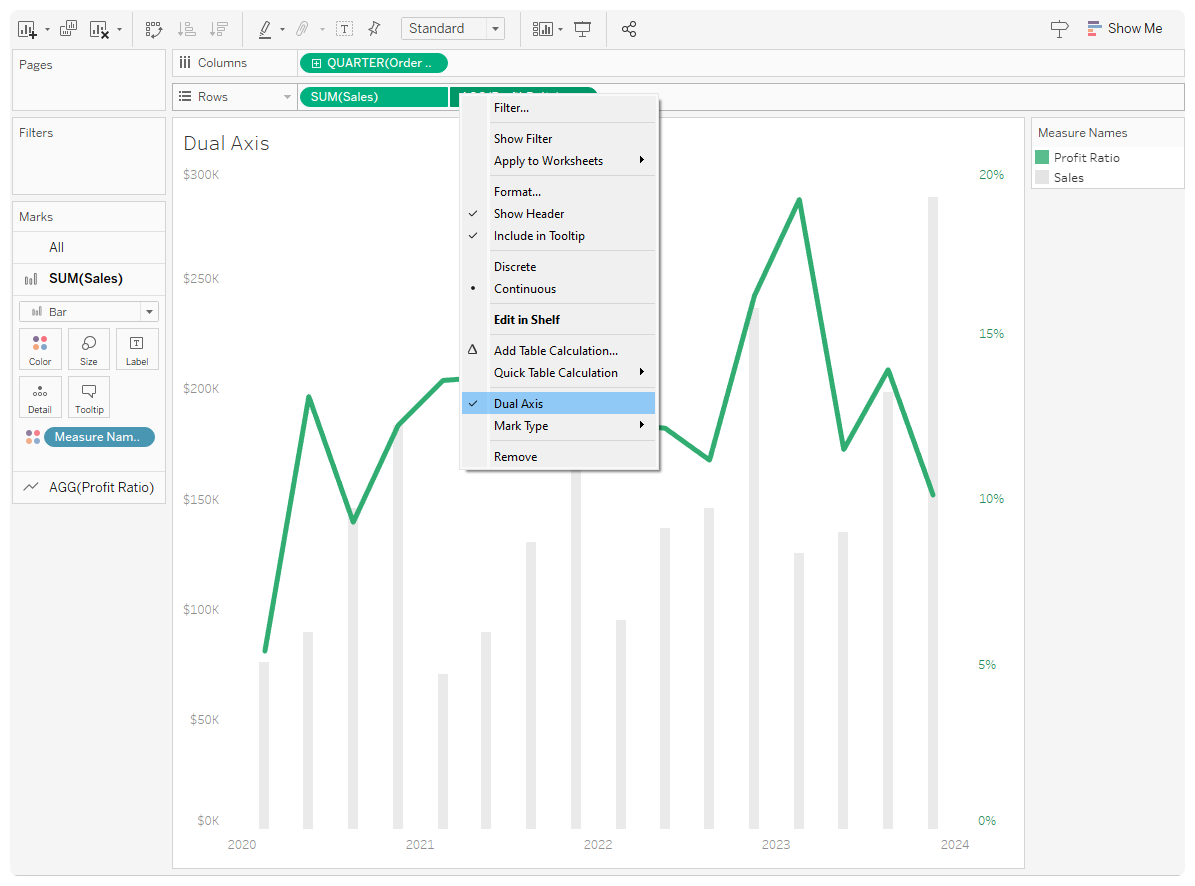
- Two or more measures with different scales, like sales ($) and profit ratio (%) over time. Since the measures have independent axes, you can use two different marks.
- Similar to combined axis, start by dragging two measures onto columns.
- Right-click on the right measure and check Dual Axis.
- Right-click on either axis to move marks to the front or back. You can also change the order of the pills to move marks.
Combined Axis + Dual Axis
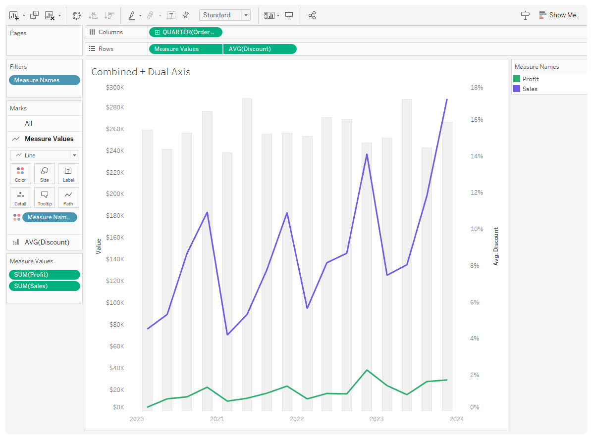
Create the Combined Axis Chart. Then, add another measure value to add a Dual Axis. You can use Measure Names and Values in Tooltips, as well.
Heat Map
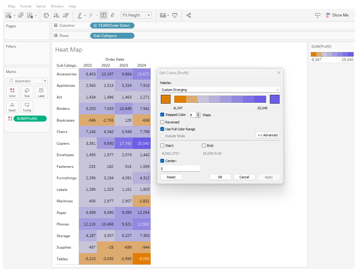
- Two discrete dimensions. Since they are disaggregated, they will create an empty table.
- Drag a continuous measure to color.
- Show mark labels.
- Use meaningful colors to quickly show trends and patterns.
- Diverging Colors: Positive and negative values, such as profit or loss, should be represented in a way that shows how they diverge from a central point, usually zero. Adjust steps for readability or to turn columns to one color.
- Sequential Colors: When the magnitude of values is important, than use sequential colors to show the progression from min to max values.
Separated Legends
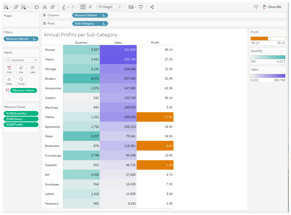
Meaningful colors matter, especially for heatmaps with multiple legends.
- Drag Measure Names and a discrete dimension onto rows and columns.
- With measure values on color, right-click to Separate Legends
The example shows sequential and highlight colors. Do not adjust sequential color scales to show min and max values in legend as default.
Notes on Inheritance
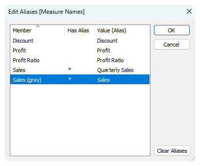
The color and aliased name of a Measure Name is inherited across all sheets. You can access Measure Names and Values in Titles and Tooltips, but not in Calculations.
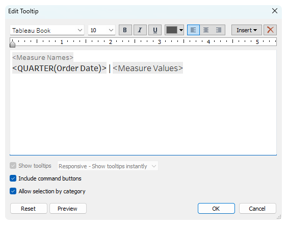
When coloring a measure in different ways across multiple charts, make a copy of the continuous measure and name it [Name (color)]. Edit Measure Name aliases to remove the parenthesis in the name.
