


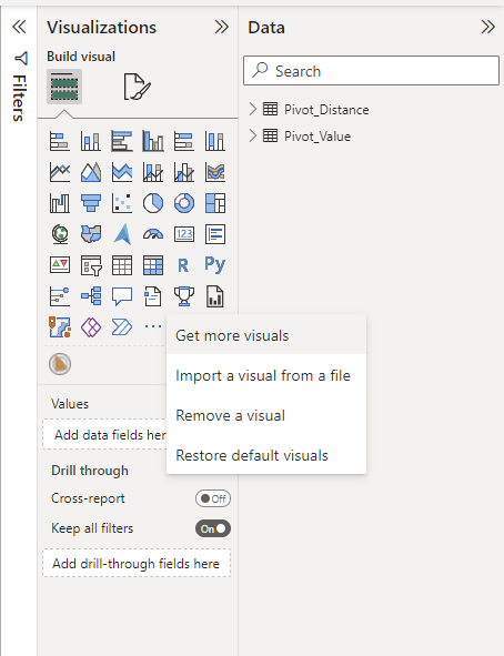
Radar chart is not one of the build in visuals in Power BI, so the first thing we need to do is to download a radar visual. Click the three dots in the Visualizatrions pane and select "Get more visuals", then it will bring you to what I call the visual store.
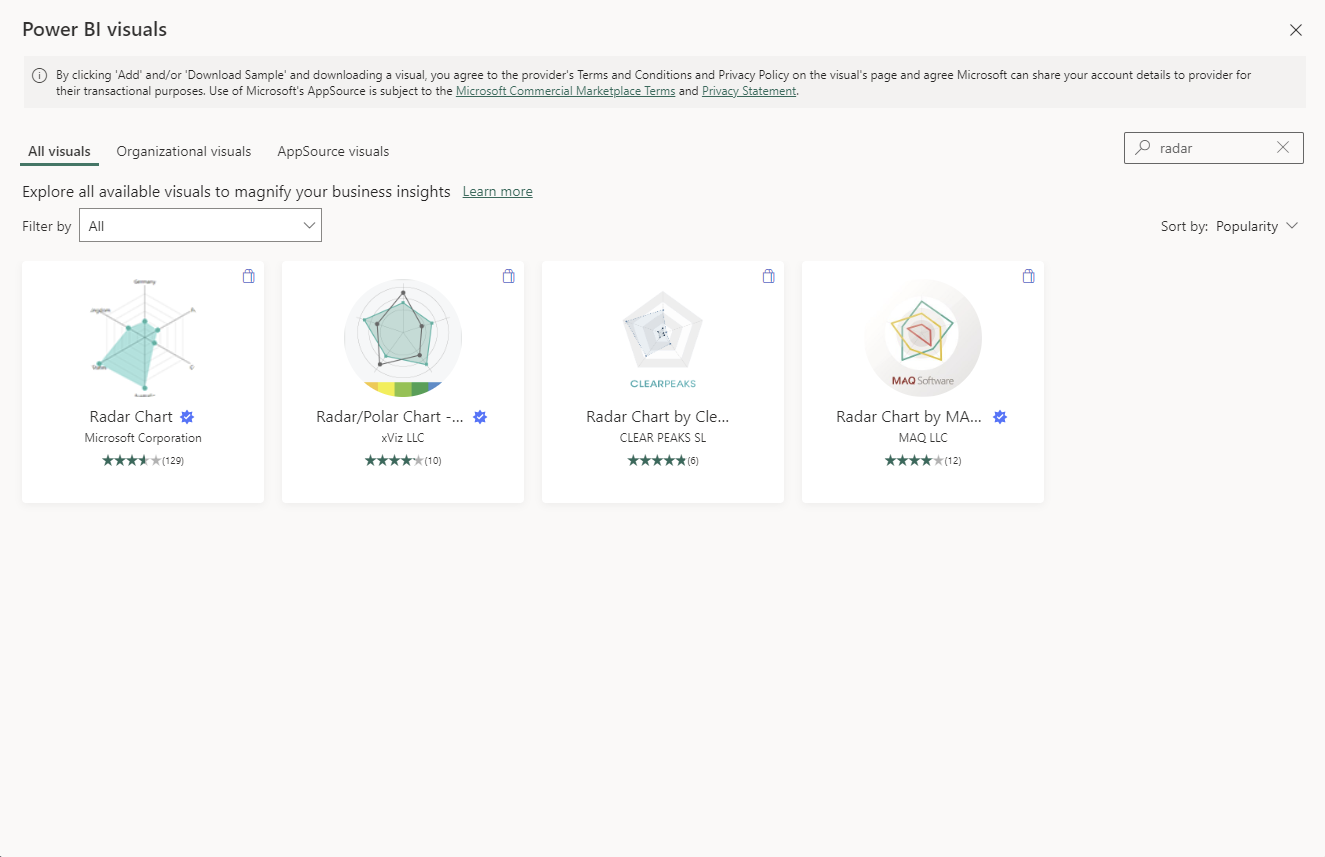
Simply search "radar" then you will presented with a list of visual options. I chose the one with Microsoft Corporation.
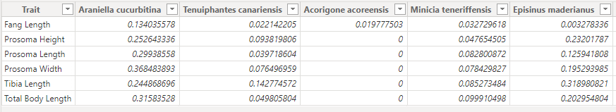
The data shape Power BI prefers is different from Tableau. To make a radar chart, you want the break down category in one column, and each group to have their own column. In my example, I am making multiple radar charts about different spider species. So I pivoted my Trait to be in rows, and spider species to be the columns.
After data preparation, it is simply the case of choosing the radar visual type on the Vistulization pane, and then ticking the correct break down category and measure on the data pane.
