


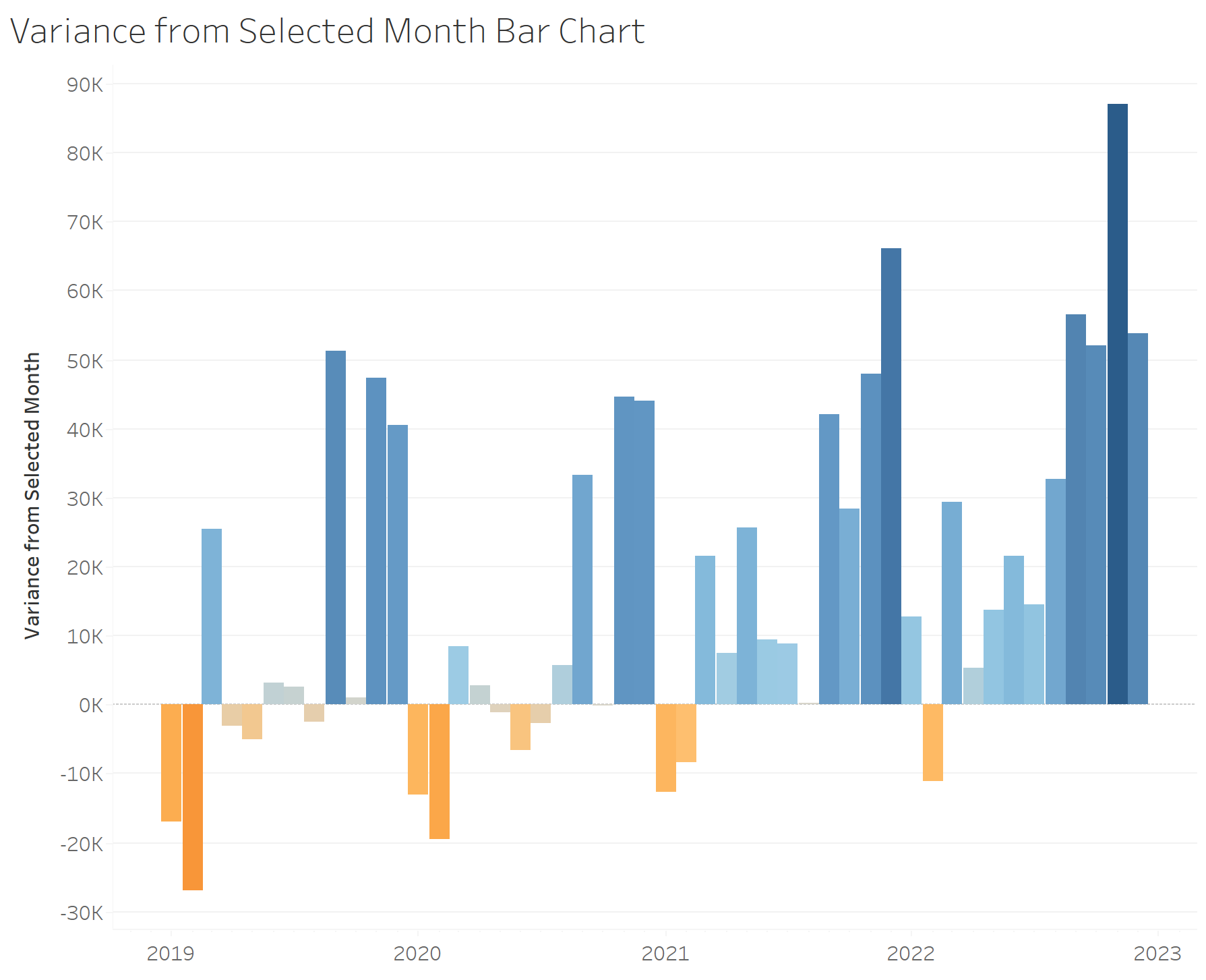
This week at the data school, DS37 have been learning about using set actions to create interactive graphs. This blog will use the Superstore data set to take you through how to create a bar chart showing the variance in monthly sales between a selected bar and the other bars in the graph. Using set actions in this way allows for the user to dynamically change the selected bar, and for the surrounding bars to adjust according to the selection. The final product should look like this:
The first thing we need to do is create a set for our different months in the data set. For this, we cannot simply right click on the Order Date Dimension and select 'Create Set' as this will only give us the option to filter by day level.
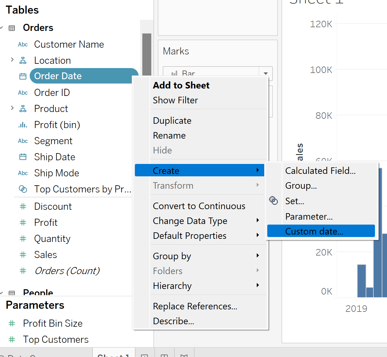
We want to look at the sales data at a month level. For this, we create a 'Custom Date' Dimension. Right click on 'Order Date', hover over 'Create' and select 'Custom Date':
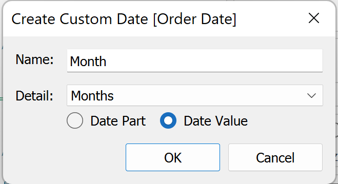
From here, a pop up box should open. Call it 'Month', since this is how we want to categorise our Sales data, and in the drop down of the detail option, select 'Months'. Lastly, because we want the value of the dates including the month name, we select Date Value. Press OK.
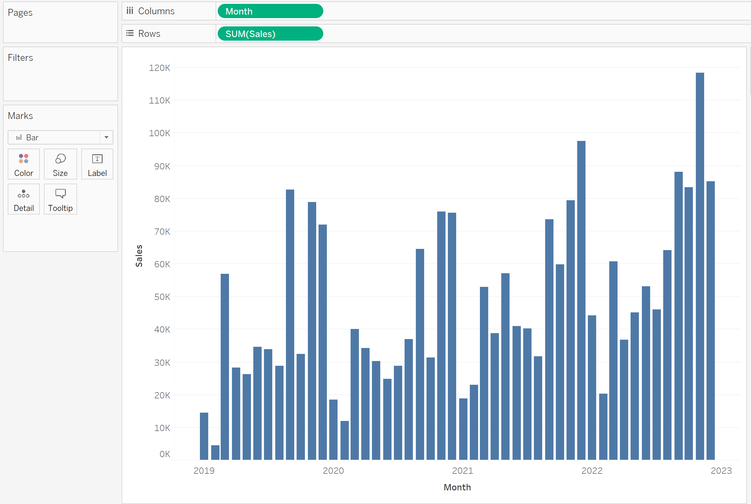
From here, you should see your new 'Month' dimension. Now drag this into the columns shelf, and drag your 'Sales' measure into the rows shelf to generate a bar chart. At this stage you may need to manually resize the bars.
The next step is to create a Set for our new Months dimension. For this, right click on 'Month' in the Data Pane, hover over 'Create' and select 'Set...'.
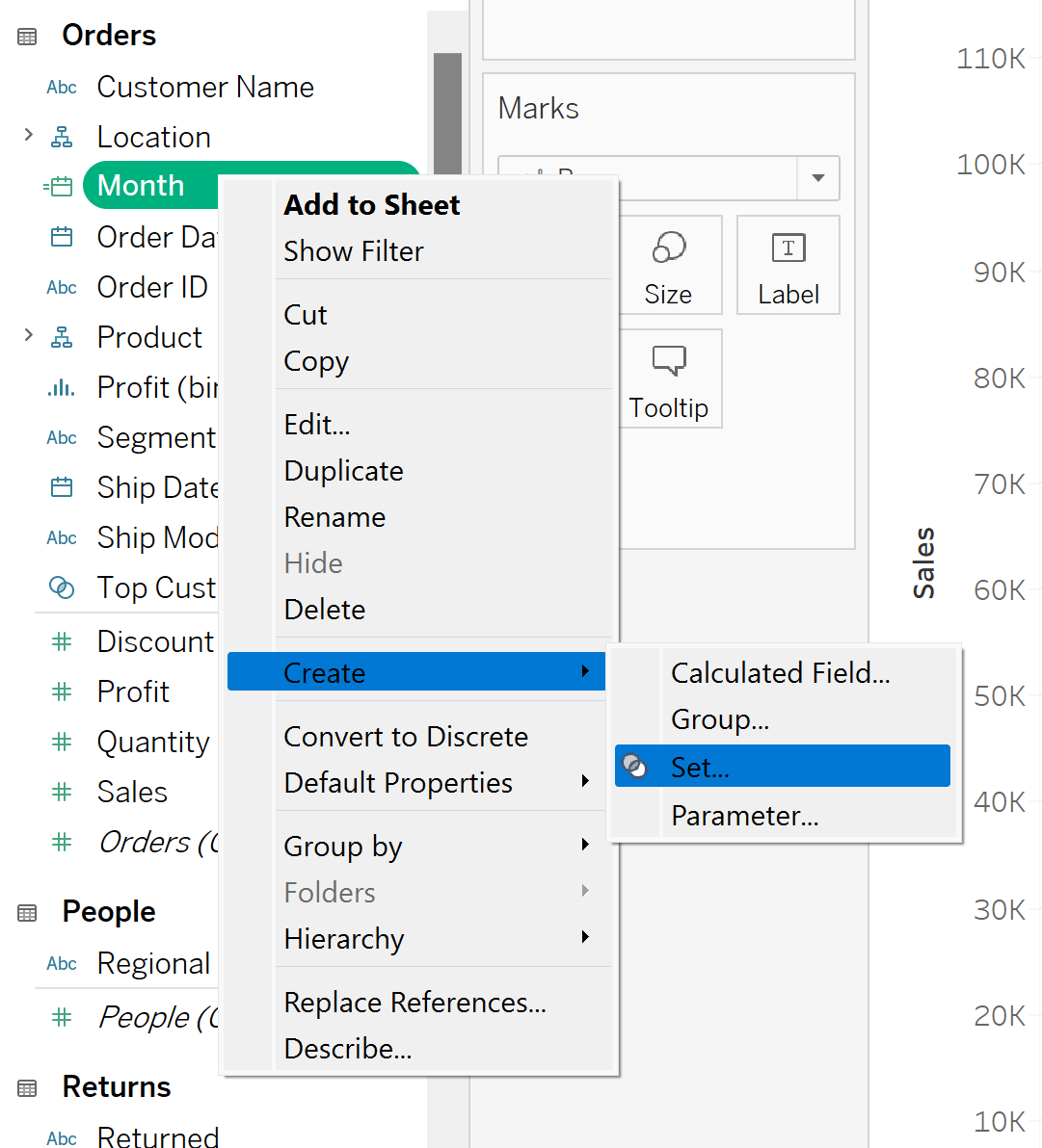
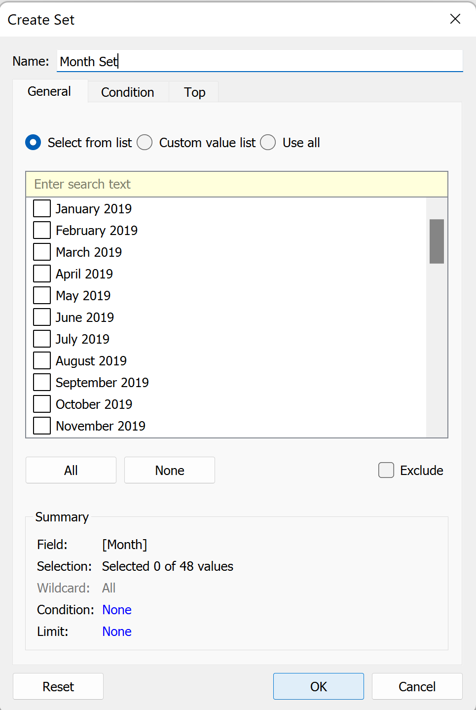
This should open a pop up box. Name your set, 'Month Set' and select OK.
You should now be able to see your created set in your Data Pane.
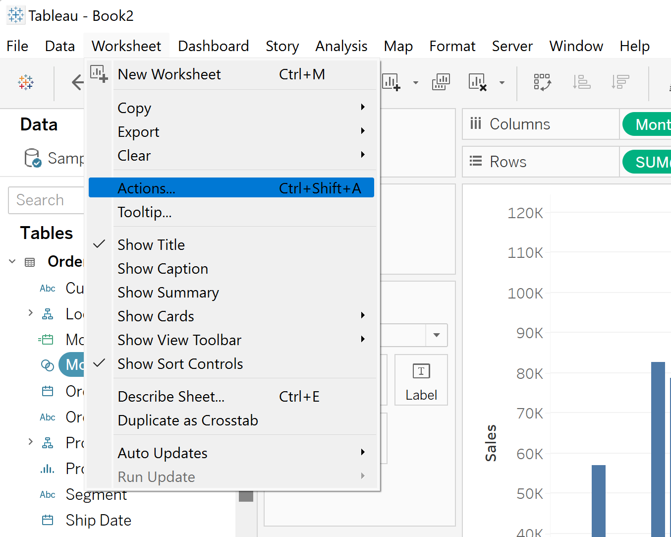
Next you need to create a Set Action to change your Set based on a certain Action. For this click on 'Worksheet in the top left corner of your screen. Select 'Actions...'
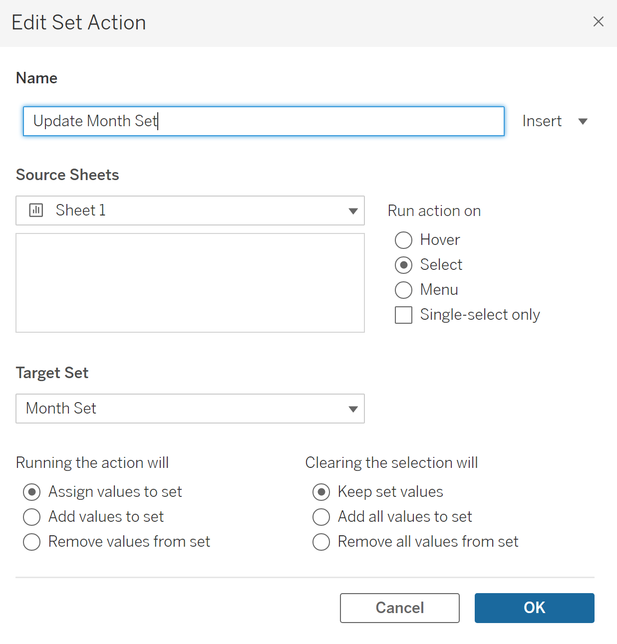
Select 'Add Action' in the bottom left corner of the Actions pop up, and select 'Change Set Values' from the dropdown menu. Rename your new Set Action to 'Update Month Set'. Select your 'Target Set' as the Month Set within your Superstore data.
Next, when you Run the action, you want to Assign values to set, so select this option. Lastly, when you unselect on of the bars, you want to keep what was there, so select 'Keep set values' on the 'Clearing the selection will' part. Once all of these settings are configured your pop up should look like this:
Click OK, and OK again to get out of the Actions pop up box.
Next we need to create some calculated fields to actually get our values to change.
First of all we need to create a calculated field to update the Set to show the Sales of that Month if it is selected. For this, click on the arrow in the top right corner of the data pane, and select 'Create Calculated field'.
Rename the calculated field: Sales for Month Selected. We want this calculated field to be fixed, meaning it should not affect what we see in our view. To do this we need to use a LOD (level of dimension) calculation, more specifically 'Fixed'. In tableau, when creating a fixed calculation, we can shortcut slightly and just use curly brackets to specify that it is fixed. We want to write a calculation that if a month in the set is selected, then show the Sales for that month. We then need to sum this value, as we are nesting it in a LOD.
Your calculation should look like this:
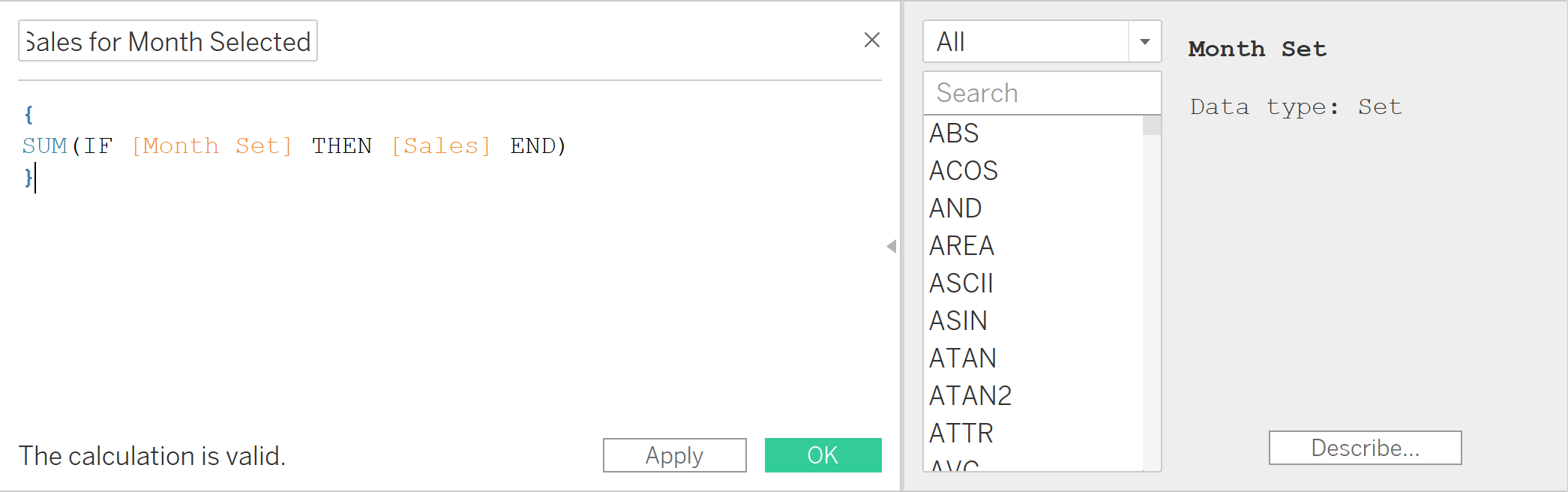
Click ok, and you should see the new Calculated field in your data pane.
The next step is creating a calculated field to calculate the variance between Sales for each Month. For this, create another calculated field, and call it 'Sales vs Selected Month Sales'. The Variance is the difference between the sum of sales in the selected month (the calculated field we just created) and the sum of sales of other months. Your calculation should look like this:
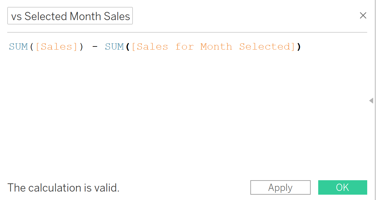
Select OK, and you should see this new calculated field in your Data Pane.
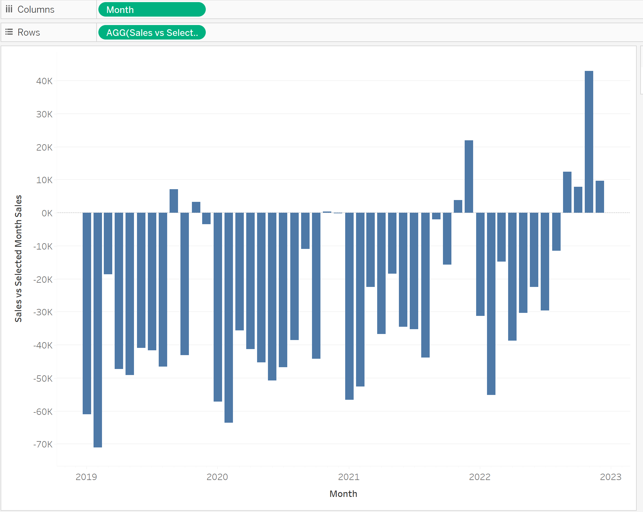
Drag the new 'Sales vs Selected Month Sales to your Rows Shelf, and this should generate a new bar chart showing the varience between the total sales for each month. Selecting a bar should dynamically change the chart to update the selected month.
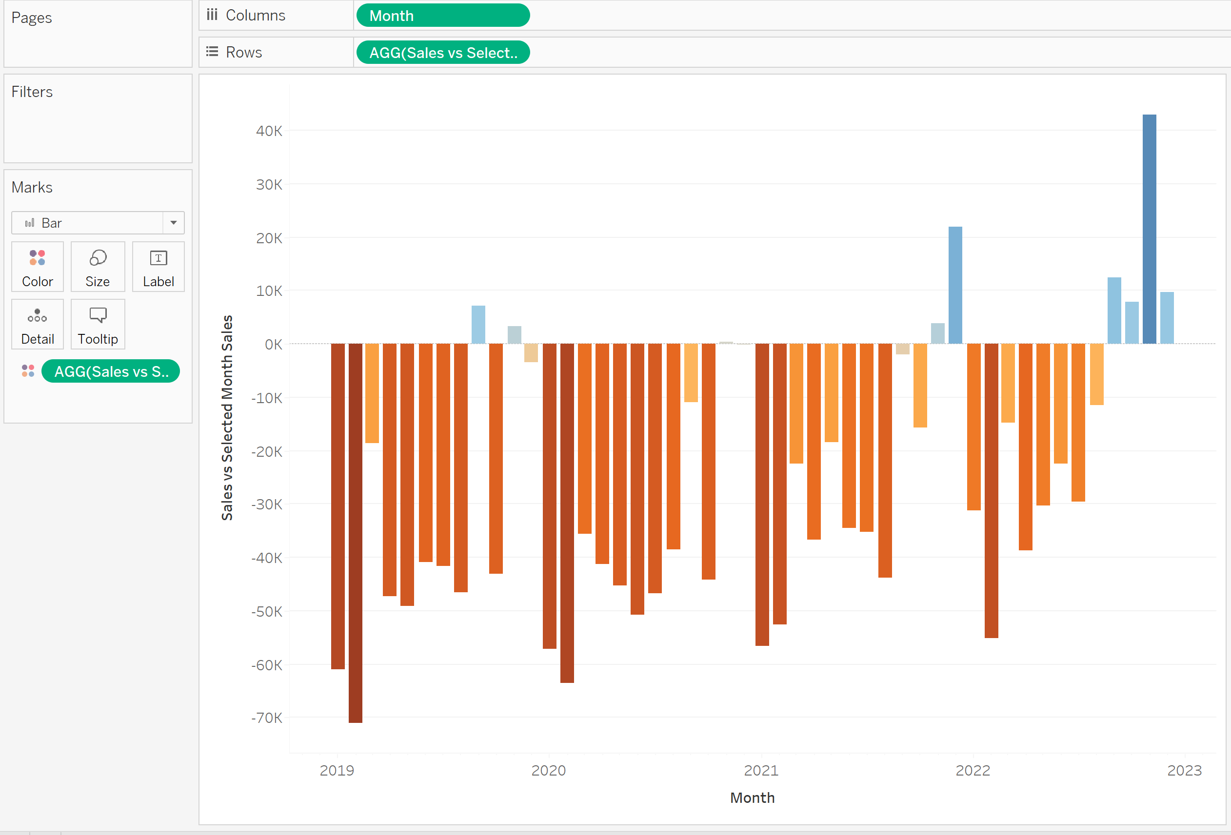
For formatting, drag the 'Sales vs Selected Month Sales' to the 'Colour' part in the Marks Card. A final formatting option is also to remove the border around the bars to make it look more sleek. Do this by deselecting border in the 'Colour' card. Your chart should update to look like this:
Following these steps should have created a bar chart that changes depending on which bar is selected, showing you the variance of total sales between the selected month and the others. Set Actions are a great tool to create dynamically changing interactive charts, and this is just one example of how to use them!