Formatting is an essential part of data visualization. Keeping a consistent number format and colour scheme for a given measure value could be a great starting point to have a neat and consistent dashboard.
Today, I learned an easy and effective way to format measure values. Though it is a little formatting trick but could be really useful and timesaving when you have multiple worksheets and dashboards.
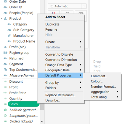
If you have a measure value that you might use in multiple charts and graphs, instead of formatting it on every worksheet, you can simply format it once for all. To do so, simply right click on your measure value and select default properties. This will give you a menu list with options to perform different formatting actions.

Voila! From this menu, you can select:
- Comment: This will add a comment to your measure value.
- Colour: You can set a colour scheme for the measure values so that same colour range is used every time the measured value is used.
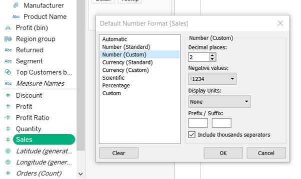
- Number format: Using this a preferred number format for the measured value can be set.

- Aggregate: Using this, you can set the way you want your values to be aggregated (sum/average/Median/etc.). By default, it is set to sum.
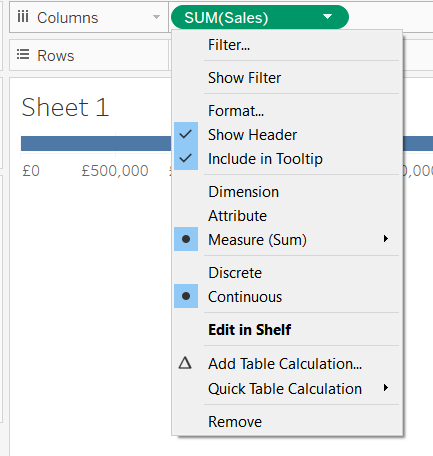
Once you format your measure value as per your desired needs, you can use it in all your workbooks/Dashboards without worrying about formatting. However, in case you need to reformat it for a particular graph, you can do that by right clicking on the measure value in row/column pane and selecting ‘Format’ from the drop down menu.

That’s all folks! Hope this tip was helpful.
