


….
The road to The Information Lab’s Data School involves creating a visualisation in Tableau and telling a story with it, based on any topic you’re interested in.
One of the great things about using Tableau early on in the application process is that you immediately realise how easy and intuitive it is to start making vizzes in Tableau. Powerful features, such as mapping and custom filters can be quickly learnt and incorporated into your dashboard designs. However, with all these capabilities at your disposal, it’s important to bear something in mind…
…
…
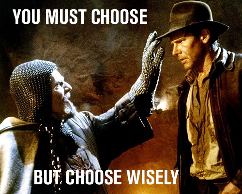
After the first day of The Data School, I realised that you need to make savvy choices when utilising Tableau’s power.
In our first week, we learnt about the principles of data visualisation and best practice. One of the ways Andy emphasised these principles was by showing us various visualisations and asking us to create makeovers, simply with crayons and paper, paying particular attention to best practice techniques.
These exercise were extremely useful. The main lesson that I took away was that vizzes should be easy for audiences to understand, learn from and explore. A great question to ask yourself is whether each element of your viz adds value.
When you add elements to your viz that are eye catching and impressive without adding value, ultimately they may only detract from your visualisation’s ability to convey information to your audience. This outcome is a disaster, especially if your viz actually has a fascinating story to tell and great insights to show. This was the case with many of the vizzes we looked at; great stories and insight hidden away in seas of obscurity.
…

…
The principles of data visualisation are simple, yet I imagine that the lessons from The Data School’s very first day, before having even *touched* Tableau, will be the ones that I’ll revisit the most in the future.
…
Getting started with Tableau & Data Visualisation
…
If you’d like a resource for learning more about data visualisation best practice using real examples, check out http://www.datavizdoneright.com/.
If you’d like a recommendation on how to start using Tableau, I found Tableau’s starter videos to be very useful before creating my first viz.
There are also some great vizzes on Tableau’s Public Gallery for inspiration. Many answers to your questions can be found via Google; answers often originate from Tableau’s Online Help, Tableau’s Knowledge Base & Tableau’s Online Community.
An invaluable lesson is in understanding what those blue & green things mean in Tableau; read this explanation via The Information Lab to find out. Understanding this crucial concept will greatly enhance your capabilities with Tableau, as you’ll learn to think how Tableau thinks.
The first intake of The Data School also have some smart advice; read their advice here. In addition, Ramon Martinez has a rich list of resources on his Health Intelligence Website.
Finally, some creative tips & techniques have already been posted on this blog by my colleagues during our first week. There’ll be plenty more on the way in the next 4 months!