


Statistics are extremely useful to any analysis as they can help us make sense of and quantify trends in our data. In tableau statistics are mostly found in the analytics pane. A variety of tools can be used in alteryx for statistics:
1) Association analysis:
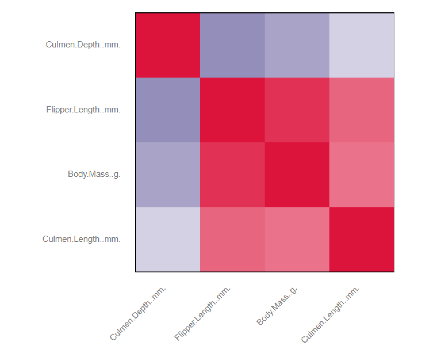
This tool permits to establish weather two measures are correlated. The tool will give you back a correlation matrix, p-values and the ability to visualize all points in the data as a scatter plot. In order to use that tool, you need multiple measures. We used penguin data! You will then need to select the measures you want to see in the correlation matrix inside the tool, followed by two browse tools. One for the static output as well as for the interactive output. You can see below the view of both static and interactive reports:
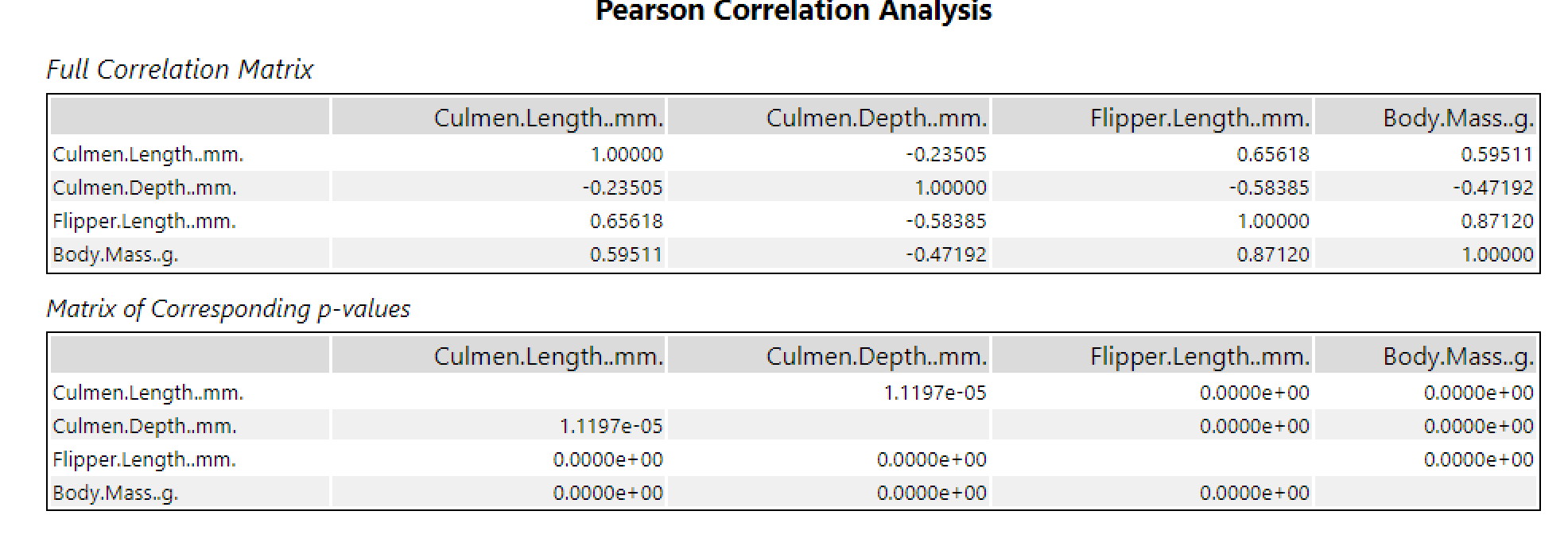

The tool gives you the ability to use different measure of association, the pearson product moment correlation, spearman rank order correlation, and Hoeffding's d-statistic. These are meant to be used in different situations.
2) Linear Regression
Linear regression is used to predict the values of a dependent variable based on another variable. In terms of input the linear regression tool will need two measures. A predictor variable (independent) and a target variable which is dependent on your predictor variable. Once these selected, you will obtain three outputs:
o - is the model, you can input that model in other tools such as the model comparison tool to assess it's efficiency compared to another model for example. Just remember these models are supposed to predict as close as possible but not being exactly the right values.
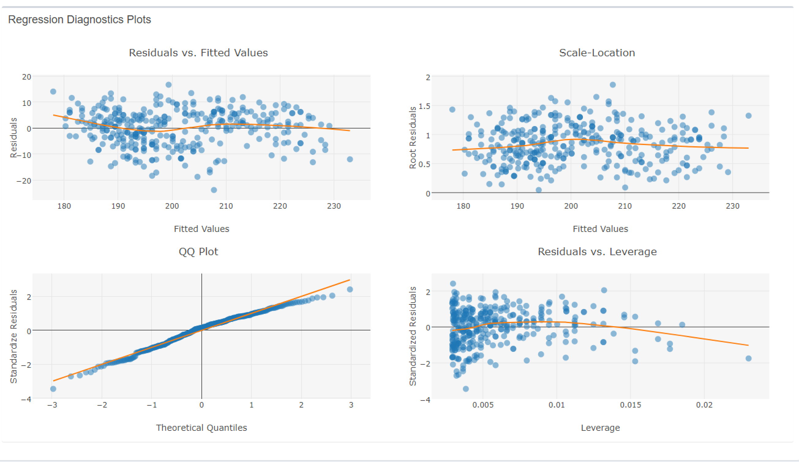
r - is the report, this includes a statistics report with the usual statistics such a quartiles, median, Std. error etc. Also provided in the report is different diagnostic plots.

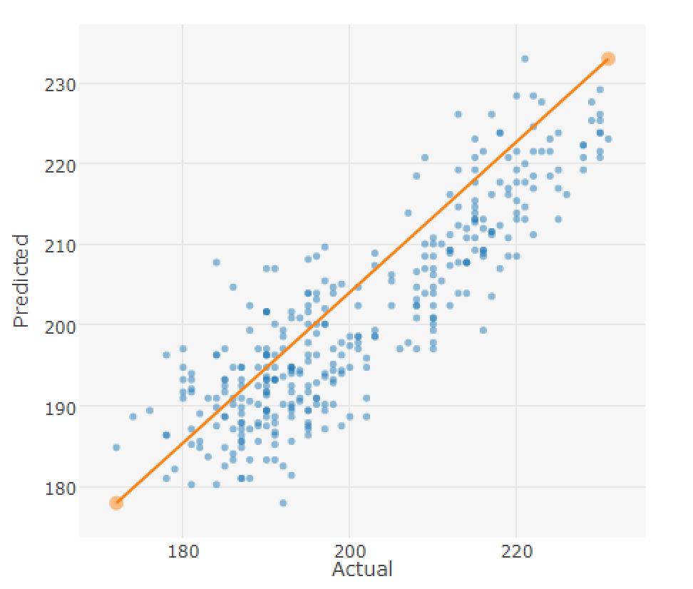
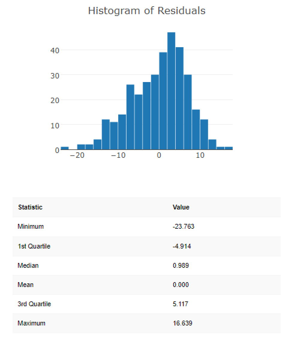
i - interactive report. This provides you with an interactive report, similar to the static report but going slightly more in depth. We find a more complete summary, and models showing predictive vs actual values. This shows how good our linear regression line is! You also obtain a histogram to see how off your predicted values are. Once again this helps estimated the quality of the predictive model. Once again we get also some more in depth diagnostics plots.

3) Linking the linear regression model to a model comparison tool:
If we have two different models we can compare their quality. First you need to union the tools you want to compare. Then you want to connect these to the M branch of the model comparison tool. In the other branch you will want to connect data that has not gone through the linear regression model. This is to assess the quality of predictions. Three output branches exist. The first will assess quality based on error measures directly given to you in alteryx as a table. The second will give you the comparison in values obtained for the field using each model. The third will put these in a report, with link the the wikipedia page of each measure as well as a plot showing how the different models performed in predicted vs actual values.

4) Score
Finally the score tool can be used by providing the d branch with a model, and the m branch with data. This will create an estimate for a measure using the model as well as the predictor variables present in the data.
These are examples of frequently used stats tools in Alteryx. Alteryx provides other predictive and machine learning tools which I am looking to discover soon!