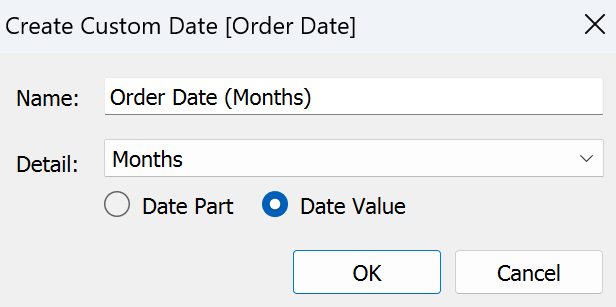
Small multiples are directly set up in Power BI, however, if you want to use them in tableau here's how to do so (warning it's a bit tricky). Took me a while to understand it but this is the way that got me to finally understand!
Step 1) Create your rows and columns calculations
To be able to have small multiples you need to get some dimension divided into rows and columns so using index and size is a good way to obtain a value for those for each small multiple.
Rows: INT((INDEX()-1)/ROUND(SQRT(SIZE())))
Columns: INT((INDEX()-1)%ROUND(SQRT(SIZE())))
The reasoning behind these calculations is that you create a number based on the index which helps you with positioning as well as size to know how big your sample is. Using the int() function you make those numbers integers instead of decimals, this helps you get x number of small multiples on your rows and columns as the row value or column value need to be the same to plan your small multiples. You can now put your rows and columns in the respective panes they fit in.
Step 2) Input what you want your small multiples to be based on and the chart you want to visualise.
There are three parts to this, the first one is to put the dimension you want to base your small multiples on in the details section of the marks card.
Then you will want to add to rows and columns whichever axis you want in your visualisation. If you are to use a date you will need to follow these additional steps. You first want to create a custom date. For me I wanted to use the months and year. You then want to drag your date as an attribute in your columns or rows pane.

This is what your rows and columns pane will look like when you try to build a line chart for example:

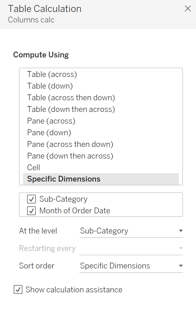
You will then need to adapt the table calculation, for this you right click your columns, select edit table calculation. Then we want to compute using specific dimensions, you want to have first your dimension creating small multiples (sub-category for me) then your axis (months of date for me). Then below the specific dimension you will select at the level and drop down to use your small multiple dimension (sub-category for me). This is easier to visualise so here's a screenshot.

Repeat this for the rows next, exactly the same way.
This will get you your line chart as small multiples!
The one additional thing you might be wondering about is how to know what is in each section? You are able to add a label via a hacky way.
If you add a calculated field being Avg(1), and set up a dual axis. You will now be able to remove measure name from the marks cards and in your second marks card set to opacity to 0%. This will make the marks invisible, you can then add a label based which will appear in your top right corner.
I hope this helps! Enjoy your new small-multiple charts!
