


One of the best ways to represent changes in rank over time is using a bump chart. It permits to visualize the changes in rank over time and easily compare the rank of different dimensions.
In this blog, I will take you through the steps required to build a bump chart. I will use the Railroad Infrastructure dataset from MakeoverMonday: https://data.world/makeovermonday/2022w47.
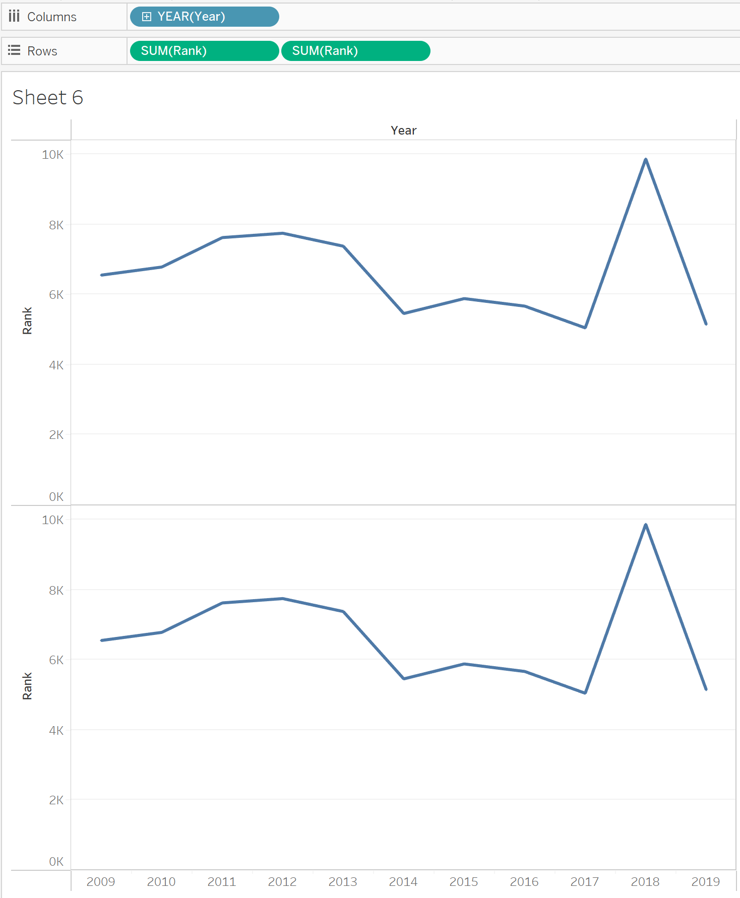
The first step is to drag the years into columns, making sure to set it as a dimension. We then want to drag our measure in rows. In this case the rank is already calculated, if that is not the case you can simply right click on the measure, select 'quick table calculation' and then rank, you then have to right click once again on your measure and select 'compute using' and select what you are looking to rank (in our case here countries). Once that is done, you can duplicate your measure by pressing control, click on the measure and drag it into the rows.
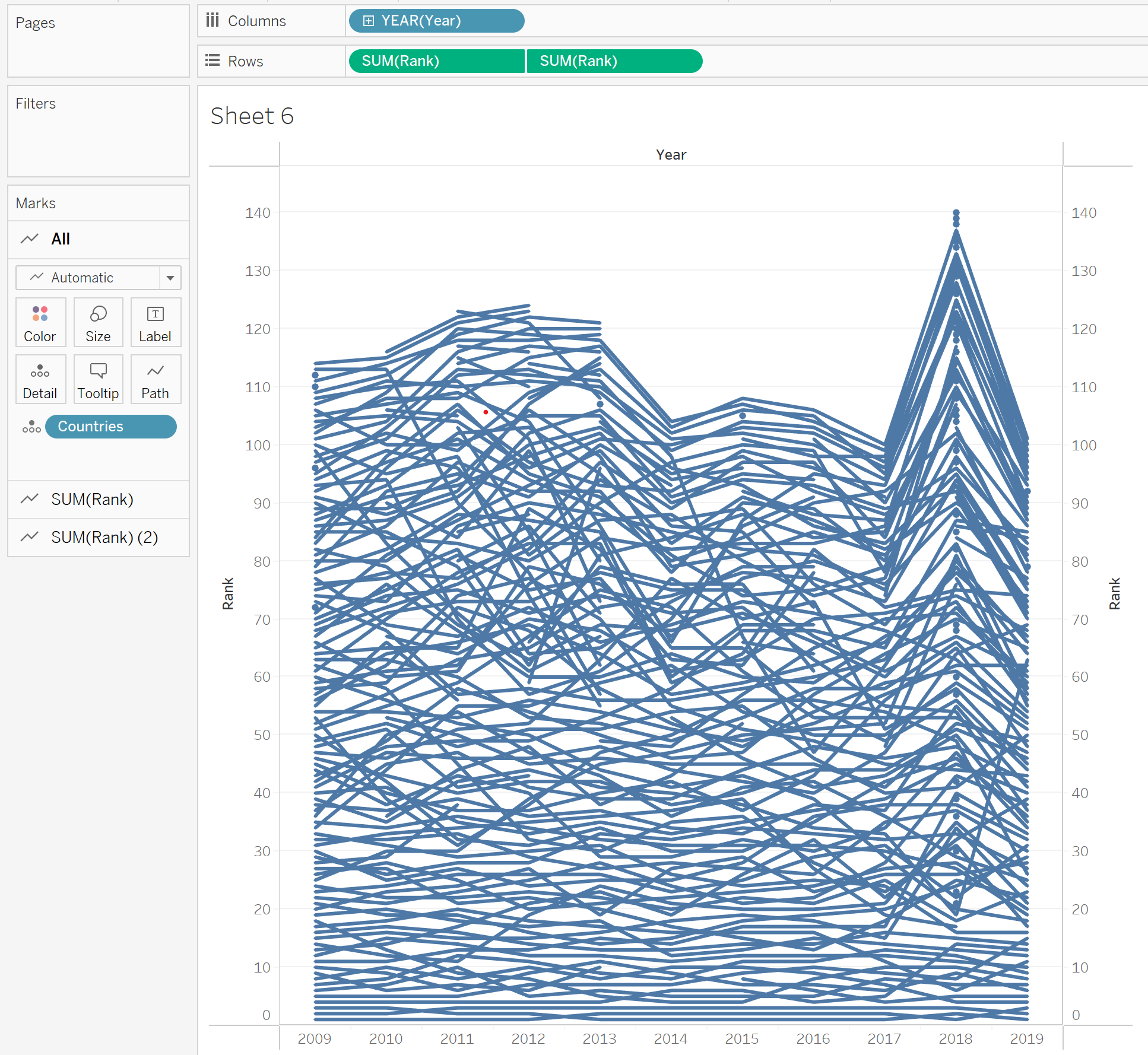
In our second step, we will add our dimension of interest, countries, as detail in the marks card. Then we can click on one of the rank measures in the rows pane and select 'dual axis'. You can then also right click on the rank axis and select 'synchronize axis'.
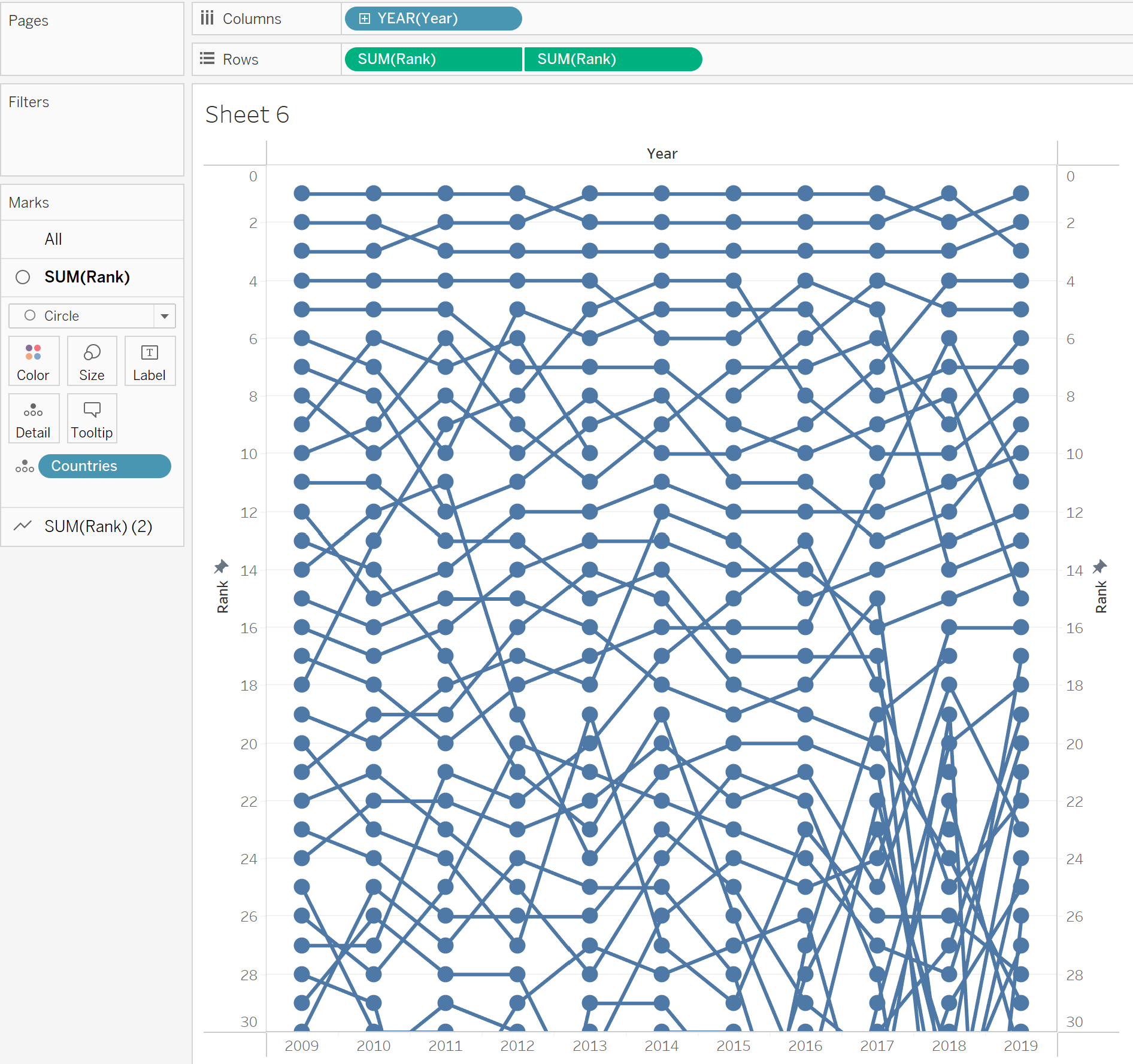
Looking at the previous picture, you will notice that our rank right now has the best rank at the bottom. We therefore want to right click our rank axis and select 'edit axis' followed by ticking the 'reverse' box. This allows us to see the number 1 ranked country at the top. Next we will want to focus on our marks. We need two different marks. The first will be a circle mark, if you click on the mark pane where our rank is, in our case 'SUM(Rank)' we select the mark and select circle. For the second marks card, in our case 'SUM(Rank)(2)' we will select line. As we have a lot of countries in our dataset, I have decided to only show the 30 best countries each year. To do that we right click the rank axis again, tick the box for fixed axis and put the minimum as 0 and maximum as 30. We then can in the marks card, select the circle mark and change the size of the circles, so they don't overlap.
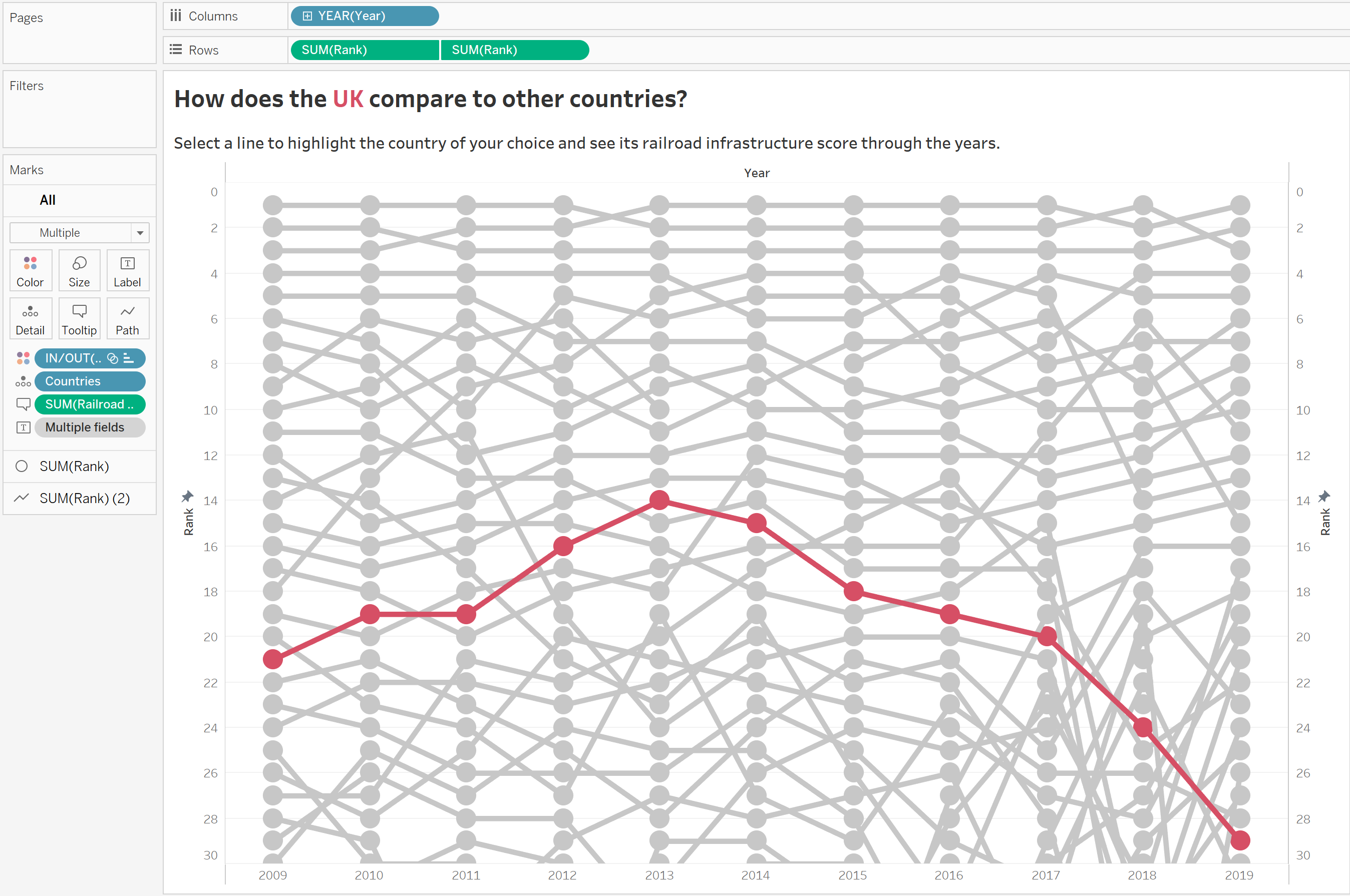
Now it all depends on what you want to do! I would like to highlight the UK in this chart, I have therefore created a set which created two groups, either being the UK or any other country. I will put that set in the mark pane as color, to highlight the UK in the chart. You can also have a color for each country (be careful as this might lead to a lot of colors in our example!), for each continent etc. You can also set labels which would show on each circle the actual railroad infrastructure score for a country in a specific year. There are many possibilities that you can explore with this bump chart! Make sure to have a title and explain any possible interactivity and your chart is ready.
Here is a link to visualization, I built with this chart, feel free to make a copy and play with the visualization in any way you feel.