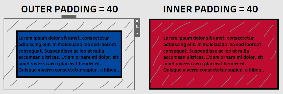
During the second week of the Data School, we learnt more about designing and creating dashboards. And one of the things that we tweaked are the outer and inner padding settings of the different elements on the dashboard. I learnt that they can be very useful in creating white (or negative) space and creating a clear dashboard. In this post, I'll talk about the difference between inner and outer padding and how they can be used in dashboard design or thicker borders.

Outer padding:
- pushes the border, background and content inwards
Inner padding:
- only the content is pushed inwards
- padding is inserted between the border and the content
Using padding in dashboard design

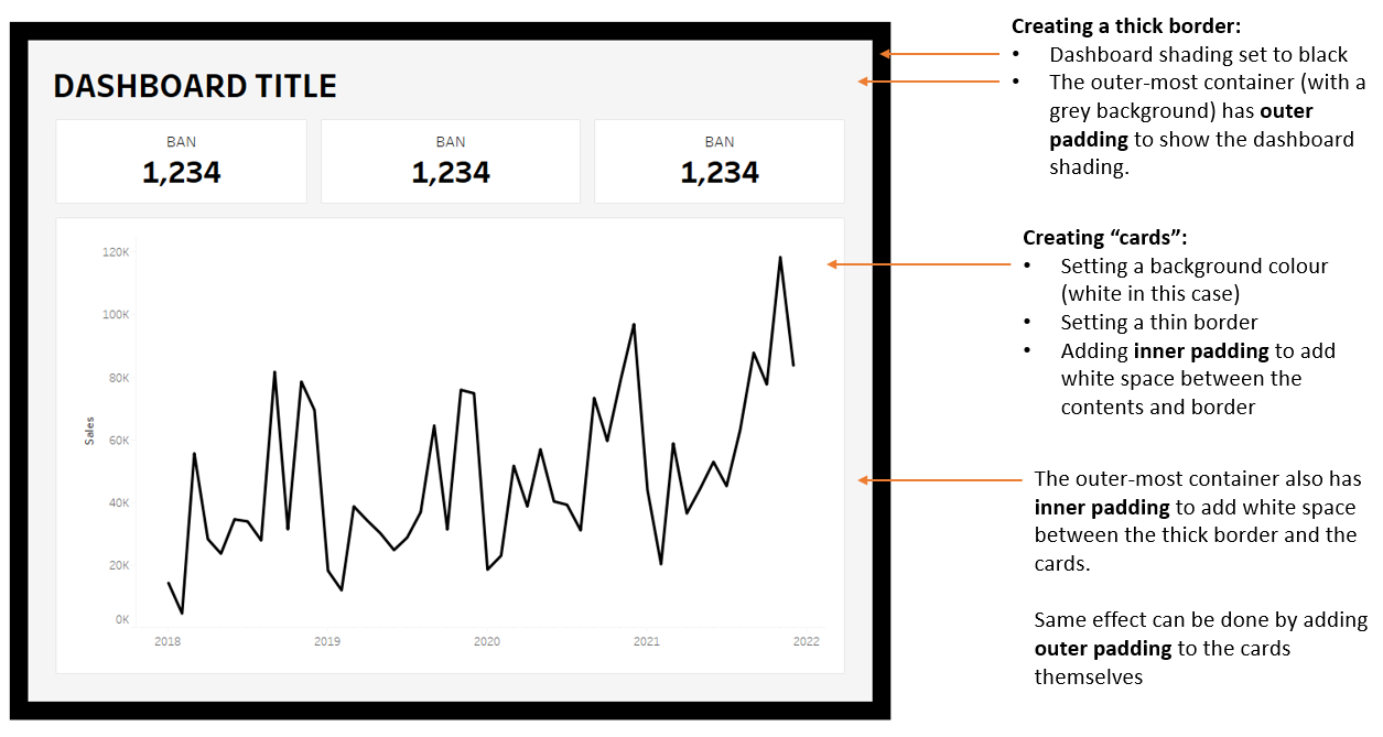
The figure above shows how to utilise padding settings more when creating dashboards and other visualisations. Cards were created for the main elements of the dashboard by tweaking the background colours and padding. As a result, more attention are given to the cards and they each have more breathing space.
Tableau allows us to add borders of different sizes already but the selection of thickness is limited and by using padding we can create thicker borders. It's not necessary for dashboards but it's good to know we can do this for stylistic purposes!
