Week 2 was focused on what brought us all to the Data School in the first place – Tableau Desktop. Almost an entire week dedicated to data visualization best practices, design methodology, and practical Tableau learning with the big man himself, Andy K, with a dash of Carl Allchin for flavour. We got to learn a whole bunch of Tableau tips and graphs, and more importantly got to play with crayons.
Day 1
Monday was spent going over data visualisation best practices! This included important considerations such as pre-attentive processing; the subconscious processing of information. Pre-attentive processing works incredibly quickly – a fraction of a second – and is especially powerful at picking up differentiation in form, colour, spatial positioning; this helps explain why trends in charts can be understood and recalled so quickly opposed to trying to identify and recall the same information displayed in a simple table of numbers and values.
We also went over the Gestalt Principles of Visual Perception. In short, these principles cover the different ways in which we automatically group information: proximity, similarity, enclosure, closure, continuity, and connection. A very simply example of this is: if you plot a series of different coloured dots on a scatter chart we automatically assume all dots of the same colour must be in a group together. If you draw a border around a set of dots you assume they must be in a group together. If some dots are circles and some are squares then you assume the circles are all in a group and the squares are all in a group, and so on.
Day 2 – Day 4
Tuesday through Thursday were spent firstly going through the Information Lab’s Tableau Desktop Fundamentals course, and then the Tableau Desktop Intermediate course! These courses are actually offered externally as well as to Data School students. They’re a quick-fire way to turn a Tableau Desktop beginner into a power user.
This included learning how to make new chart types like bullet charts, and scatter path plots. Tips included things when to use a dual-axis vs a shared axis, how to properly set up and save table calculations, and how different filters interact with each other. All-in-all, it was an incredibly valuable week and got myself and my cohortians up to speed on all the basics.
Day 5
Each Friday at the Data School is a project & presentation day. This week’s project was:
- take an Exasol data-set,
- take a look at the data itself,
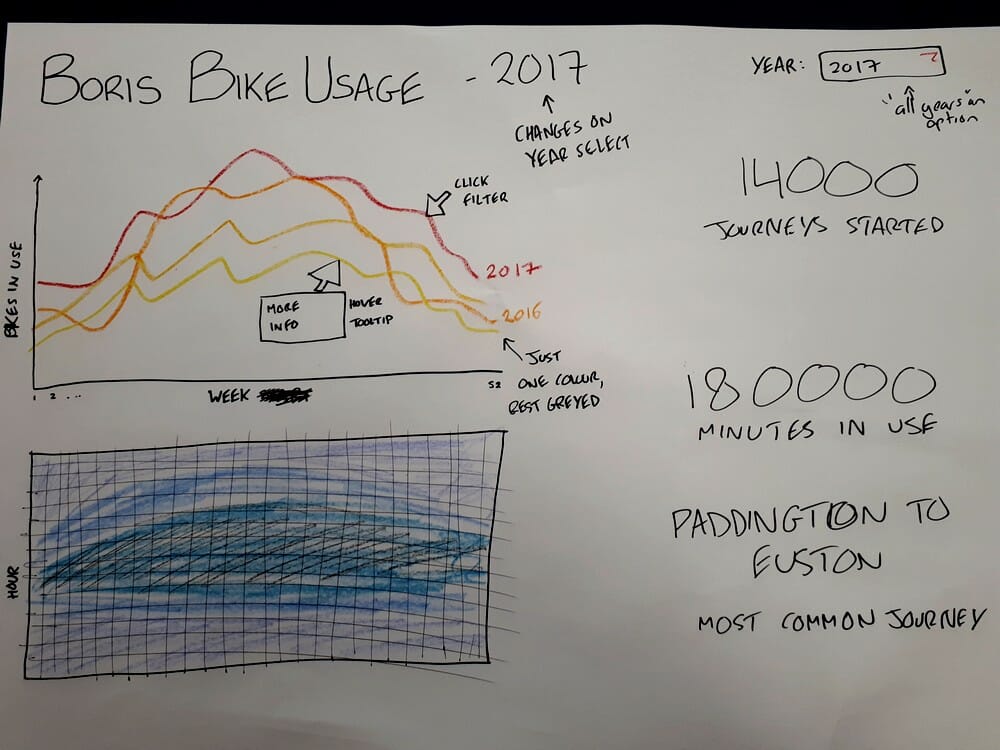
- design a dashboard on paper using the lessons and fundamentals taught during the week,
- create the dashboard.
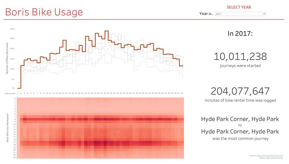
This was followed up by presenting both the paper design and the final product. It was a really valuable experience to try and plan a dashboard without playing directly with the data first, and you can see my initial design and final product below.