Let me first preface this series of posts by admitting I have learnt the majority of what I know and how I use Tableau containers from a video by Curtis Harris. I’m now here to share what I know which hopefully could come in handy for those of you without the time or option to watch a Youtube video.
This is intended to be part of a series which should cover at the very least the following topics:
- What are containers?
- Container tips & tricks.
- Why & how I only use floating containers for my dashboards.
What are containers?
Well, when building a Dashboard you should see these options in the bottom left when you have the Dashboard tab selected.
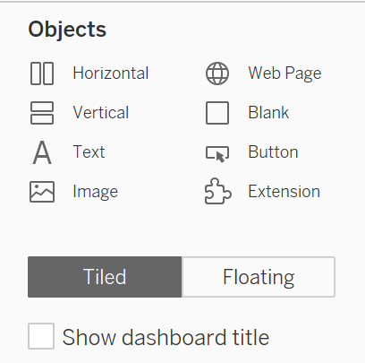
Throughout these posts, I’ll be referring to the Horizontal and Vertical objects as containers. This is because they can contain other objects.
What’s the difference between tiled containers and floating containers?
In short, when dragging a tiled container onto your dashboard Tableau will try to add and fit it into a grid layout that it automatically generates.

The generated layout can be viewed in the “item hierarchy” which can be found on the bottom left when you have the Layout tab selected.
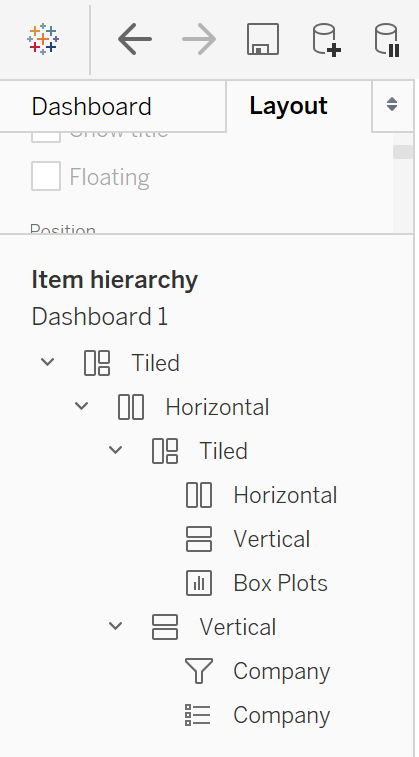
I’ll explain in a later post why I believe tiled containers are the devil’s work and why a Tiled container appearing on your object hierarchy needs to be dealt with swiftly and harshly.
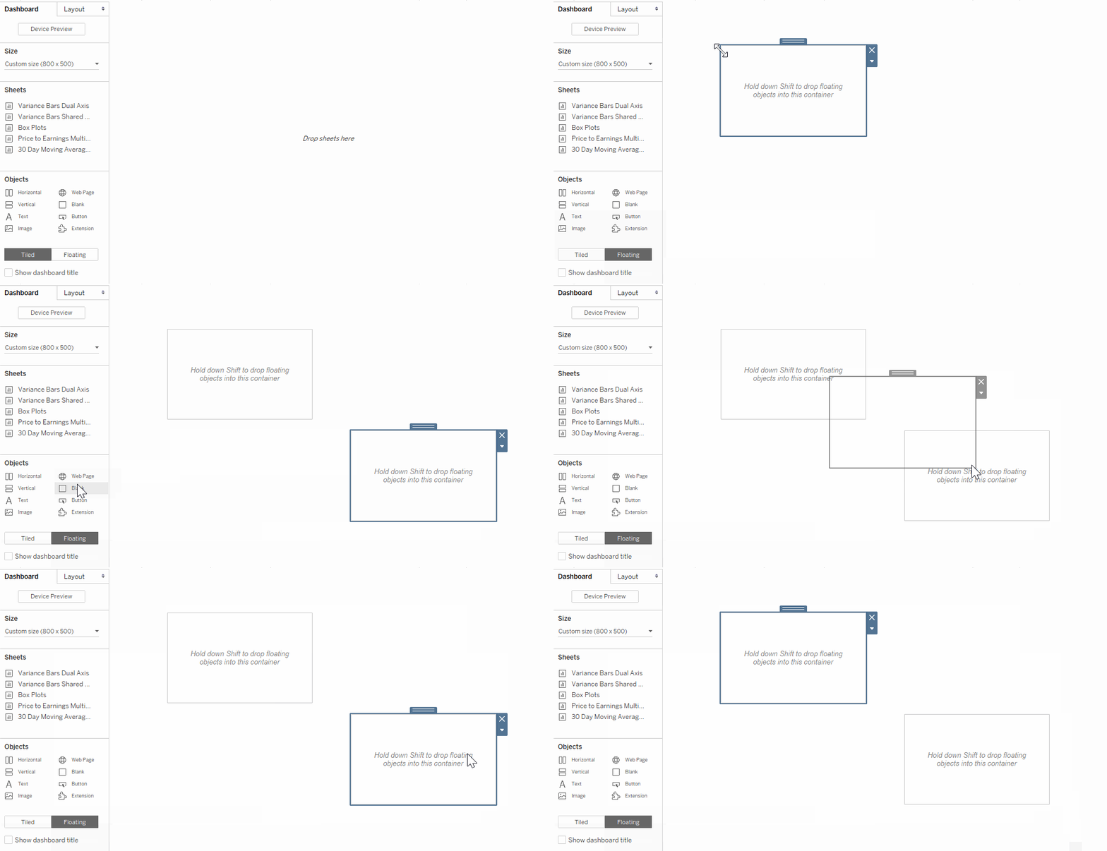
On the other hand, when you drag a floating container it will simply sit exactly wherever you drop it. You can drop floating containers over each other, over tiled containers, and even inside other floating containers – I’ll explain in a later post about why that last option is so incredibly useful for building and structuring dashboards
What’s the difference between Vertical Containers and Horizontal Containers?
Their names give a slight hint on this one. Vertical containers are really great at letting you position other objects above or below each other. On the other hand, horizontal containers excel at letting you position other objects to the left or right of each other.
It’s important to note that you can actually place objects horizontally in a vertical container, and vertically in a horizontal. However, this can cause some real issues down the line in terms of managing your dashboard layout and object hierarchy, so take care to ensure you use them correctly.
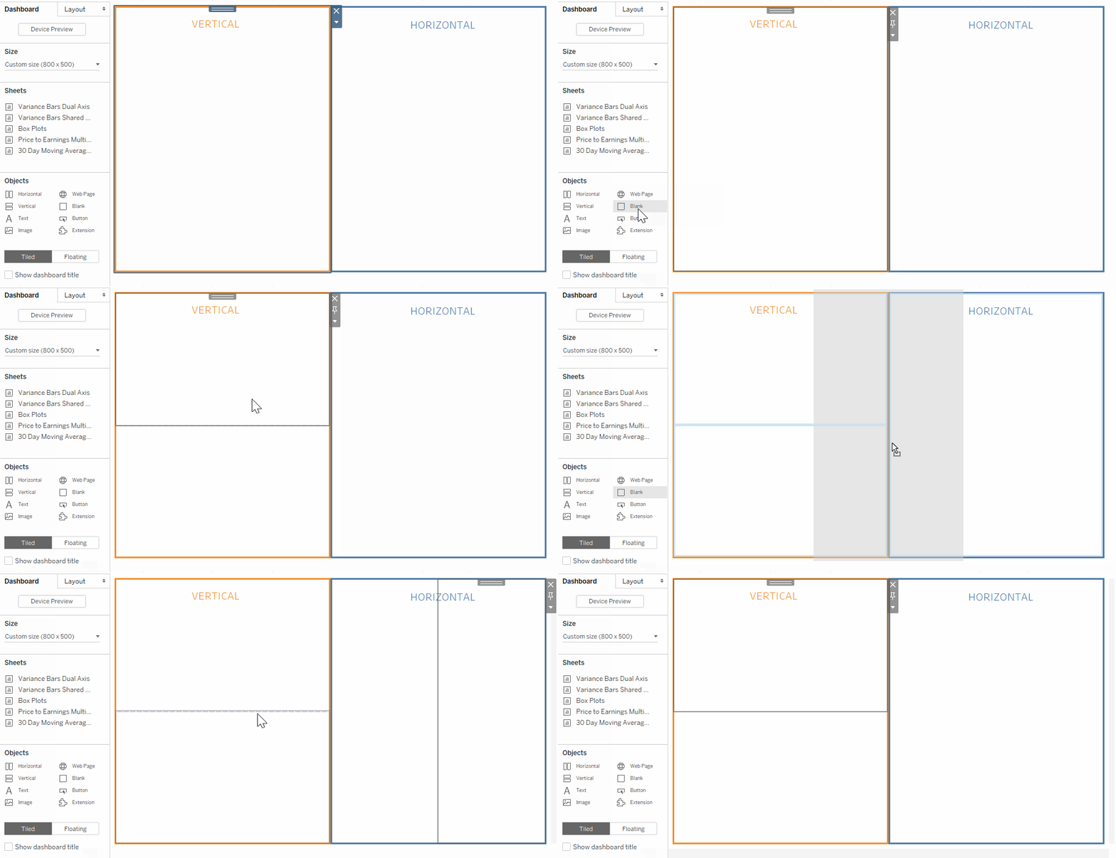
To demonstrate how these containers work, you can see below how two blank containers sit neatly on top of each other in the vertical container, and neatly next to each other in the horizontal container.
Why use containers?
The real brilliance of these containers comes from the fact that they can be placed inside each other. By thinking about how you’d like your dashboard to be laid out, you can quickly plan how all your sheets will fit together in terms of vertical and horizontal containers! This is incredibly useful in avoiding those frustrating moments where you decide you want to fit an extra object in and suddenly all your sheets shoot all over the place. It’s also just an all-round great practice at improving how quickly you can both design and implement your dashboards. Consider the quick doodle plan I made for my dashboard below.
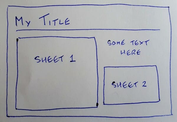
This can be quickly imagined in terms of horizontal and vertical containers!
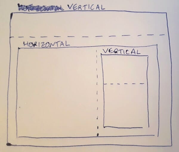
So I can see I want a vertical container to place my title above my content. Then inside that I want a horizontal container to place Sheet 1 next to my other text and Sheet 2. Finally, I want another vertical container inside the horizontal one to place my other text on top of Sheet 2! From here I can hop onto Tableau and drag and drop those containers into each other to recreate my plan. If I use Blank containers instead of actual sheets you can see how quickly it can be built belo

You can see the final layout as an image below.
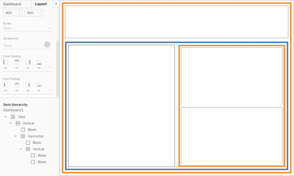
Above I’ve given my vertical containers a thick orange border, my horizontal containers a thick blue border, and my blank containers a dotted black border. You can also see how this is represented in the item hierarchy. By using a container based layout like this structuring, resizing, and modifying your dashboards becomes a lot easier. Specifics on just exactly how much easier and why it’s so much easier will be covered in future parts.
