


Finished graph:
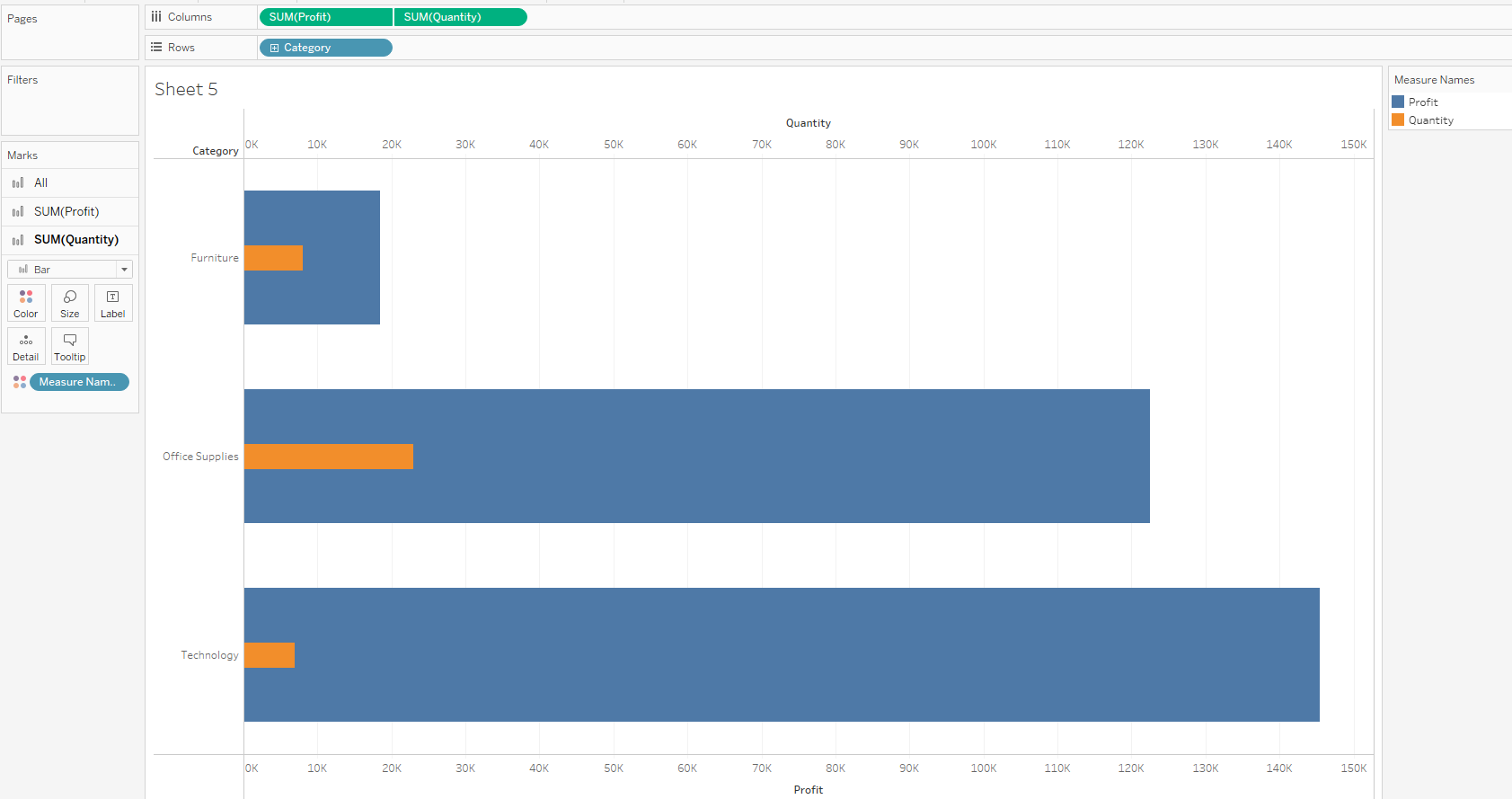
Duel Axis graphs are a great way of comparing two different measures, for example, below we can see the 'SUM(Profit)' compared to the 'SUM(Quantity)':
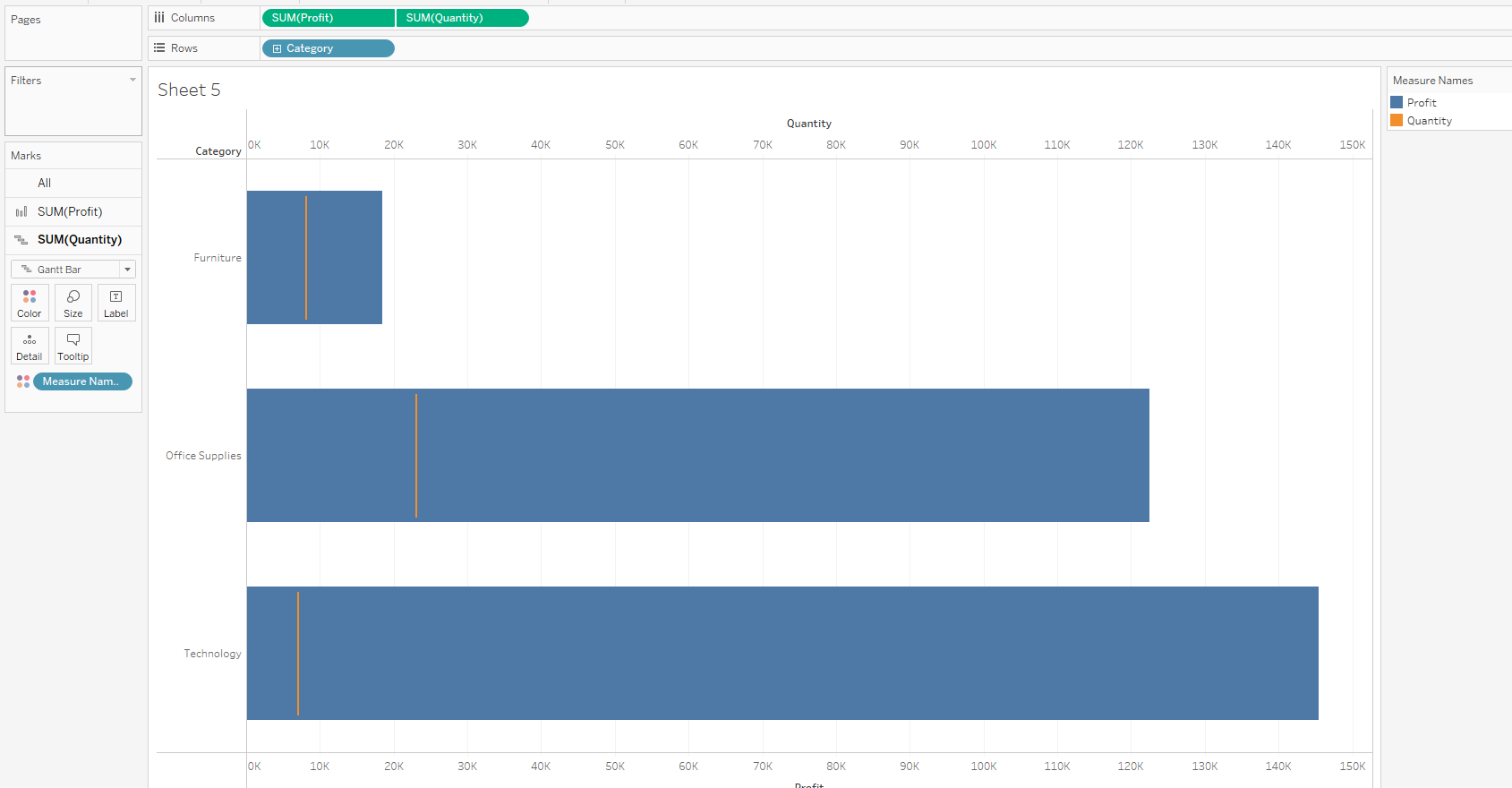
We also have the ability to change the mark type for the measures, for example updating the 'SUM(Quantity)' to be a Gantt Bar:
However, with a Duel Axis chart we can only compare two measures. So what would we need to do if we wanted to include 'SUM(Discount)' as well? For this we would need to create a Shared Axis graph.
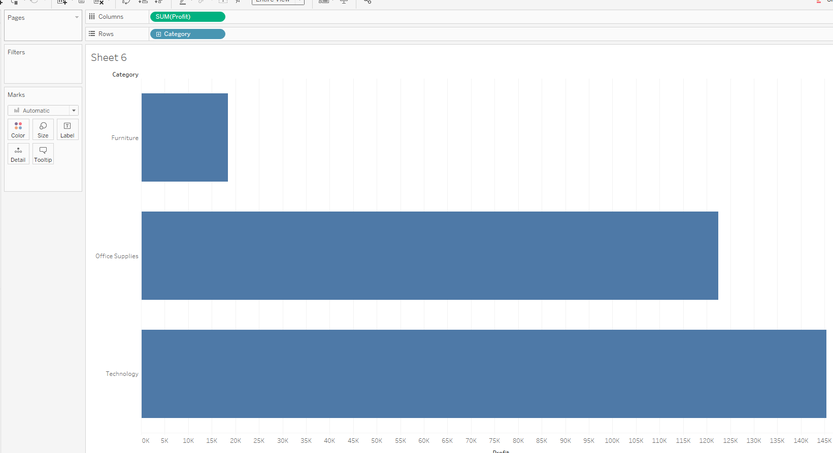
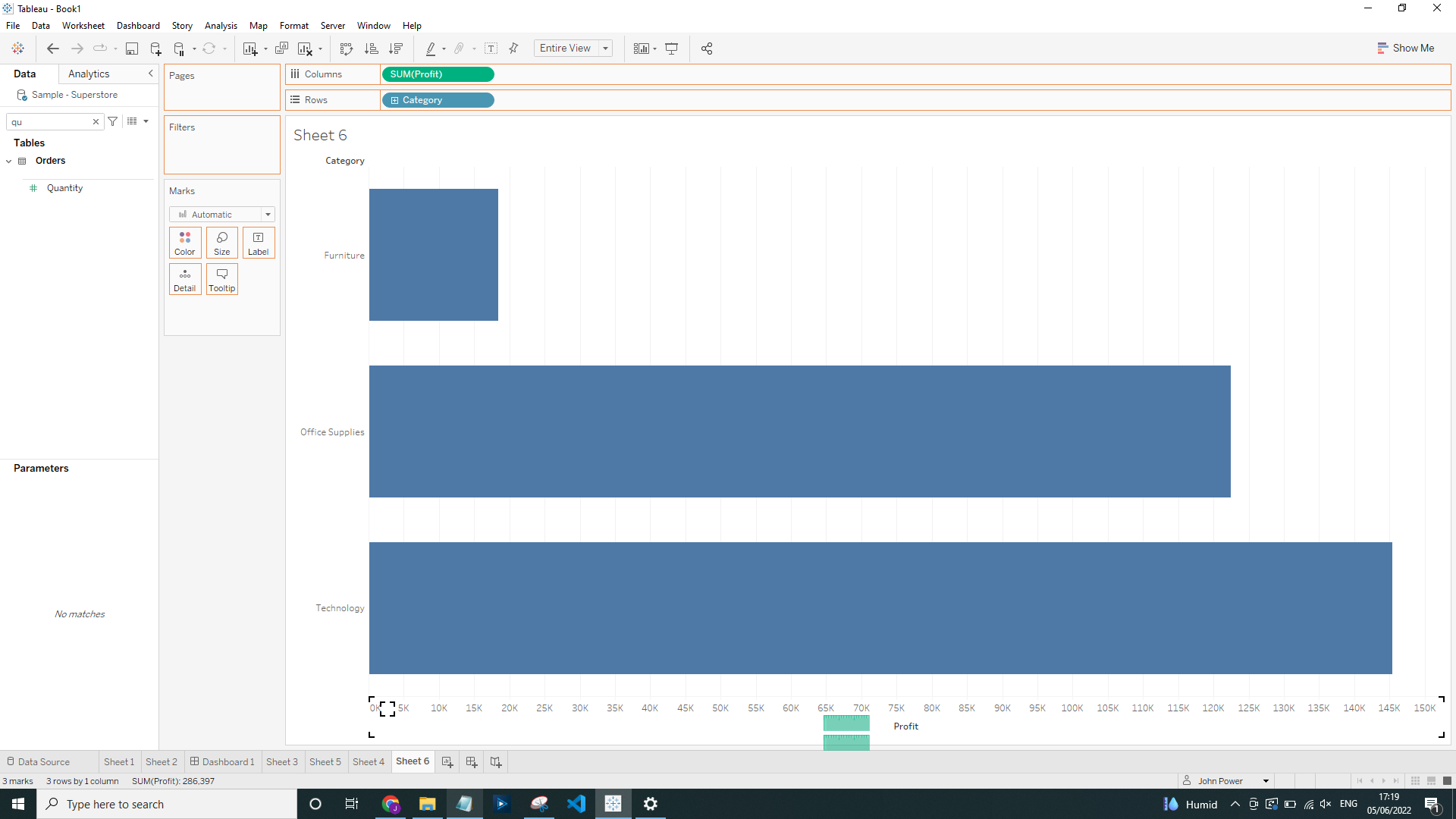
Firstly drag the 'SUM(Profit)' onto the Columns and 'Category' onto Rows:
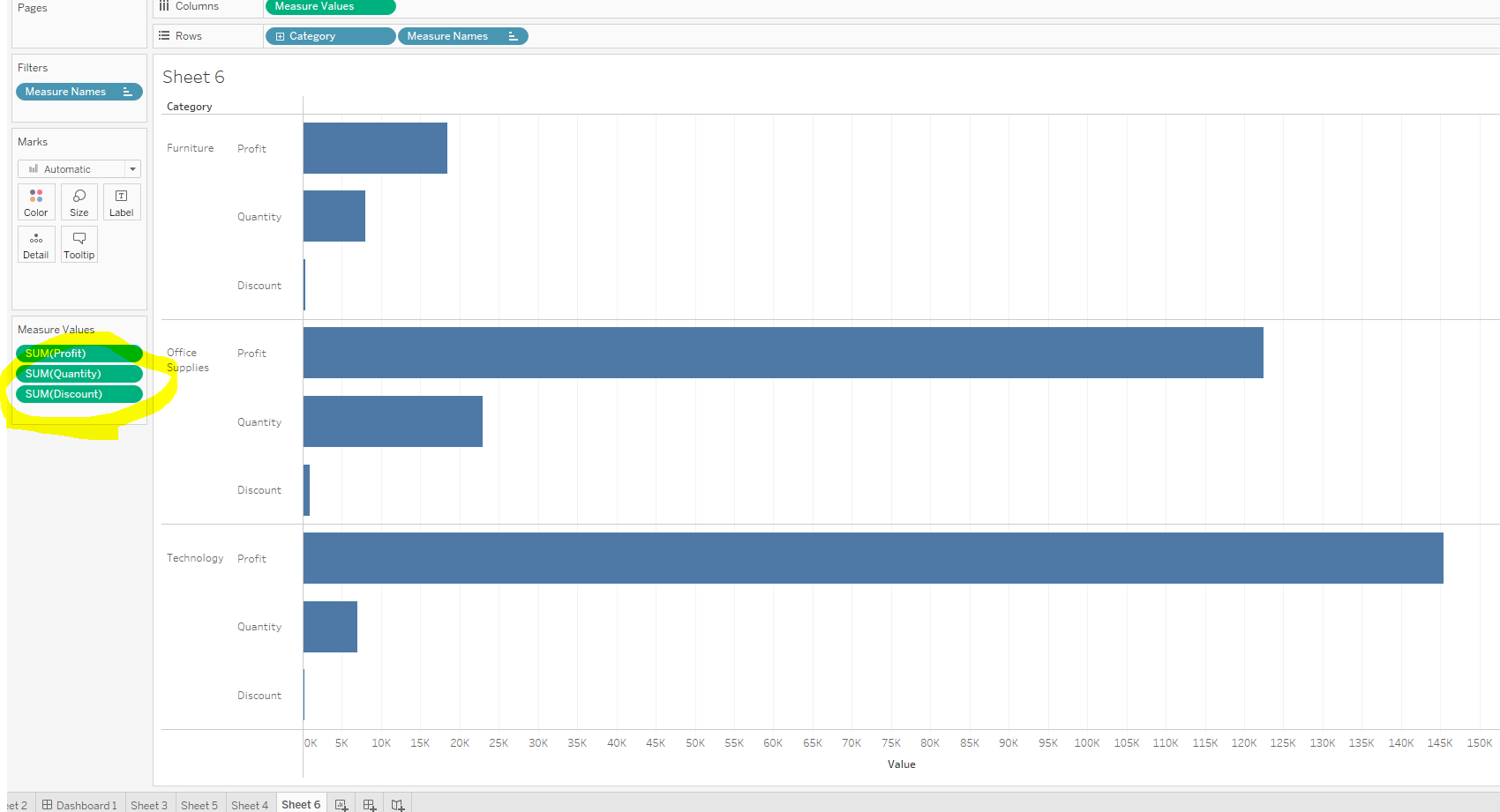
Now we need to drag 'SUM(Quantity)' onto the X Axis:
This will then create the Measure Values box, we can drag 'SUM(Discount)' into this box as well:
Move the Ctrl + Right Click to drag the Measure Names onto the color card and size:
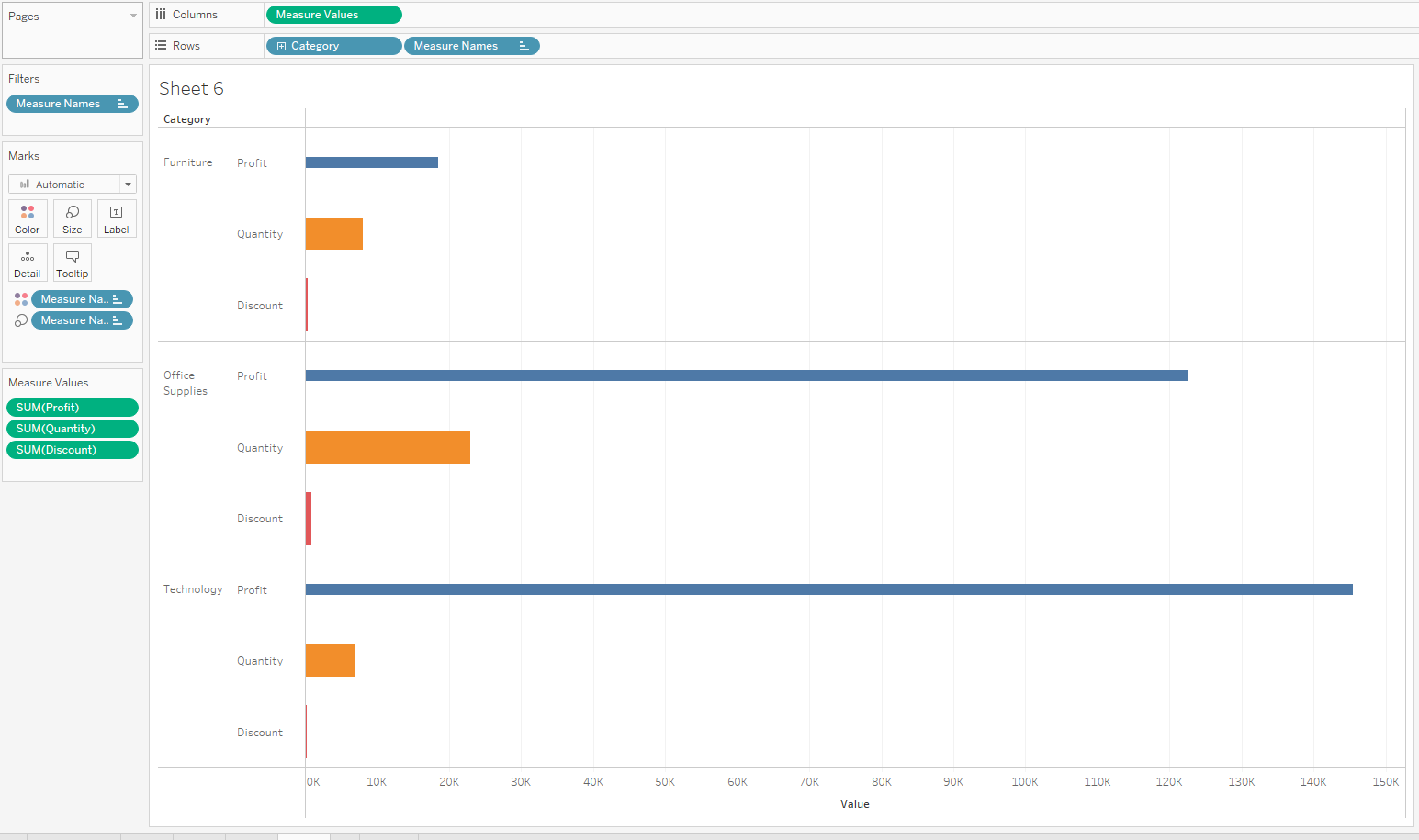
Remove the Measure Names from the Rows:
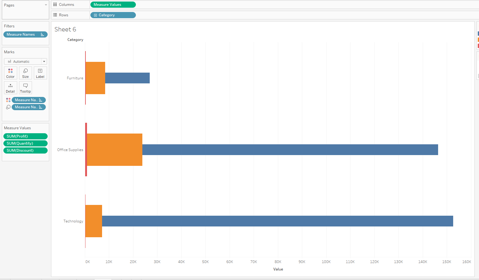
Now, under Analysis, Stack Marks, switch from On to Off:
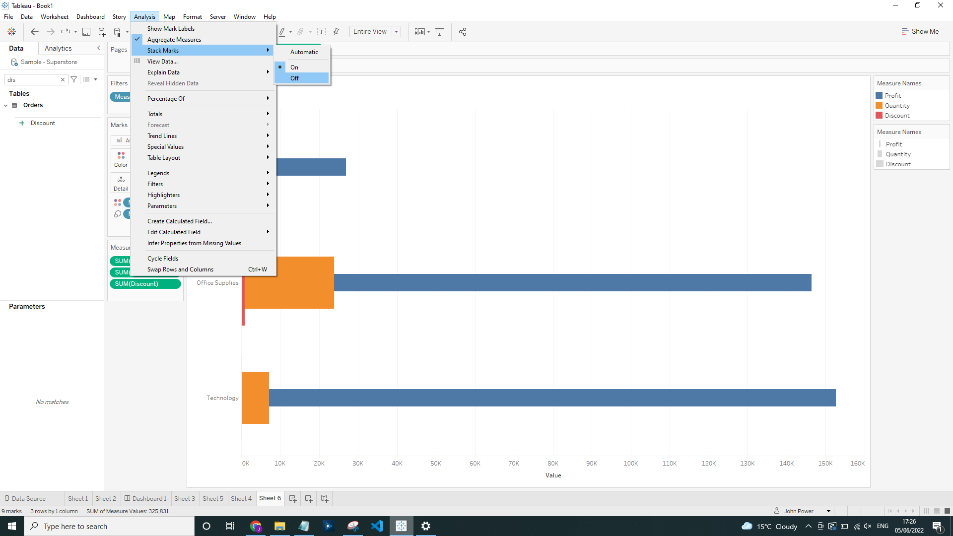
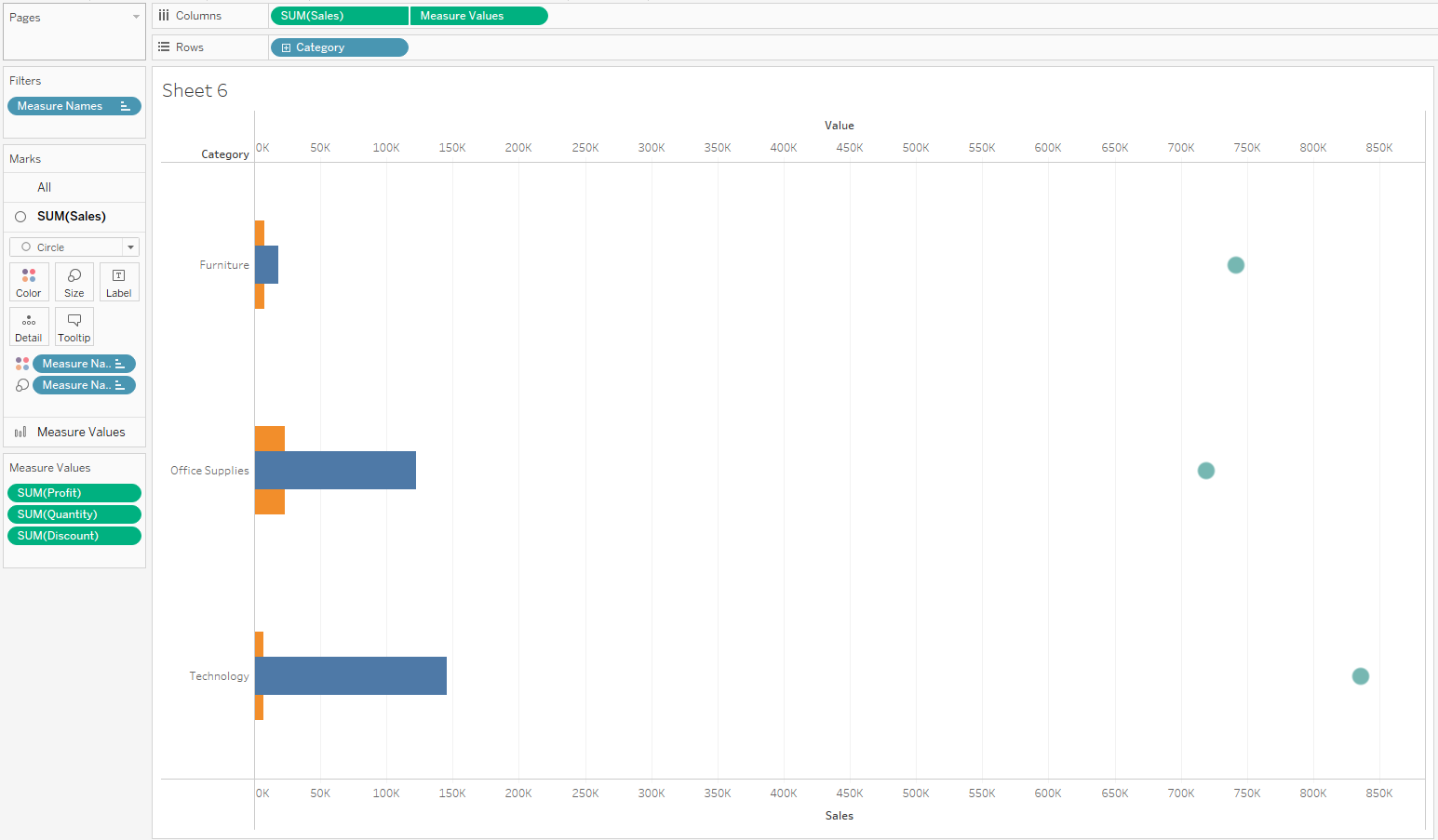
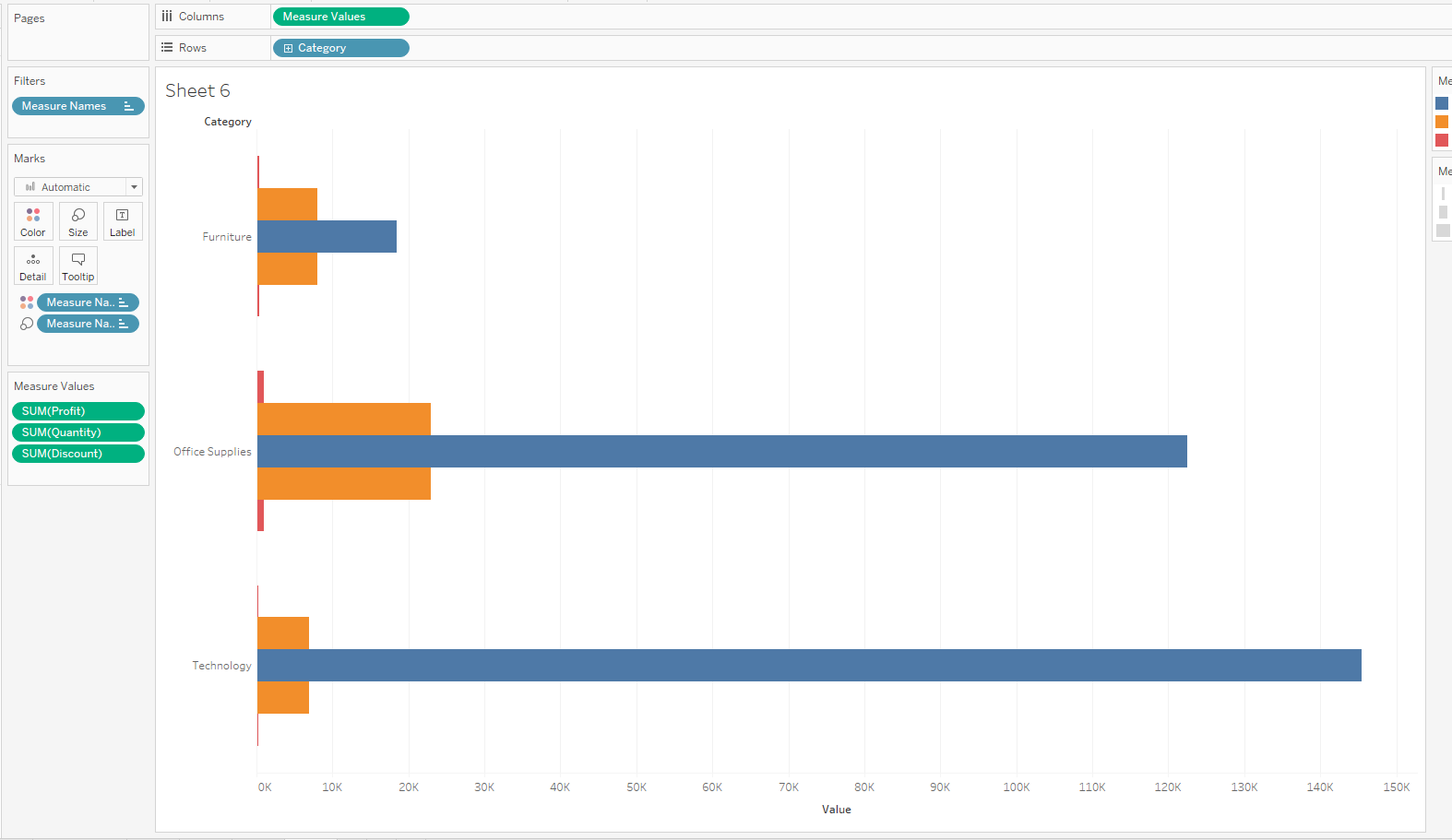
Now we can clearly compare the 'SUM(Profit)', 'SUM(Quantity)' and 'SUM(Discount)':
From here we can create a Duel Axis chart using another measure and then update the mark type:
