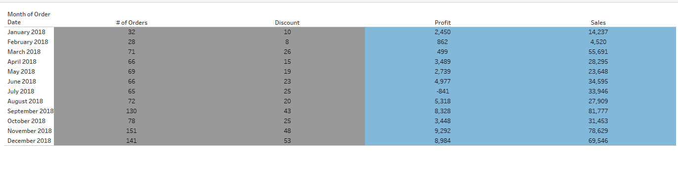
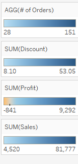
For this example we will be using the Superstore dataset. Here we have a simple table showing the '# of Orders', 'Discount', 'Profit', and 'Sales' for each month of 2018:
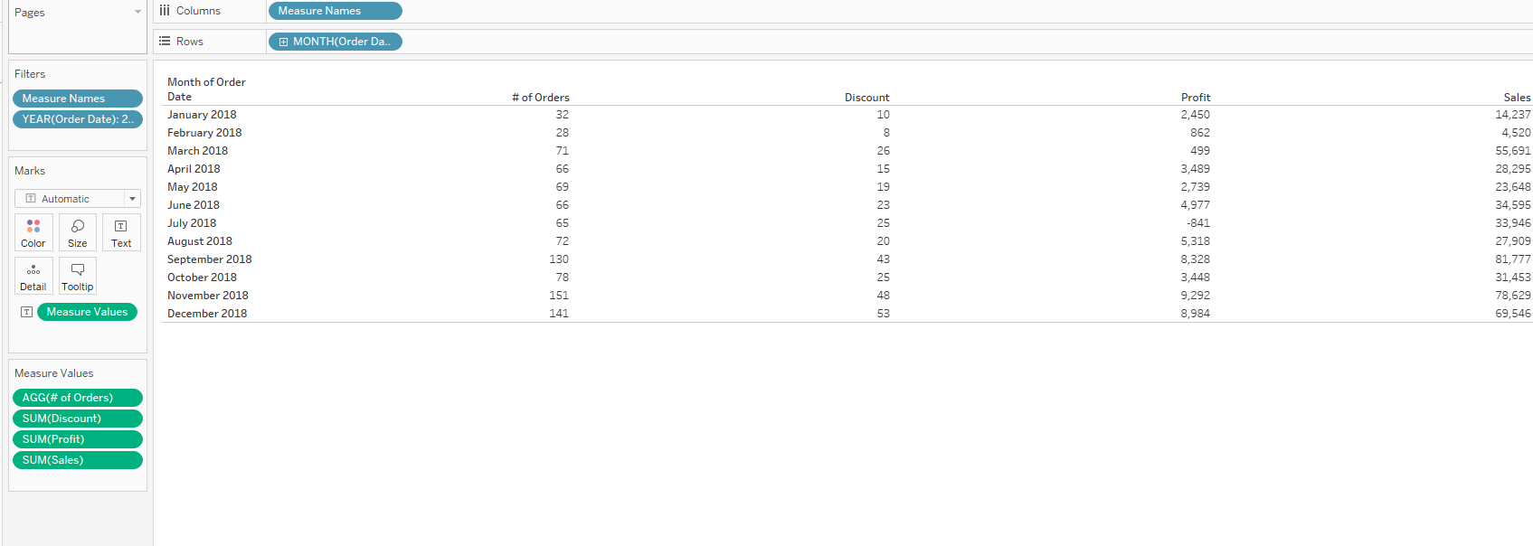
We want the columns of '# of Orders' and 'Discount' to be colored grey, but 'Profit', and 'Sales' to be colored blue. For this, The first thing we need to do is drag our Measured Values to color:
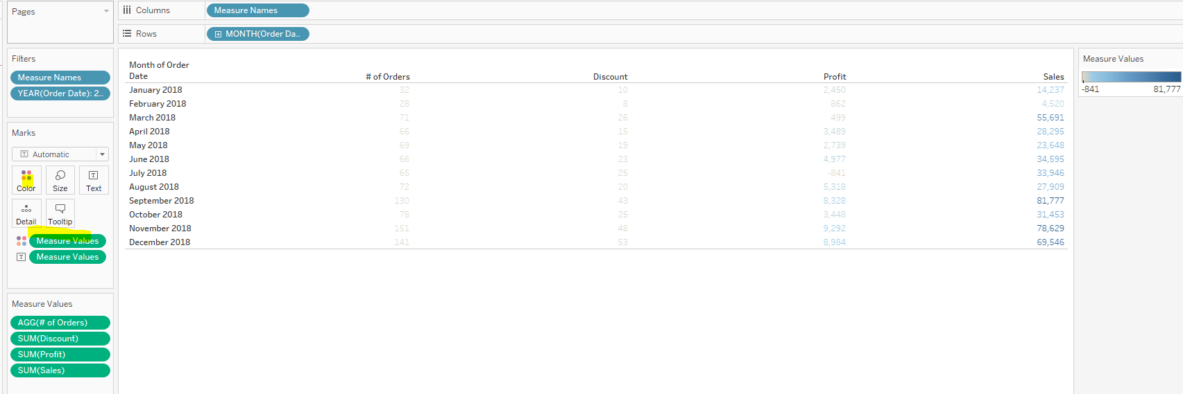
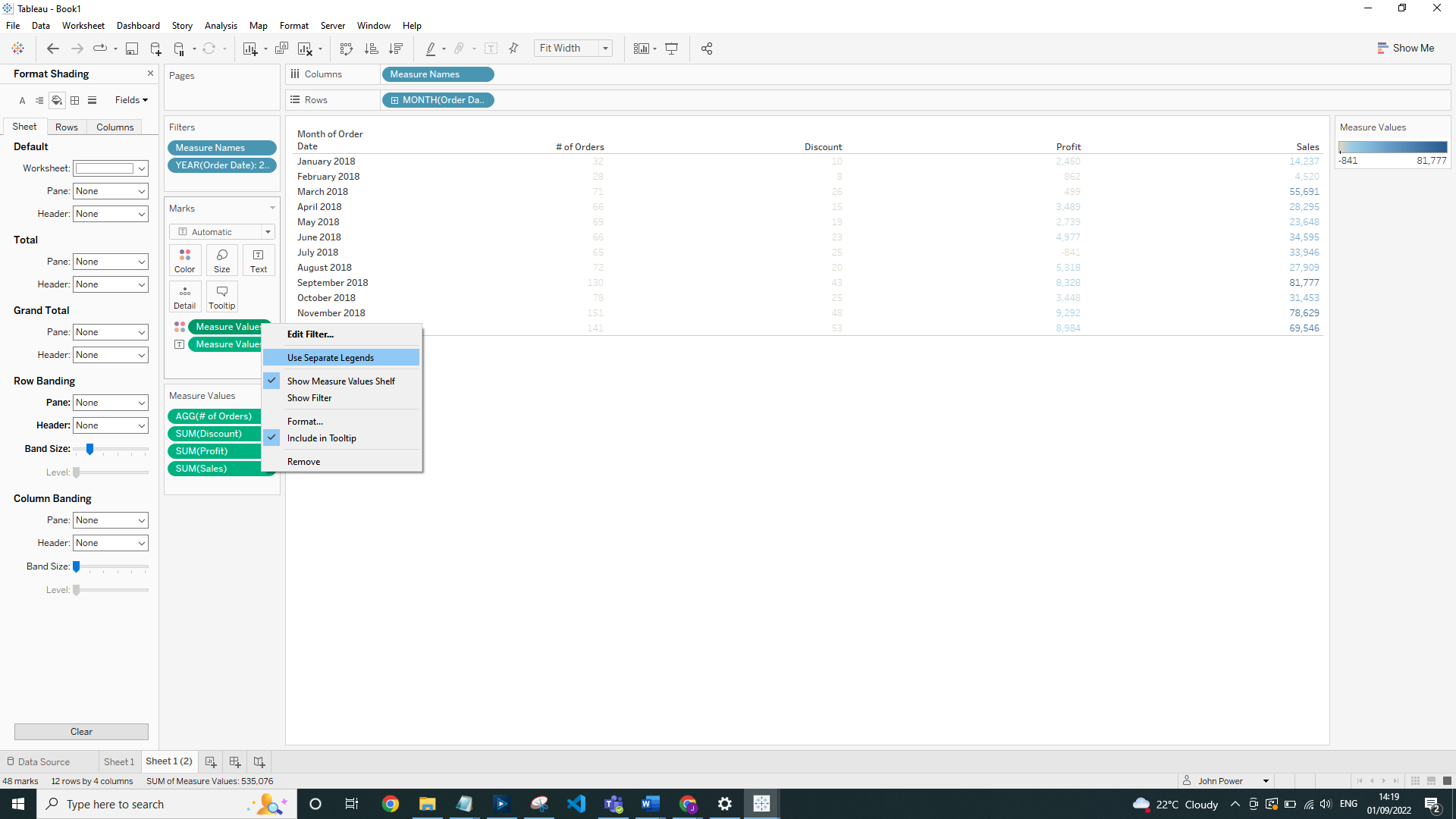
Then you need to click on Measure Values and select 'use separate legends':
This will allow you to change the colors of the individual Measure Values:
Update the Marks type to be Square:

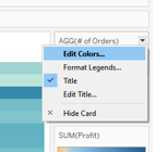
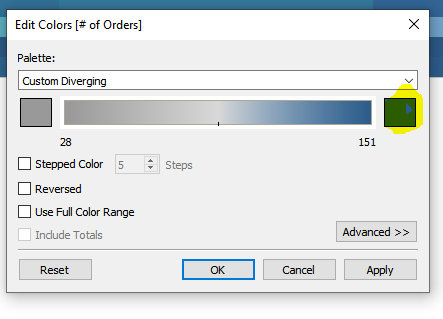
You then need to click on the '# of Orders' color legend and select 'Edit Colors':
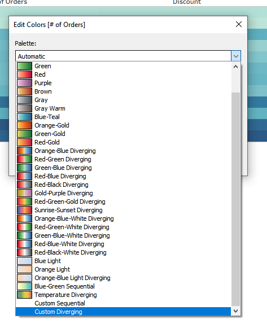
Then on the dropdown you will need to select 'Custom Diverging':
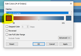
Click on left hand color to update it:
Update to be grey and then select 'OK':
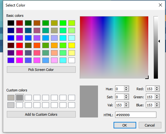
Do the same for the right hand color (make sure it is the same shade of grey):
Click 'Stepped Color' and change the count of Steps to be 2:
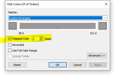
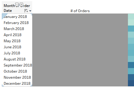
This will then update our '# of Orders' column to he the same shade of grey, rather than varying depending on the actual number of Orders:
Do the same for each of the measured values ('Profit' and 'Sales' will need to be colored blue in this example). Then add the 'Measure Values' onto the Label marks card se we can see the numbers again: