


When I think of The Economist, several things come to mind. In my previous job in PR consulting, our agency had The Economist as a client, so I had numerous touchpoints with the publication even before my time at the Data School. Although my role back then involved preparing press releases, newsletters, and special contributions for the DACH region, one aspect has always stayed with me: the incredibly good data visualizations.
When it comes to visual storytelling, there are hardly any media outlets or institutions that do it better than The Economist. Their charts and graphs can certainly be considered a masterclass in precision, clarity, and impact. Whether visualizing economic trends, highlighting global inequalities, or unpacking geopolitical challenges, The Economist consistently manages to make complex topics and ideas understandable to the reader.
But what sets The Economist apart from other media? What aspects do they implement so effectively that their message is clearly understood by a global audience? In this blog post, I would like to show you five techniques that make The Economist’s visualizations so effective. Let’s dive in!
1. Clarity and Simplicity
Instead of overloading visuals with excessive details, The Economist strips away unnecessary elements, creating clean and simple layouts. This minimalist approach directs the viewer’s attention to what truly matters, allowing them to easily understand the key message without getting confused.
Additionally, every chart is designed to tell a story. Titles and annotations often function as headlines and highlight the central insight of the data. These brief, clear messages guide the audience, ensuring they interpret the visualization as intended.
2. Strategic Use of Visual Hierarchy
A defining feature of The Economist’s charts is their deliberate use of visual hierarchy, ensuring that the most important insights stand out immediately. For this the Economist highlights key trends, comparisons, or data points by using bold colors, thicker linkes or annotations. These visual cues naturally draw the viewer's eye to the most critical aspects of the chart.
By carefully leveraging color, size, and positioning, The Economist ensures that the most important information captures the viewer’s attention first, while secondary details provide additional context without overwhelming the audience. This thoughtful balance makes their visuals not only easy to read but also deeply engaging.
3. Creative and Innovative visualization
The Economist stands out for its willingness to go beyond conventional visual formats, using creativity to enhance storytelling and ensure the data is presented in the most effective way possible.
While they often rely on classic chart types as bar charts and line graphs, the Economist is is not afraid to experiment with innovative and unique visual arrangements that fits with the specific narrative or dataset, making their graphs memorable and engaging. This blend of creativity and functionality allows The Economist to consistently craft visuals that are as innovative as they are impactful, turning data into compelling stories.
4. Consistency and Familiarity
A key factor in the effectiveness of The Economist’s visuals is their commitment to a consistent and recognizable style. This approach not only reinforces their brand identity but also builds trust and makes their graphics more intuitive to interpret. Every chart make use of a cohesive aesthetic that reflects their simplicity, brand and professionalism. Their consistent use of fonts, chart types and layouts makes it easy fot the reader to immediately identify a graphic as an Economist visual.
They also use neutral and muted tones, which create a clean and comfortable to look at look. Bold colors are used strategically to draw attention to the most critical data points or trends. By maintaining consistency in design and presentation, The Economist makes it easier for readers to focus on the content of the charts, building a seamless and trustworthy visual experience.
5. Trendy and Social Media-friendly formats
In an era dominated by social media, The Economist has mastered the art of adapting its visuals to meet the needs of modern audiences. Unlike many traditional media outlets that struggle to leverage social platforms effectively, The Economist excels at optimizing its charts and graphs for these formats, ensuring their insights reach and resonate with a wider audience.
Many media organizations overlook the potential of social platforms, leaving out a significant group of potential readers. In contrast, The Economist actively uses platforms like Twitter, Instagram, and LinkedIn to share their visuals, tailoring content to the medium while retaining their signature style. The Economist’s graphics are designed with mobile users in mind, using elements that are easily to understand at a glance. This makes their chart highly shareable and engaging for users who consume content on the go.

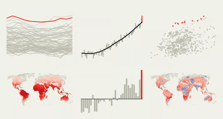
On this page, you have a great overview of the published visualizations from The Economist