As the title suggests, this blog post focuses on the so-called Makeover Mondays, which are designed as weekly tasks for Data Schoolers. These tasks can be seen as a kind of personal challenge where Data Schoolers can test their skills and let their creativity run free.
At its core, it’s about selecting a publicly available dataset and telling an alternative story based on it.
The Rules
If you’re wondering what this is all about, let me briefly explain the rules:
- On the website https://makeovermonday.co.uk/, you’ll find a list of different topics. These topics are typically based on online articles that have already been published, using charts to convey their stories or support their arguments. Here, you’ll find an interesting selection of topics guaranteed to suit every taste. Alongside links to the original articles, you’ll also find a link where you can download the dataset.
- Once you’ve chosen a topic and downloaded the dataset, think about how you can craft an alternative story from it. There are no restrictions here, as long as your ideas are grounded in the data.
- Consider which type of visualization best demonstrates your idea. The website https://datavizcatalogue.com/ offers a catalog of possibilities and ideas that can help you find the right chart or graph. Once you’ve found the right medium, try your hand at creating a dashboard and see how far you can get within the time limit.
- Speaking of time limits, Makeover Monday gives you only 2 hours per week. So plan your process early and focus on keeping yourself on track at the right moments! Best of luck and, most importantly, have fun!
My First Makeover Monday
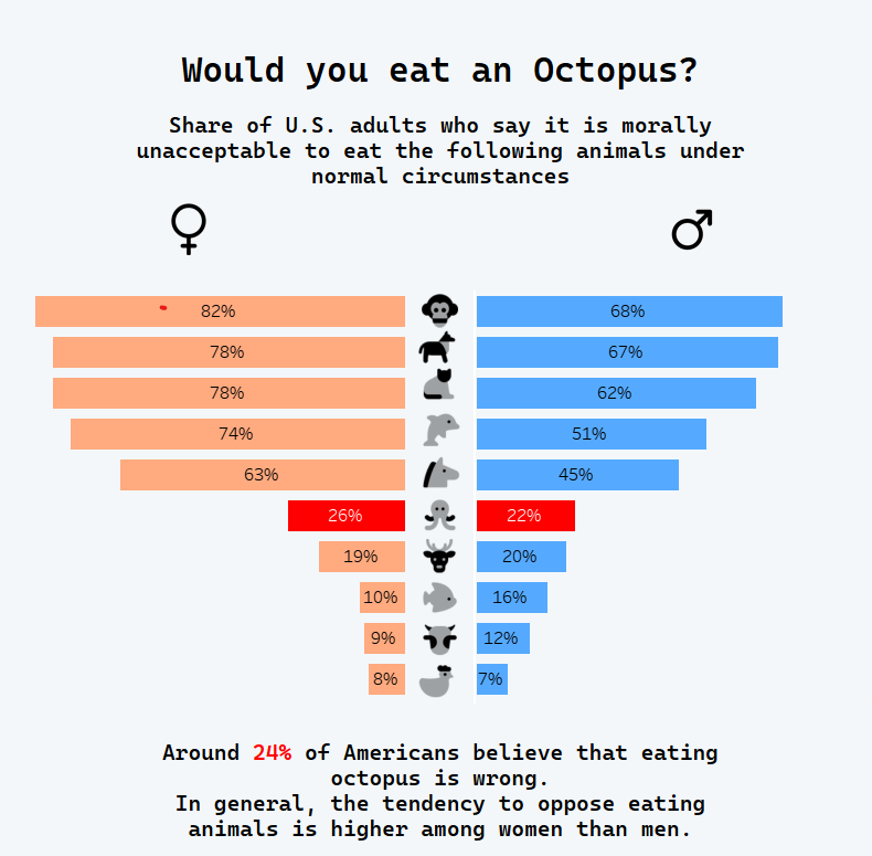
Now that you know the rules, let me show you how my first Makeover Monday turned out. For my dataset, I chose an article that caught my attention because of its humorous title: “One in Four Americans Say It's Wrong To Eat an Octopus.” As an octopus lover, this immediately got me, so I downloaded the dataset and discovered that it included gender-related information.
I decided to use a butterfly chart for the visualization and created an image bar using Canva, replacing the names with animal illustrations. While I kept the original title, I aimed to make the existing chart more appealing by adding the gender dimension and enhancing the visuals.