


This week, Peter assigned us a special task. We are to choose a previously created Makeover Monday dataset from the past and give it another makeover. In this blog, you'll learn how I approached this task and what ideas I came up with for my new dashboard.
The Old Makeover Monday
While searching for an interesting topic, I came across the following on https://makeovermonday.co.uk: The World's Most Innovative Companies. This topic appealed to me because Forbes had only created a list of the most innovative companies without any visual creativity – something I wanted to change.
The criteria provided were the 12-Month Sales Growth and the Innovation Premium, with the Innovation Premium being used as the ranking criterion. Additionally, the dataset included the companies' names and their countries of origin.
During the analysis, I noticed early on that the USA dominated the dataset by a large margin. I wanted to visualize this imbalance. I decided to use a scatterplot to display both the Innovation Premium and the 12-Month Sales Growth in relation to each other, allowing for a comparison of the companies.
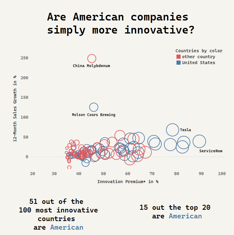
I also differentiated the USA and other countries by color to allow for a quick comparison. Unfortunately, I made a mistake with the size of the bubbles, as I used the ranking as the determining factor. This meant that the higher the rank, the larger the bubble. In hindsight, I realize this was not a good idea, and I was able to learn from this experience.
The New Makeover Monday
For my new approach, it was important to me that this Makeover Monday would fundamentally differ from my old dashboard. However, the dataset contained only a limited number of data fields and information, which made me feel somewhat constrained.
To bring in a fresh wave of inspiration, I explored Andy Kriebel's Visual Vocabulary for ideas on how to present a ranking in an interesting way. I decided on a Dot Strip Plot, which turned out to be well-suited for showing the distribution of variables by country. To better distinguish the countries, I grouped them by continents and assigned the countries accordingly.
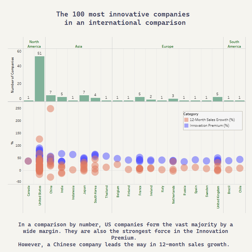
To make it clear how the number of companies is distributed across countries and continents, I created a bar chart aligned with the axes of the Dot Strip Plot. This allows the viewer to quickly see how countries and companies are evaluated based on the given criteria.