


The highlight function is a great tool for clarifying target groups that are often difficult to narrow down in large datasets. It enables interactive and engaging data analysis in reports by highlighting specific data points or categories, making patterns, trends, or anomalies easier to identify. Highlights combined with appropriate slicers are especially intuitive and allow even less technically experienced users to analyze data without requiring significant technical knowledge.
Creating highlights is not particularly difficult, especially with bar charts, which are an excellent starting point for beginners.
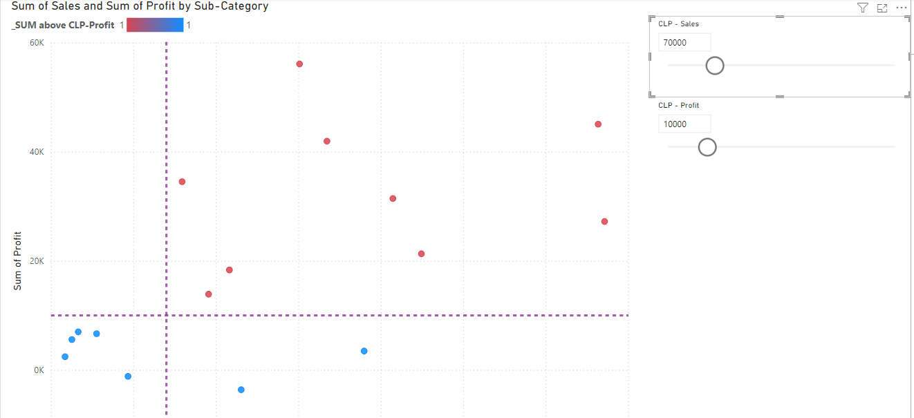
But how do you create a scatterplot with two filters that define a clear space, resulting in an outcome like this:
1. Create two Parameter with a Numeric Range
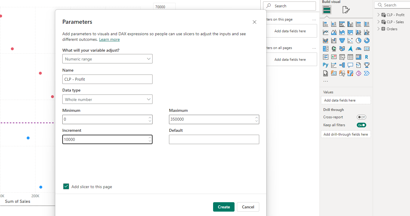
First, we need to create a parameter with a “Numeric Range.” In the desktop view, go to the Modeling pane and click on New Parameter, which then allows you to open a “Numeric Range” or “Fields.”
For our case, we use the “Numeric Range,” and a window opens where you can name the parameter, select a variable, and define the range. Repeat this process for the next axis. I named my parameters CLP - Profit and CLP - Sales, but you are free to choose your own names.
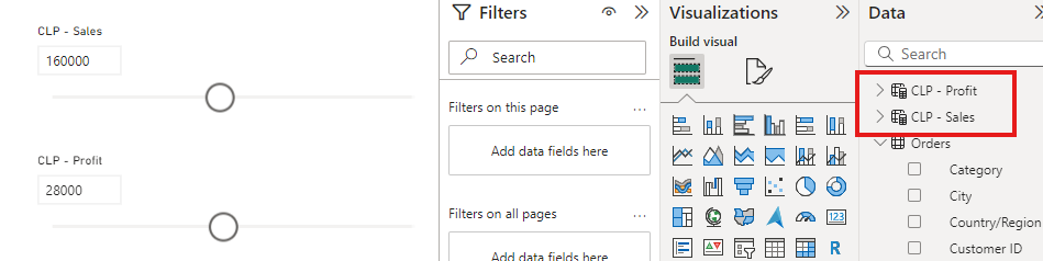
If you successfully created two parameters, you should see two sliders in your workspace and two new tables in your data view:
2. Create a New Measure
Next, return to the Modeling tab and click on New Measure. A text field will appear. Here, you’ll write a formula that relates both parameters and creates a condition.
In my case, the formula looks like this:
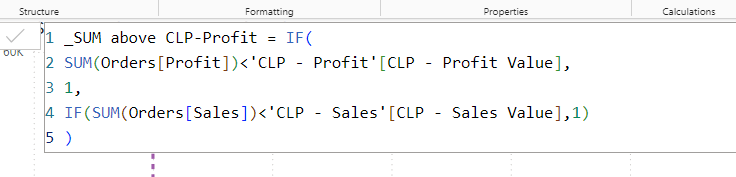
Feel free to use the formula as-is, but ensure that you adapt the parameters in the formula to match your setup. Also, give the measure a name that aligns with your intention.
3. Insert the Parameter and Measure into the Scatterplot
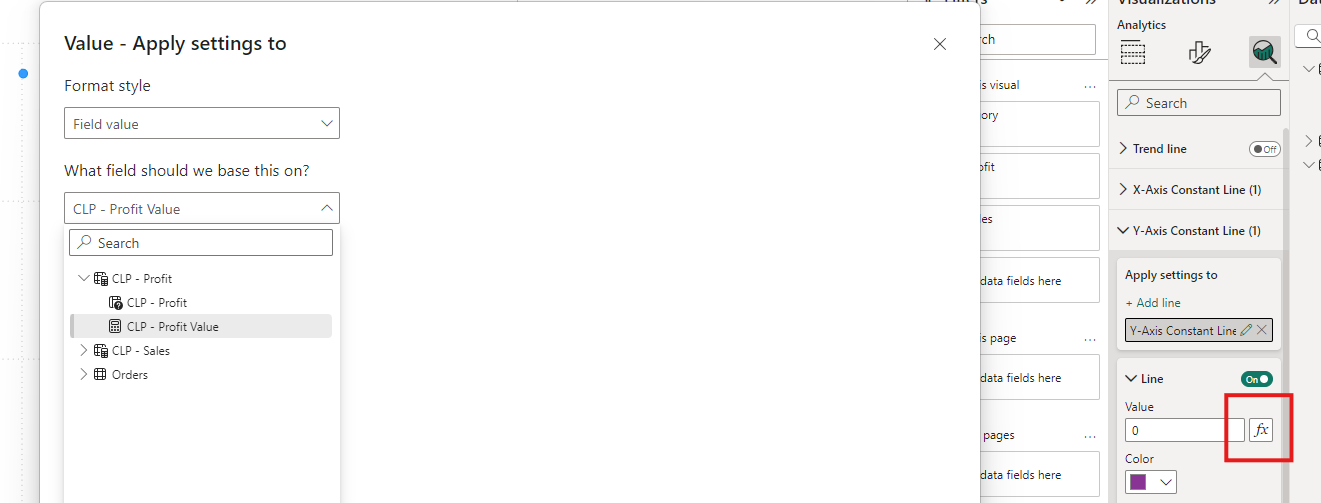
If your measure is correct, you should see a new measure in your data pane. Now, go to your scatterplot and open the Visualization pane. Here, you can define your axes. In my case, I clicked on the Y-axis and used the Conditional Formatting feature (short fx).
In this field, you can select a data field. Use the parameter you created earlier, but make sure to select the value file.
To apply the measure, go to the Visualization pane, then Format visual, and open Markers. Similar to the previous step, click on the Conditional Formatting feature in the color field and insert the measure.
Define the colors and click OK.
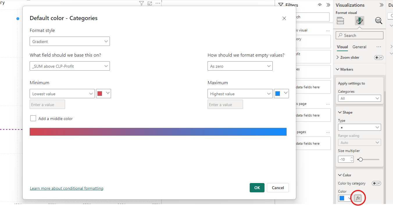
If everything worked, you should see gradient lines in your scatterplot that allow you to highlight a specific area with color!