


Level of detail expressions (LODs) are a scary concept, but for me it makes sense with a use case.
For a fantastic explanation on LODs, that really define exactly what they are and what they do, check this blog out.
Here’s a classic example of how to use one to effectively draw some great insights from a dataset.
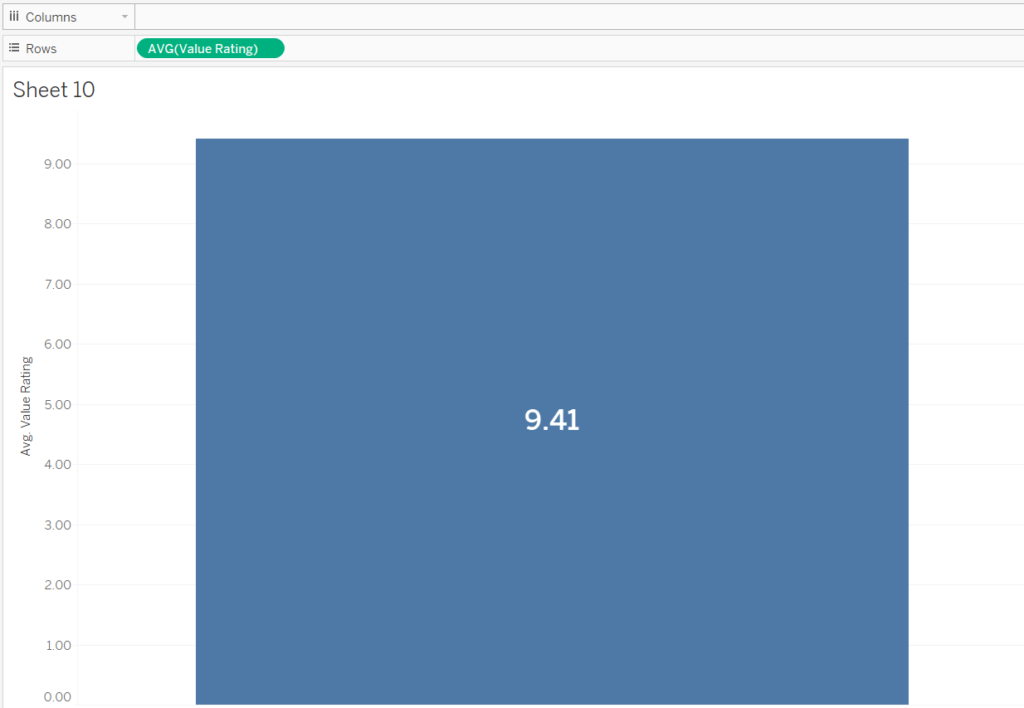
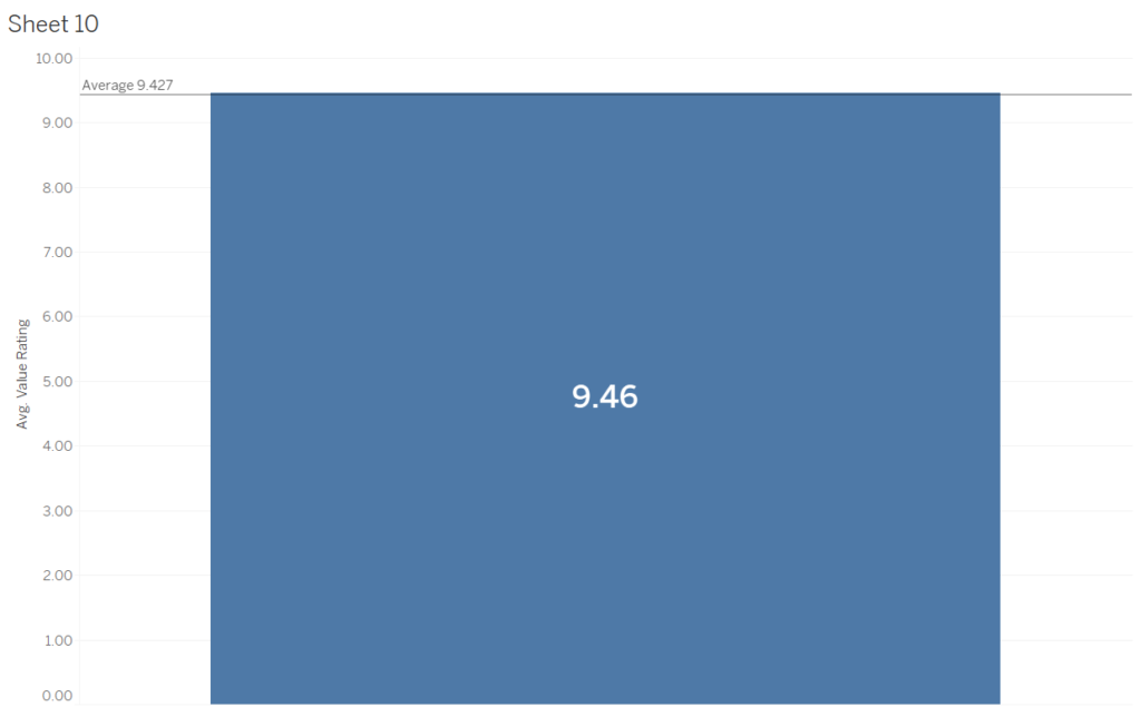
Basically, here I am filtering by a neighbourhood in Germany to give an average overall rating of AirBnBs in that neighbourhood. The ‘average line’ shows the average of all the AirBnBs in Berlin. If above, the bar turns blue, if below, it turns red.
This is something that can be taken and adapted for all sorts of charts and general analysis. In the end I’ll show you the completed dashboard I came up with for a Makeover Monday, that takes this LOD concept and provides a powerful way to draw insights from a dataset.
So how do you do this?
This is created using the dataset from Makeover Monday week 25, 2019. Go ahead and follow along if you want!
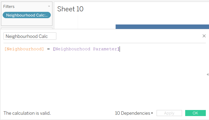
- Make yourself a parameter, in my case using the neighbourhood field, which allows the user to choose a neighbourhood. Creating a calculated field as below and putting it on the filter shelf will allow the user to filter the data themselves. Then throw your measure (I’ve used ‘Value Rating’, with an average aggregation) into the rows shelf. I’ve also moved my measure into the labels shelf, aligned it vertically and made the font bold.
- So, the next step is to put a reference line onto the view.
The problem we have here is that the entire view is filtered by the neighbourhood dimension. Tableau is bringing back the average of just the neighbourhood that the parameter filters by. This is where we need an LOD expression, that breaks from the level of detail the view has defined and goes back to using the entire dataset.
To do this, we create a calculated field:
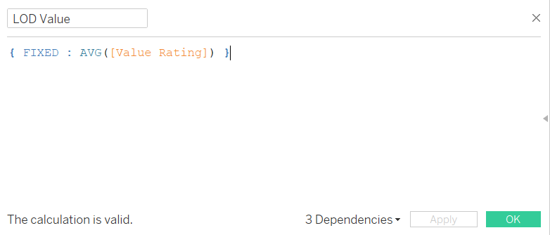
All this is saying is for every row of data in the dataset, ignoring any filters, return the average value rating.
- Now we want to drag our new calculated field into the ‘details’ part of the Marks card, this allows us to reference the calculated field in the reference line section.
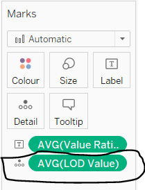
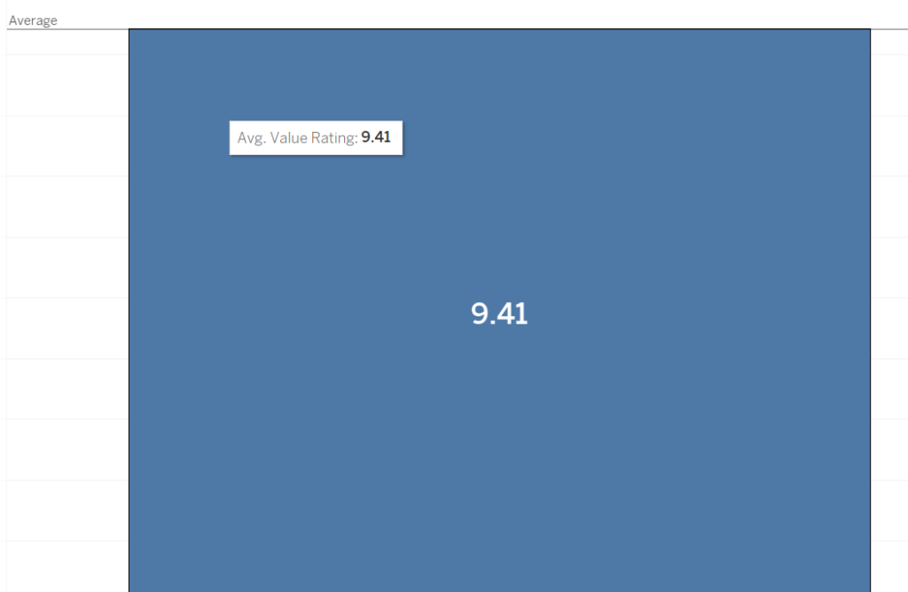
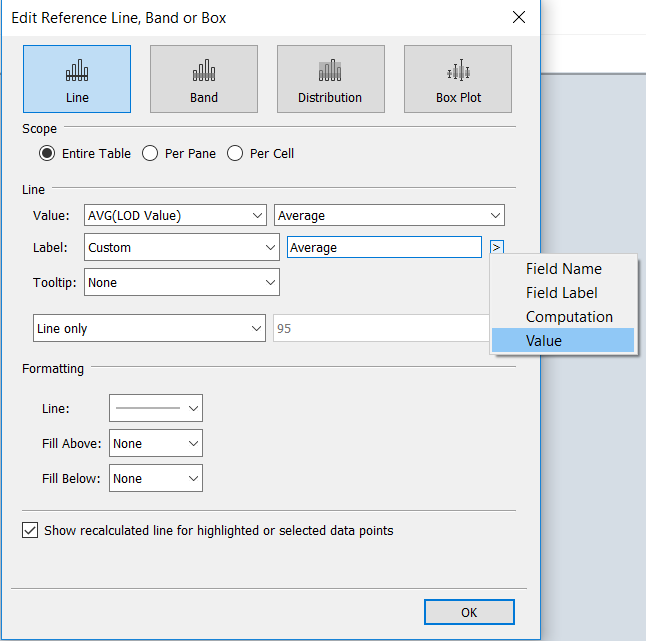
Next, click on the reference line and click ‘edit’.
You’ll want to change the Value dropdown to AVG(*Name of calc field*), turn off tooltip and I like to use a custom label where I type the word ‘Average’ and then add in the value of the calculated field using the button to the right of the text input field.
After that press OK and things are looking better!
- Lastly let’s add a way of changing the bar colour if the filtered value is higher or lower than the average. It’s simpler than you think, another calculated field.
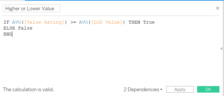
Here all we are saying is if our filtered average value rating is higher than the average value rating of the entire dataset return true, if not return false.
Next, drag this calculated field onto the colours shelf and change the colour for True/False to whatever you like. Note you will have to use your parameter to find a true or a false, make sure you change the colour for both.
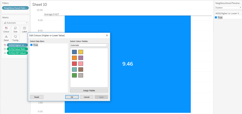
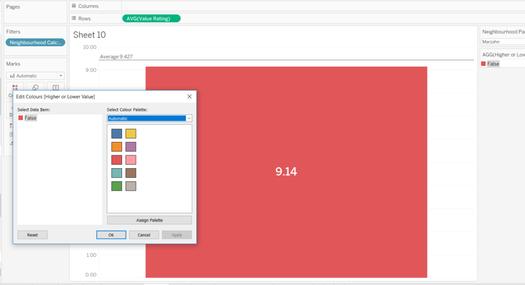
And there you have it. You should now have a bar that changes colour dependent on if it is higher or lower than the average line!
This can be used within a dashboard, in which the same parameter will affect different measures.
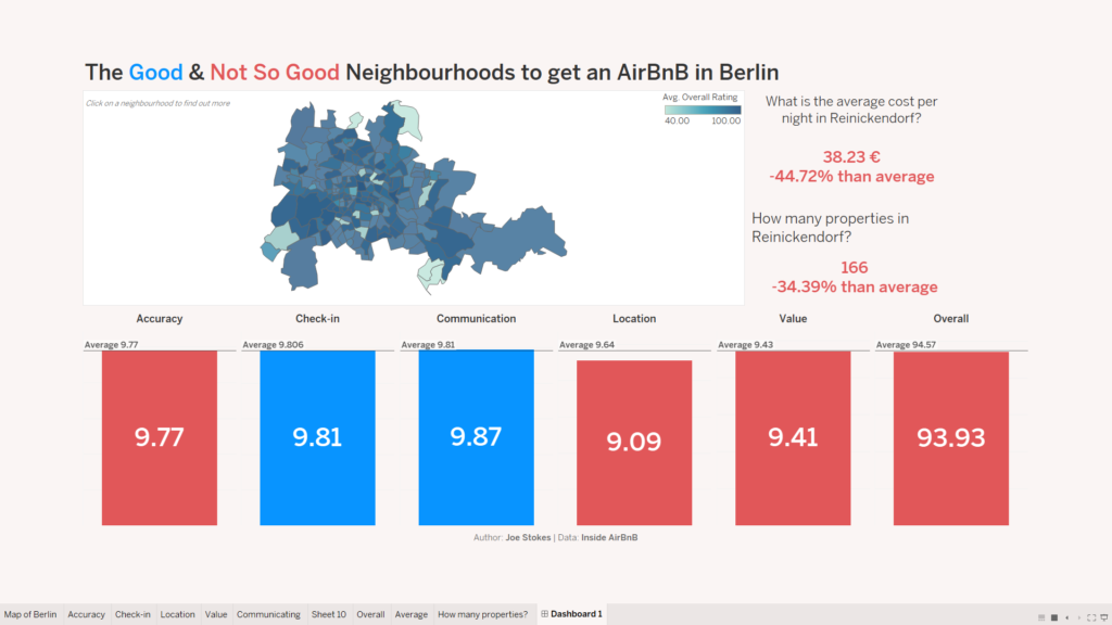
Here on the viz I created I have six different measures that all dynamically move based off of the same neighbourhood parameter. This can offer the user flexibility to explore the city of Berlin and draw insights for themselves.
I hope this can offer you a look into how LODs can be used effectively and easily!