


It's now week three of DS 46. Over the previous two weeks we have learned about planning workflows for cleaning and extracting data, as well as designing effective dashboards. We have been given three separate tasks which have led on from each other, all taking around 1 - 1.5 hours each - and it is interesting to see what can be achieved in that space of time.
Task 1 - We were given an article about the Top 50 highest paid athletes: https://www.forbes.com/lists/athletes/ and told to plan a dashboard around this subject, thinking about the appropriate mark types to use etc. I decided to focus on the influence of Saudi Arabian funded sports leagues on sport's highest earners.

My feedback for this plan was that the colours used down in the bar charts can also be used within the line charts to make it easy to follow all charts. This would mean I wouldn't be able to highlight a single player, however as the focus of the dashboard was on Saudi Arabian influence it would make sense to do this.
Task 2 - In order to create the dashboard above I needed data from the top earners for previous years, not just in 2024. In this case we were given a challenge to clean and merge various sheets of data which had been web scraped containing data from previous years. I created a plan and was able to clean the data into the required format. See my plan and work flow below.


Task 3 - We were then given around an hour to build the dashboard that we had designed, here is what I managed in that time:
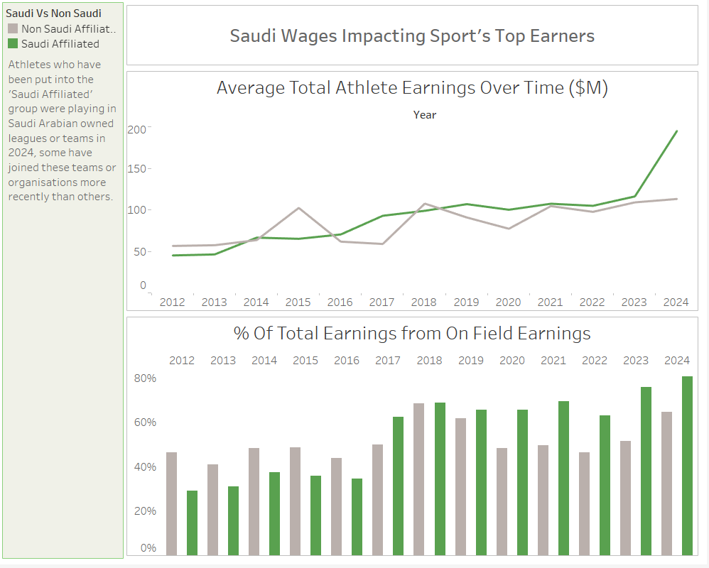
With more time, this dashboard could definitely be improved, however it has been a good exercise to see how long these steps can take if you only have limited time.