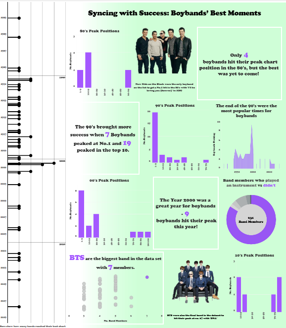
For the final day of Dashboard Week, we took on a creative challenge: transforming data from the Internet Boyband Database into an infographic. The dataset contained every boyband's peak chart position on the Billboard Hot 100 since 1980, as well as member details.
Understanding Infographics
Since I’d never intentionally designed an infographic before, my first step was to figure out what makes one tick. After some research, I learned that infographics are visual representations of data designed to communicate information clearly and attractively, often combining charts, images, and text into a cohesive story.
Designing the Infographic
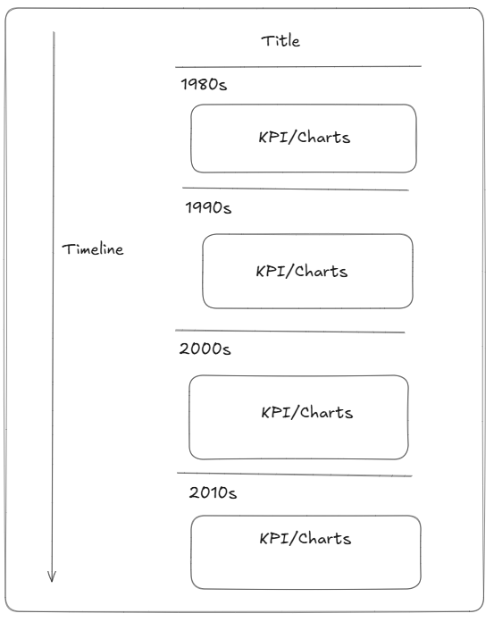
I decided to create a timeline infographic that explored four decades of boybands (1980s to 2010s). Each section highlights key KPIs for its respective decade.
Here’s my initial sketch:

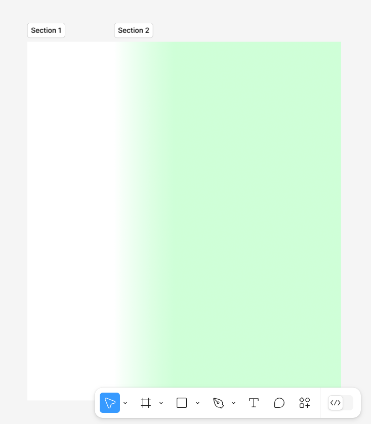
To elevate the design, I used Figma to create a background with a simple, faded color gradient. This added some subtle depth while keeping the focus on the timeline and the data.

The Final Result
The timeline runs along the left side of the design and is styled to resemble a sheet of music, tying into the theme of boybands and their connection to pop music. I’m really pleased with how this turned out, as it brings a thematic element to the infographic while keeping it clean and readable.

Reflections
This task was a refreshing change, requiring me to flex my design skills more than my technical ones. I enjoyed the challenge of presenting data in a creative, engaging way. Overall, it was a great way to wrap up Dashboard Week—ending on a fun and visually rewarding note!
4o
