Day 2 of dashboard week brought another fun challenge! This time, we were tasked with creating an Alteryx app to explore a crime dataset. The goal was to let users filter crimes by month, type, and distance from a location they select on a map. Here's how my day unfolded:
Building the Workflow and App
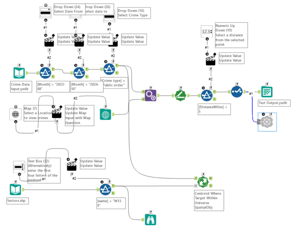
I started by creating a workflow to filter the data based on the user-defined dimensions. To let users pick a specific location, I used a Map Input tool, which generates a spatial point. This spatial point was then appended to the filtered crime data, and I calculated the distance between it and each crime location. Crimes beyond the user-defined distance were filtered out.
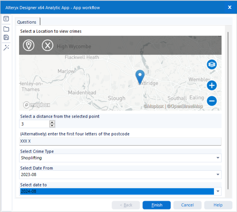
Once the workflow was functional, I added interface tools to turn it into an app. I used a Tableau Output tool to ensure the app would publish the results directly to Tableau Server. After creating the initial file, I adjusted the settings to overwrite it on each run, so that the data set would change based on the user's inputs each time they ran the app.
I also tried incorporating a feature where users could input a postcode to filter crimes based on postcode boundaries. While I got this to work in the workflow, I couldn’t figure out the logic to let users choose between this and the map input within the app in the time available. So, I left the postcode feature out for now—something to revisit later!


Designing the Dashboard
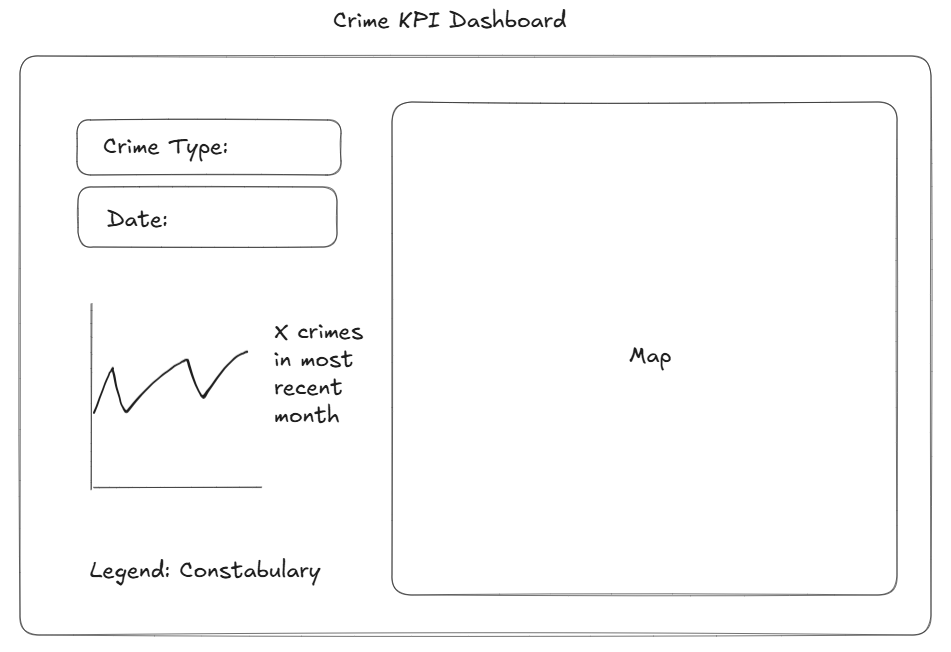
With the app complete, I moved on to designing the dashboard. I kept the layout clean and simple:
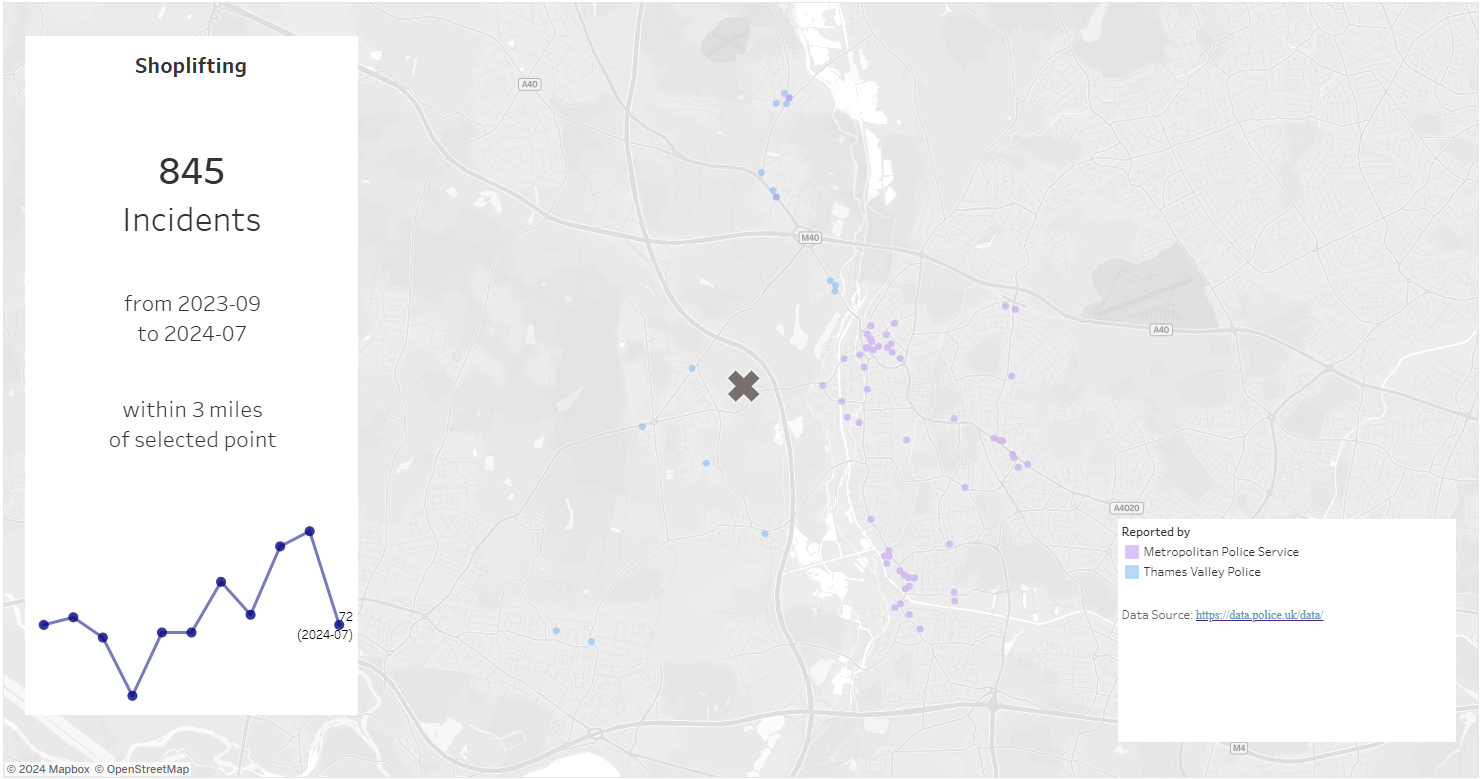
- The map served as the background, providing context for the data.
- Floating KPI and legend containers highlighted key information.
While time constraints limited how much detail I could add, I think the simplicity worked well to deliver the core insights effectively.
Here’s a look at my initial design versus the final dashboard I presented:


Takeaways
This challenge was a great exercise in balancing functionality and simplicity within tight deadlines. While there’s always room for improvement, I’m happy with how the app and dashboard turned out, and I’ve learned a lot to carry forward into future projects.
