Day 1 - Re-designing a dashboard to make it work using a screen reader.
We in DS 46 have started our dashboard week and I have completed my first task : redesigning a Tableau dashboard to make it work for someone using a screen reader. Accessibility in data visualization is often overlooked, but it’s important to make sure your target audience can understand and interact with data, no matter how they access it.
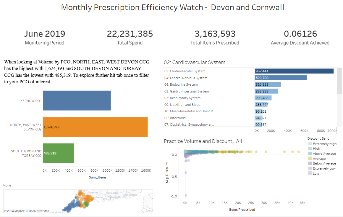
I was given an example dashboard and I tested it using a screen reader. The results weren’t great—the screen reader couldn’t pick up most of the text or numbers in the KPIs. It also struggled to provide any insights from the charts, which made the dashboard pretty useless for someone relying on a screen reader.

After doing some research, I learned that screen readers can’t read elements like tooltips, axis labels, or titles within the chart area. However, they can read things like sheet titles, captions, legend text, filter text, alt text on images, and data from the “view data” table. With this in mind, I got to work redesigning the dashboard to make it screen-reader-friendly.
What I Changed:
- Improved Readability:
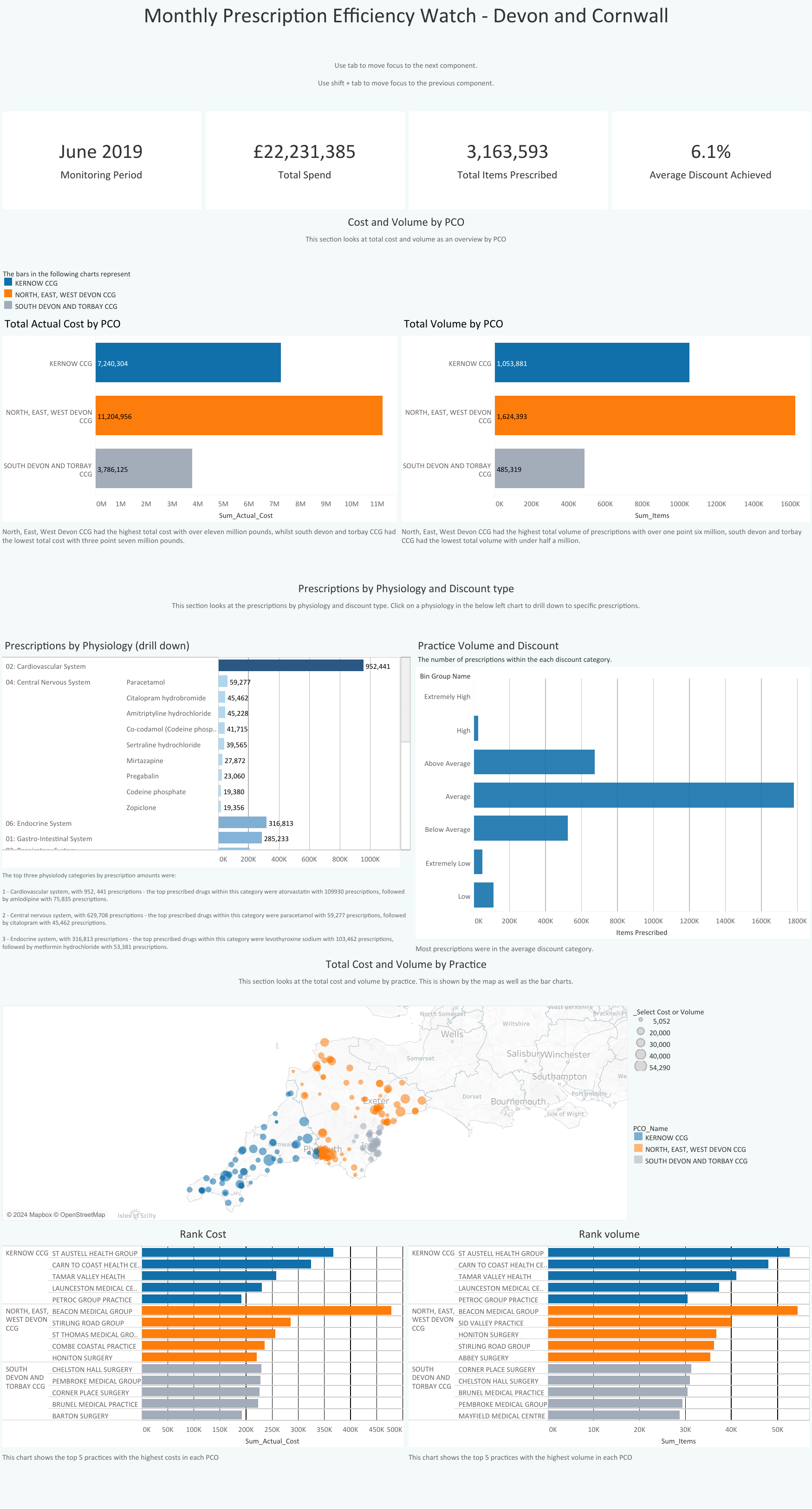
- Switched the font to Calibri for better clarity.
- Made the dashboard bigger so it wasn’t as cluttered.
- Chose a light blue background for a softer look that still had good contrast.
- Better Screen Reader Navigation:
- Reordered the dashboard so the screen reader tabs through it in a logical flow: right to left, top to bottom.
- Reworked Charts:
- Replaced scatter plots with bar charts to make the data easier to “read.”
- Added bar charts alongside maps to make geographic data more accessible.
- Added captions to charts, summarizing key takeaways for the screen reader to share.
- Accessibility for Everyone:
- Used a color-blind-friendly palette.
- Added gridlines to charts for easier interpretation.
The redesigned dashboard is now much more accessible and user-friendly for screen reader users.

This project taught me a lot about designing for inclusivity. Accessibility isn’t just a bonus feature—it’s essential that your dashboards are accessible for your target audience.
