


This week in DS 46 we have been learning principles for designing our dashboards - here are some of the tips!
Exploratory vs Explanatory Dashboards
If you are intending for your dashboard to be used to find the answer to a specific question, or guide the user through a story to a specific finding - then your dashboard is likely to be Explanatory. On the other hand, if you intend for the user to be able to have a high level of interaction with the dashboard themselves in order to find their own insights - this would be an Exploratory dashboard. You can lay your dashboard out in a way which guides the user's eye from one visualisation to the next.
If your dashboard has interactivity designed in - then it's essential that you put an explanation in to show the user how to use it.
Layout
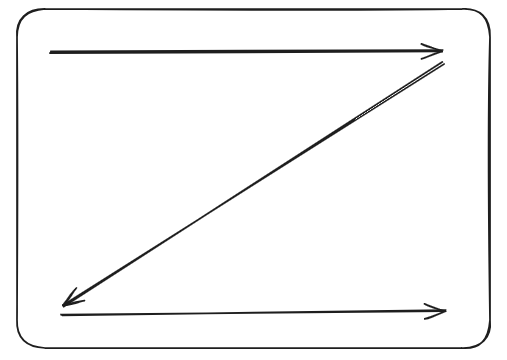
When looking at a document, especially in western cultures - most people will scan from left to right, and top to bottom, in a 'Z' shape. You can use this to lay out your story in a way which leads naturally from the top left to the bottom right of the page. You can also use borders and dividers to guide the user's eye.
Colour
Colour can be used to make the message that you are trying to convey more clear to the user. Avoid using too many colours - try to pick a palette of no more than 5 colours, picking a main colour, and others to show positive, negative and other highlights - this should help you clearly communicate the message and draw the user's eye to certain points you want to show them.
You should also think about the colour palette - perhaps you are doing work for a specific client who has branding requirements. If not, usually low contrast colours are the way to go as they are easier on the eye. Avoid using red and green together as colourblind users may struggle to see the difference.
Use of white space is also great for splitting up the dashboard and making it look less cluttered and more appealing.
Consistency
Make sure your font and text sizing is consistent for headers, subheaders and general text. Keep the use of colours consistent through the dashboard and make sure boarders and things like gaps between bars on a bar chart are all the same size. Align your chart axes and generally you will want to make sure they all start from zero (except in very specific use cases).
Interactivity
Think about whether interactivity will help you convey your message. Don't use interactive features if they are not necessary, but sometimes it will enhance your dashboard. Some examples of interactivity would be filtering, highlighting, selections, comparisons, navigation, tooltips, drill downs.
Conclusion
All of these factors should be considered when designing your dashboard in order to make them more appealing to view and use, as well as to convey your findings more clearly!