Last week’s WorkoutWednesday involved using a trellis chart to construct the visualisation. They are different ways of doing this such as using a CASE calculation and manually assigning each row a x and y co-ordinate. This will be very time consuming if we have a lot of rows. So it’s in our best interest to find a calculated field for the x and y axis to do the work for us. Luckily there are a few blogs online (this one is pretty good) which give us the calculation fields. Here they are:
x–axis: ((index()-1)%(int(SQRT(SIZE()))))
y-axis: int((index()-1)/(int((SQRT(SIZE())))))
We can copy and paste them into our own calculation fields and follow the online instructions to end up with something we want. However I felt uncomfortable using them as I didn’t fully understand what the calculations were doing. So this blog will help give some understanding to them. I will be using super store data to visualise the steps, using the sales from each of the 17 subcategories to recreate this chart
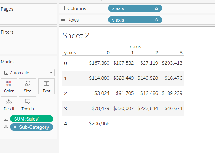
Deriving the calculation fields.
Step 1.
Essentially a trellis chart is a collection of small charts arranged to form a large square. So we need something which will give us the number of columns along one side of the square. Int(Sqrt(Size())) will do this for us, where size() is the number of rows we have in our view. In this case it is 17.
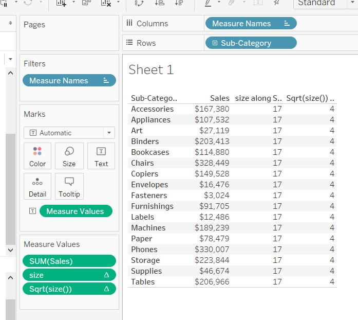
As of now our calculations are:
x axis : int(SQRT(SIZE())
y axis : int(SQRT(SIZE())
Step 2.
Now we need to separate out the individual components of the trellis chart. Index() does for us as it assigns a number to each row in our view, as shown below
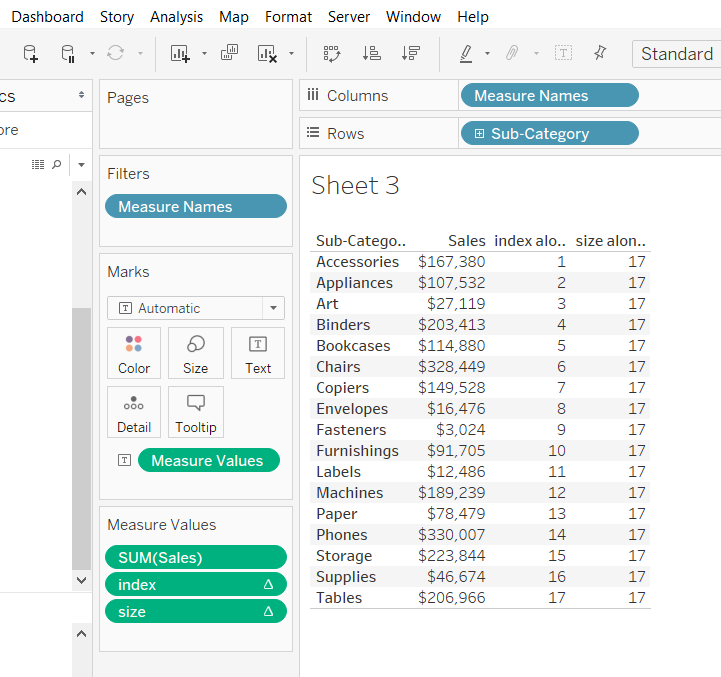
Dividing one by the other will give the position of each row in our trellis chart. We can now update our calculations:
x-axis: index()/(int((SQRT(SIZE()))))
y-axis: index()/(int((SQRT(SIZE()))))
Step 3
However this will give us many rows and columns along the trellis as shown below
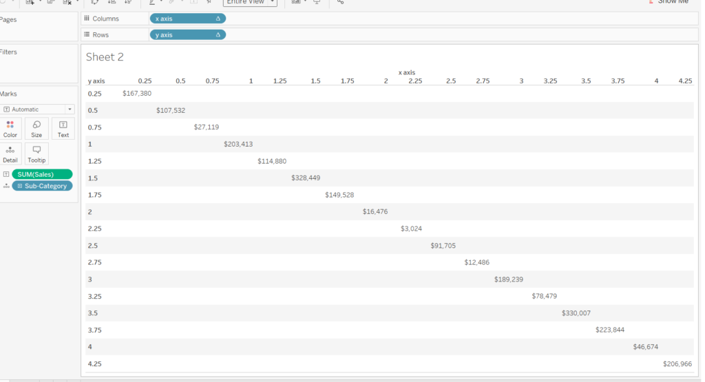
We want to reduce the number of rows and columns so that only integer values appear. INT() does this for us for both the x and y axis calculations. Our updated calculations now read:
x axis: int(index()/(int((SQRT(SIZE())))))
y axis: int(index()/(int((SQRT(SIZE())))))
which results in the chart below.
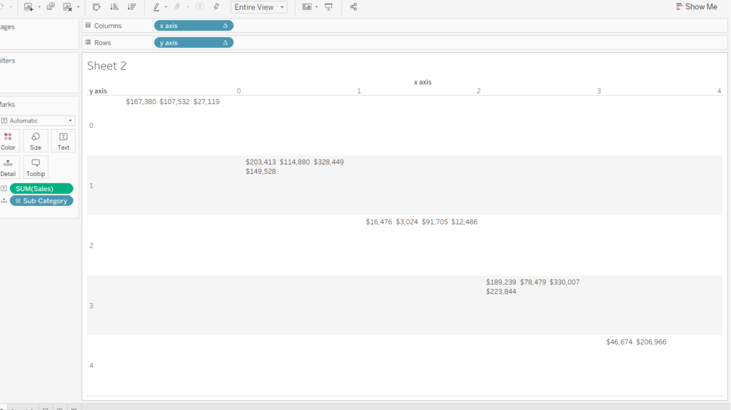
Step 4
We are nearly there. All we need to do is to separate out the values so that they are not grouped like in the chart above. This can be done using the ‘%’ sign in place of a division sign. It basically calculates the remainder of a division. For example 7%4 = 3. This can be seen for the rows under the ‘Remainder’ column.
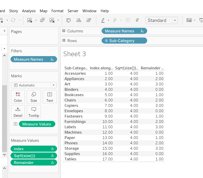
Different values for each row will exist for a group of 4 subcategories. We shouldn’t worry about the next set of 4 subcategories being the same as another group as they will be on a different row in the trellis chart. So we can update the x–axis and y-axis fields:
x–axis: index()%(int(SQRT(SIZE())))
y-axis: int((index())/(int((SQRT(SIZE())))))
Viewing them them will give us this:
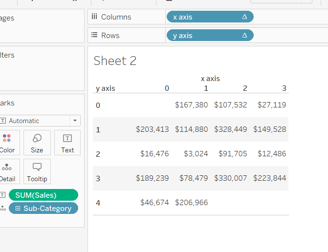
Step 5.
The above chart doesn’t look quite right. It looks like the positions have been shifted by one place to the right. This can be corrected by putting a -1 next to the index of the x and y axis so that it reads
x–axis: (index()-1)%(int(SQRT(SIZE())))
y-axis: int((index()-1)/(int((SQRT(SIZE())))))
We’ve finally derived the calculated fields and putting them in view should give us the chart at the top of this blog.
I hope I have explained how the calculation fields behind trellis charts come about. If you still have any questions feel free to contact me on twitter or Linkedin!
