


With conditional formatting, in Power BI you can customize cell colours, including gradients, based on rules or field values. This blog post will explain how to format a gradient colour scheme.
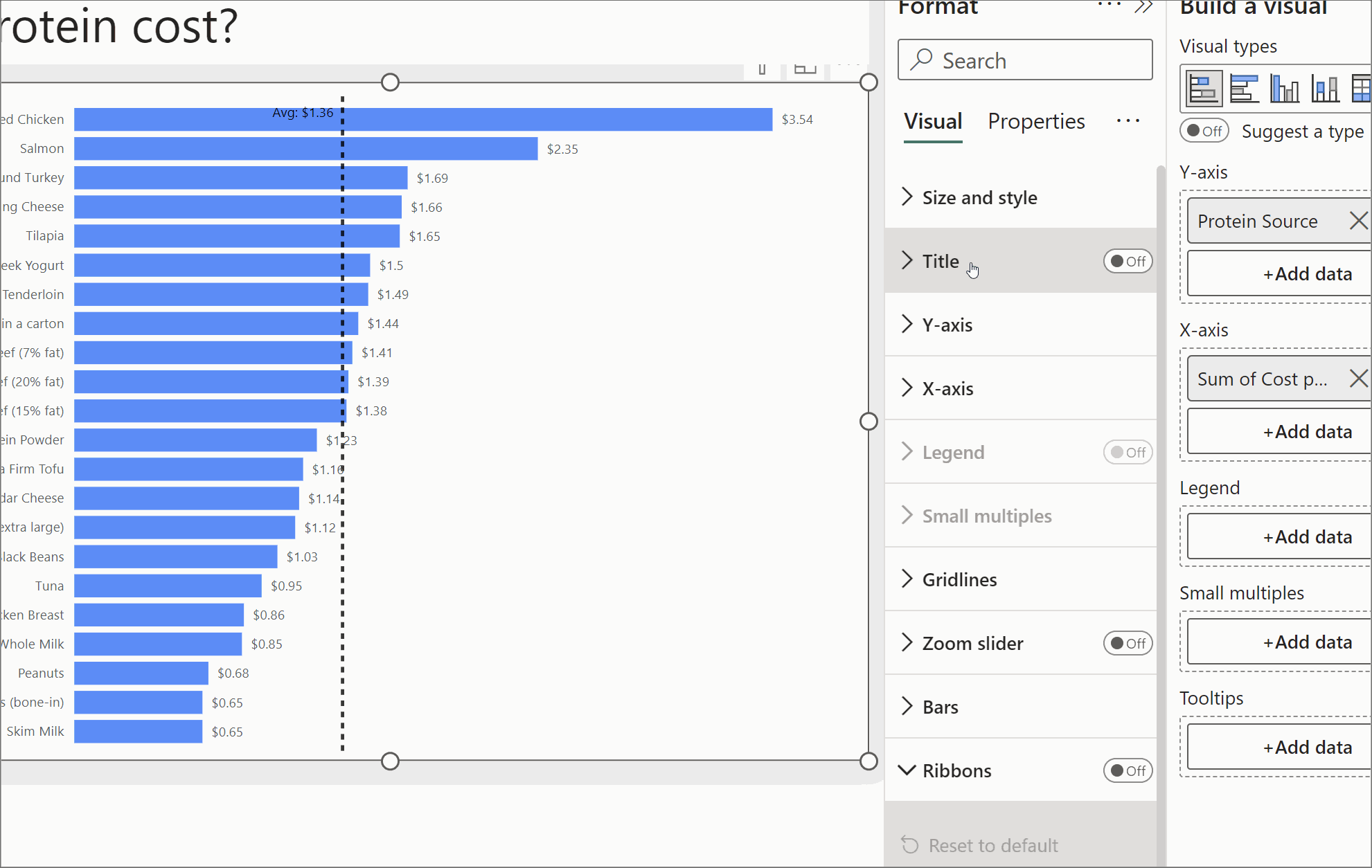
For this example we will use a bar chart. You can apply this formatting, by selecting the chart and opening up the formatting pane. Under 'Bars' and 'Colour', you will see a 'fx' icon next to the colour selector.
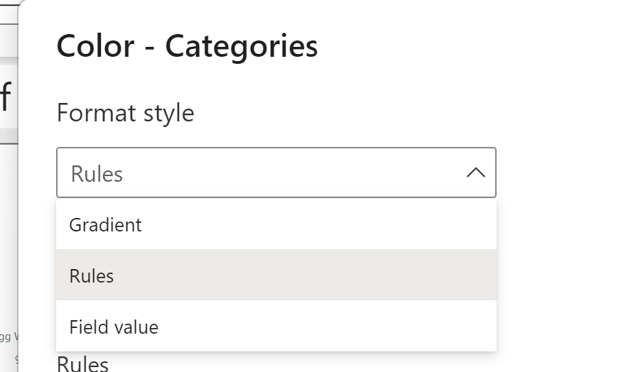
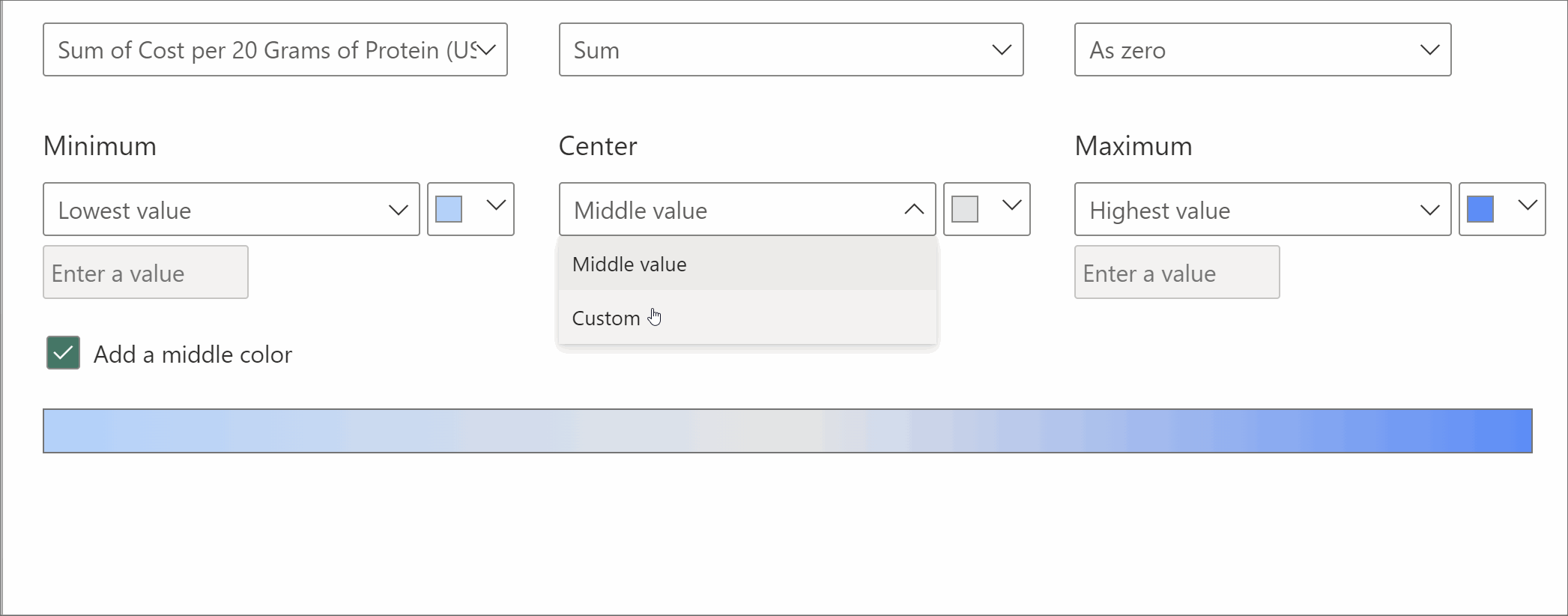
Selecting this will open a pop up, where you can select a 'Format style', and select gradient.
You can select a measure to base the gradient off, so the gradient can represent a different measure to the one your bar chart is showing.
Select your measure and how this should be aggregated. You can also decide how null values should be formatted - as zero, a specific colour, or not at all.
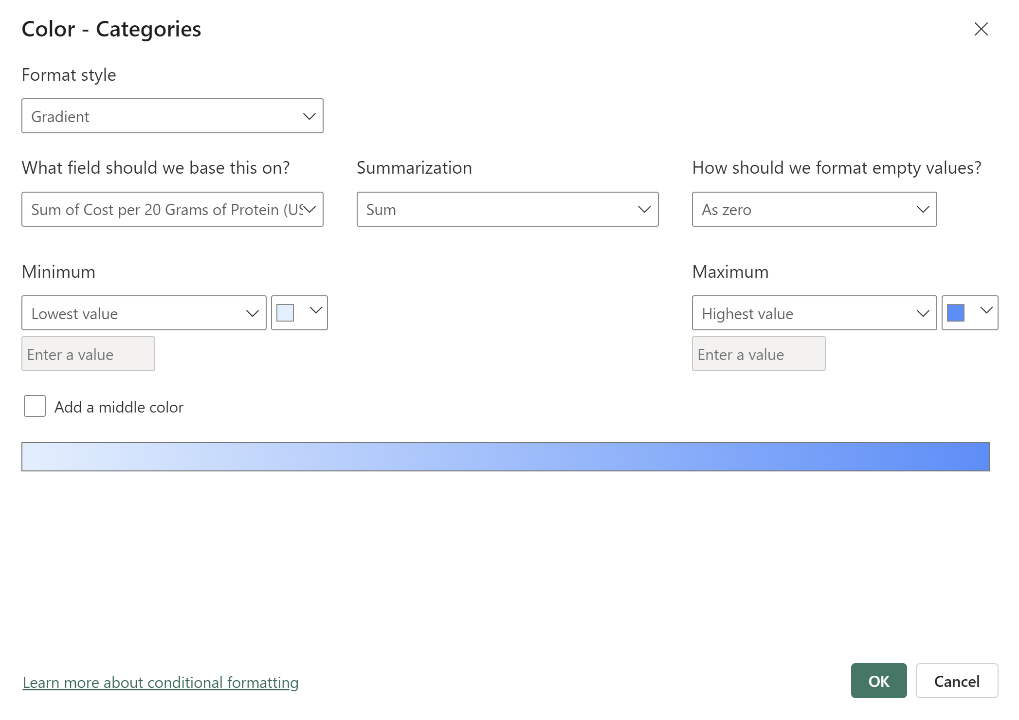
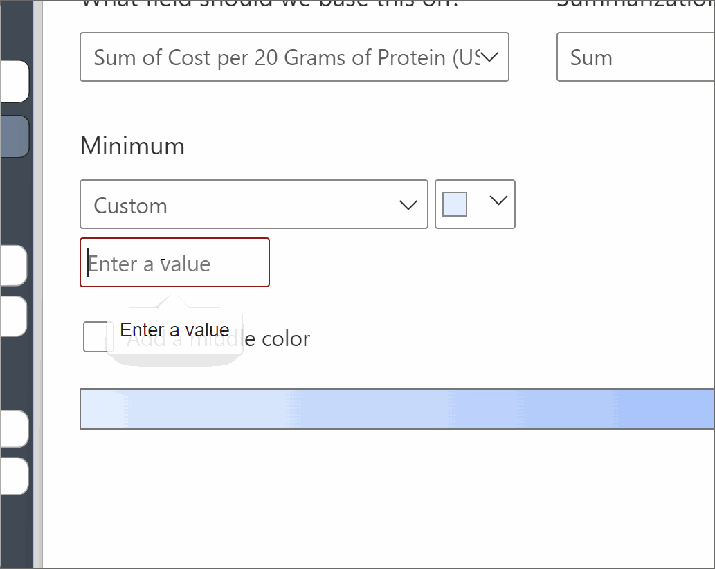
You can then choose the minimum and maximum colours for your gradient and what values they should be based off.
The default is lowest and highest value of the field, but you can also add in your own values
If your data crosses zero, it is advisable to add a middle colour.
It is nice to make the middle a grey/white colour, and 2 different colours for the min/max but it depends on your use case!
Select ok and you have your gradient bar chart!