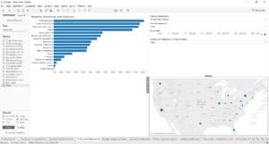
Let me tell you about my favourite Data School Week 2 tip: setting up a dashboard that allows a user to switch between charts. Here’s the example we went through:

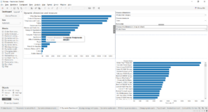
The parameter called ‘Choose the dimension (map or chart)’ allows you to choose which dimension is used. If you select State, you see a map of sales by state. If you select Product Name, however, you see a bar chart of sales by product, as shown below.

Before we build it, let’s talk about how it works. Where you see the map, there are actually two sheets, each with the same calculated field in the filter. One sheet only shows data when the calculated field is true, and the other only when the calculated field is false. The ‘Choose the dimension’ parameter is linked to the calculated field in such a way that, when the parameter is changed, the truth value of the calculated field is also changed, thereby changing which sheet shows data. By putting the two sheets in the same place on the dashboard, and making sure that only one can show data at any one time, we’ll only ever see one chart there on our dashboard.
Didn’t get that? Don’t worry – you’ll understand when you build it. To allow the user to flip between the map and the chart, follow these steps.
- In one sheet, create your map (in this case, sales by state).
- In a different sheet, create your bar chart (sales by product name).
- Create a new parameter. This parameter will be the one you’ll use to flip between views. Call it ‘Choose the dimension’, or similar.

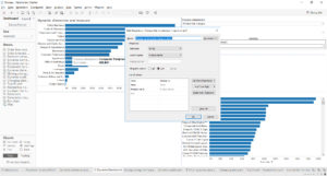
- Configure the parameter as a string and manually enter the values as shown. It doesn’t really matter what you call the values at this stage, as long as it’s clear to the user what selecting each option will do.
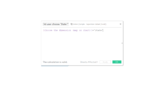
- Here’s the clever bit. Make a calculated field which changes when the user selects a different option with the parameter, as below. If the user has selected ‘State’ with the parameter, it will evaluate to True. When the user selects the other option – Product Name – with the parameter, it will evaluate to False. The bit in quotation marks should be exactly one of the strings you wrote in your parameter.

- Drag that calculated field to the Filter shelf on both the map sheet and the bar chart sheet. When editing the filter on the map, only tick the True box. When editing the filter on the bar chart, tick Exclude and then tick True, so that it will exclude True. In other words, the map will only show when the calculation is true (i.e. when the user has selected ‘State’), and the bar chart will only show when the calculation is not true (i.e. when the user has selected ‘Product Name’).
- Create a dashboard and drag a layout container to the view (from the options in the bottom left-hand corner). Drag the map sheet into that layout container, then do the same for the bar chart sheet. Only one will be showing. Add the parameter control to the dashboard, so that the user can select which chart to view. Make sure you remove the titles from both the sheets, as they will continue to show when the view itself is empty.
Congratulations – you’ve built a dashboard where the user can switch between charts!
I put together another example for my project this week – it’s a little different, as it’s based on the numerical value of a calculation going above or below a certain value, but it’s essentially the same principle with a few more steps. You can see it on my Tableau Public profile here.
