


Today we were working with some sweet data – literally. Our main challenges included preparing the data using Tableau Prep Builder and then building the dashboard in Web Edit on Tableau Server. Read the full task here.
Sketch:
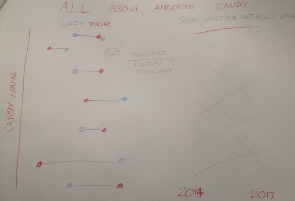
If you’ve read any of my other blogs this week, you probably know what I’m going to say in this section. I decided to keep my design quite simple. I knew there were limitations in Web Edit, so I didn’t want to try anything too ambitious.
Unfortunately, I didn’t keep it simple enough! I didn’t realise that dashboard actions cannot be set up in Web Edit and therefore my idea to have the dumbell chart highlight the slope chart turned out to be impossible. I was also unable to include the viz in tooltip that I had planned as it turns out you can’t do any tooltip editing in Web Edit!
Still, it was good to have a plan, as it helped me work out the structure for my data. I wanted each row to represent a treat in a year, with either the “joy score” or the “despair score.” I knew this would mean a lot of pivoting…
Tableau Prep:

I started with the 2014 data which was already partially formatted. I thanked my lucky stars at this point that Preppin’ Data exists! Week 16 taught me how to rank the different treats by their “Net feelies” – as I wasn’t sure the rank table calculation would be available in Web Edit.
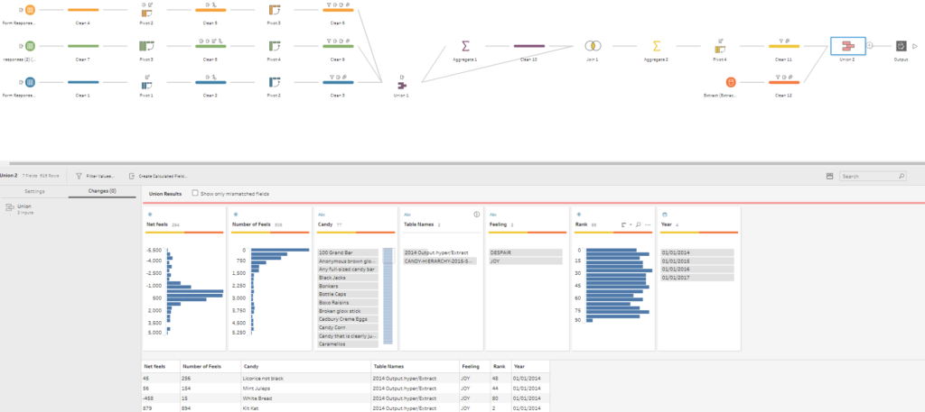
The years 2015-2017 were all in a raw format. I think I definitely could have done this flow in a more efficient way, as you can see all the repeated steps I took. However, I sacrificed efficiency for wanting to check that everything was OK for each year instead. If it works, it works, right?
The handy thing about working within Tableau Prep is that we could publish the data source straight to Tableau Server. That was nice!
Web Edit:
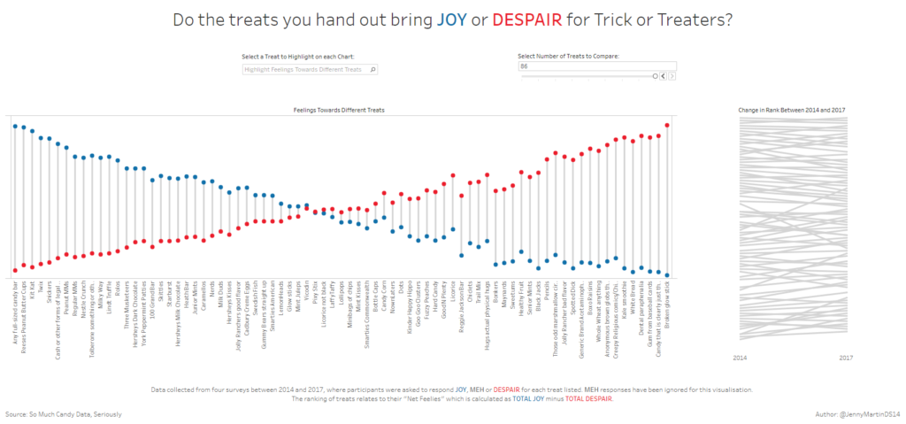
All in all, I’m quite happy with what I was able to create, despite the limitations. There are quite a lot of changes vs the sketch, so I’ll talk through the reasons behind these.
First of all, my dumbell chart has flipped. I preferred the way it looks and being able to see the crossover point where treats become more disliked than liked. This was simply stylistic rather than anything to do with Web Edit.
As previously mentioned, I couldn’t create the highlight action in Web Edit. I tried using a filter action instead, but I thought this suffered from a lack of context. Therefore, I just included a simple highlighter feature instead.
I then had the problem that I liked the way the dumbell chart looked with all the values included, but you can’t gather any insights from the slope graph. This is when I decided to use a parameter to control how many treats were included in the dashboard. With fewer treats, the slope chart looks much better, but then the dumbell chart doesn’t look as good. So it’s a bit of a catch 22!