Power BI allows you to choose a colour via a field. This accepts string inputs as Hex such as "#7fffd4", but also accepts some words such as "aquamarine" as a colour. Which words are accepted?
Accepted colour names are CSS Color Keywords, a list of which can be found here.
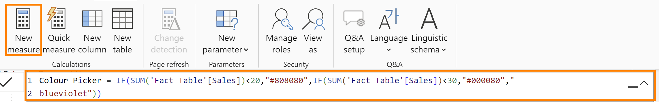
To dynamically colour charts, we will use if statements inside of measures. This will be of the form IF(<condition to check as Boolean>, "<Colour Hex code or name if condition True>", "<Colour Hex code or name if condition False>"), or can add more if statements in the Else argument.
Example: IF(sum([Sales]>100,"blue", "grey")
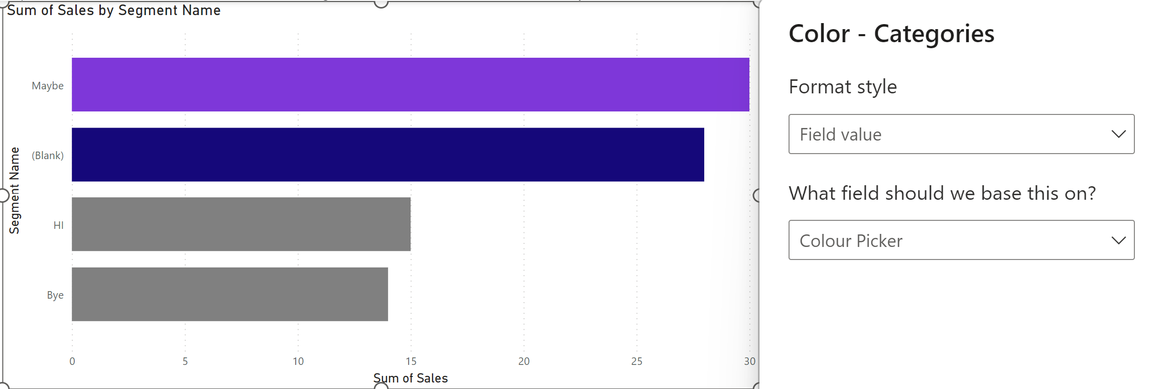
Here is an example which will pick colours based on if sales are less than 20, between 20 and 29, and over 29:
Then build your chart, and open Format, and navigate through Visual and then the mark type name (in this case Bars) to find the fx button for colour:
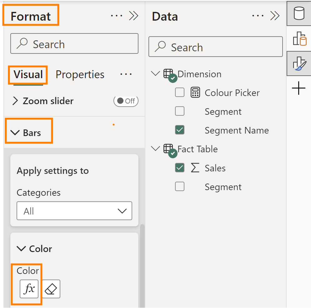
In the fx menu, select Field value under Format style, and your colour picker measure as the field.