


Our first MakeoverMonday (2023, week 19) in Power BI was about MakeoverMonday metadata. It was a fantastic dataset, although it needed a bit of tweaking in Power Query.
My first task - determine the exact date using only the column with the year and week number. I managed to solve this using a DAX function:
= Table.TransformColumnTypes(#"Added Custom",{{"Date", type date}})
My second task - find inspiration for visualization. I've already used this dataset for my visualization in Tableau here - so I decided to draw inspiration for my own work. Unfortunately, not everything went as planned...
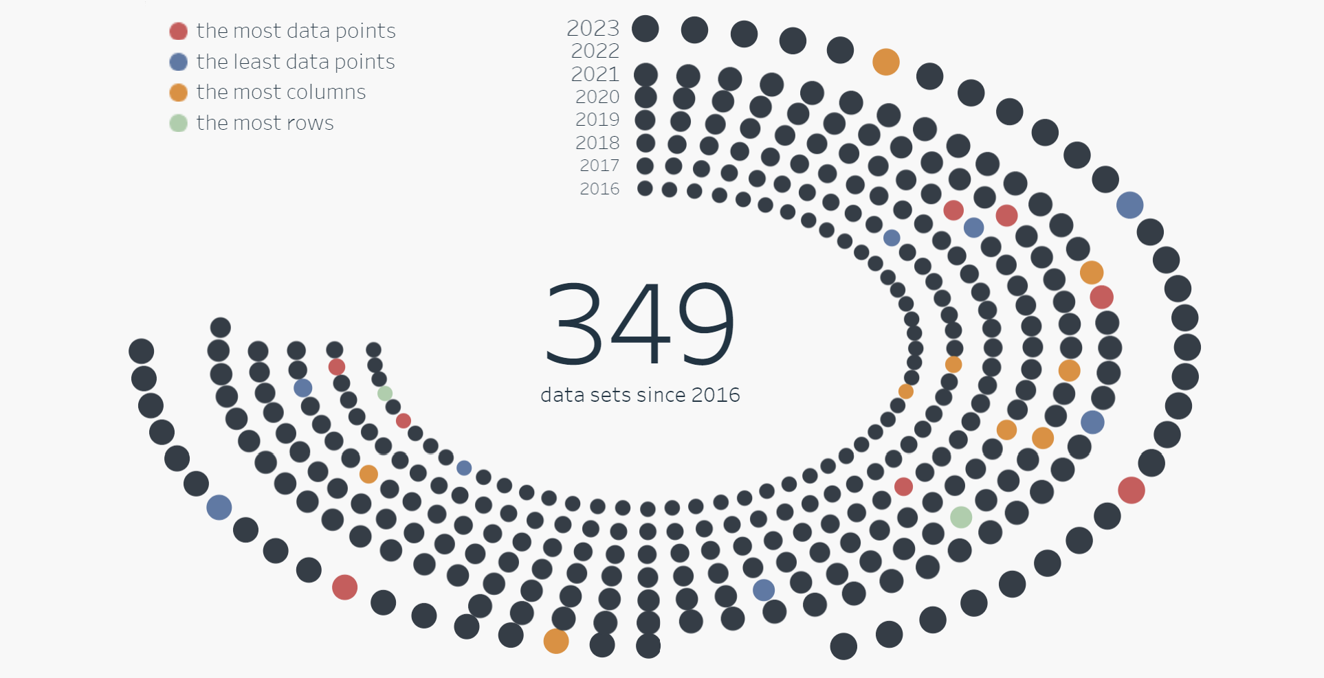
I couldn't create a Power BI Circe Dot Chart, so I settled for a Scatter Chart instead.
In this Scatter Chart, I placed the year on the X-axis and the week on the Y-axis in which the MakeoverMonday was published.
Furthermore, I used a parameter to change measures in this Scatter Chart, including changing the title based on the selected measure.
Check this tutorial about changing measures using parameters here.
Formatting took the most time, undoubtedly. Power BI's formatting differs significantly from Tableau's. But I suppose it's just a matter of getting used to it, and over time, things will become much quicker.
And here is the final result...