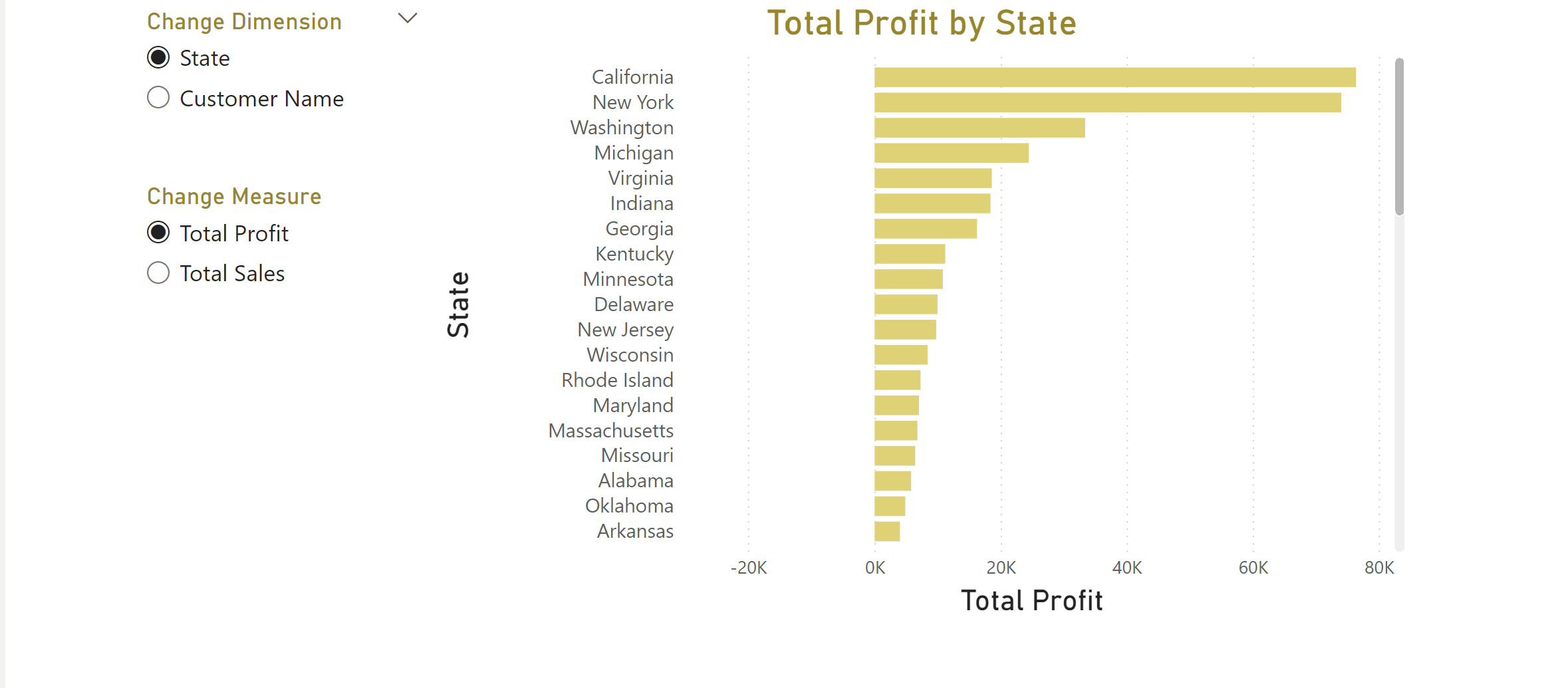
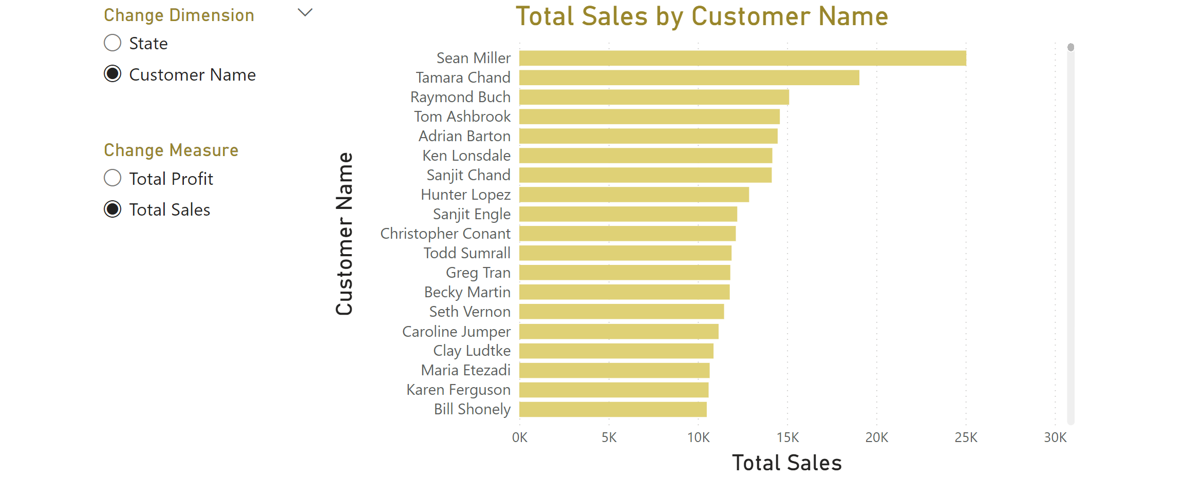
We're currently in the middle of our week, concentrating on Power BI and Power Query at The Data School. Today, I'd like to introduce you to a useful feature we've picked up.
Imagine this situation: you wish to provide users of your visualization the ability to alter dimensions or measures within the visual. How can you make it happen?
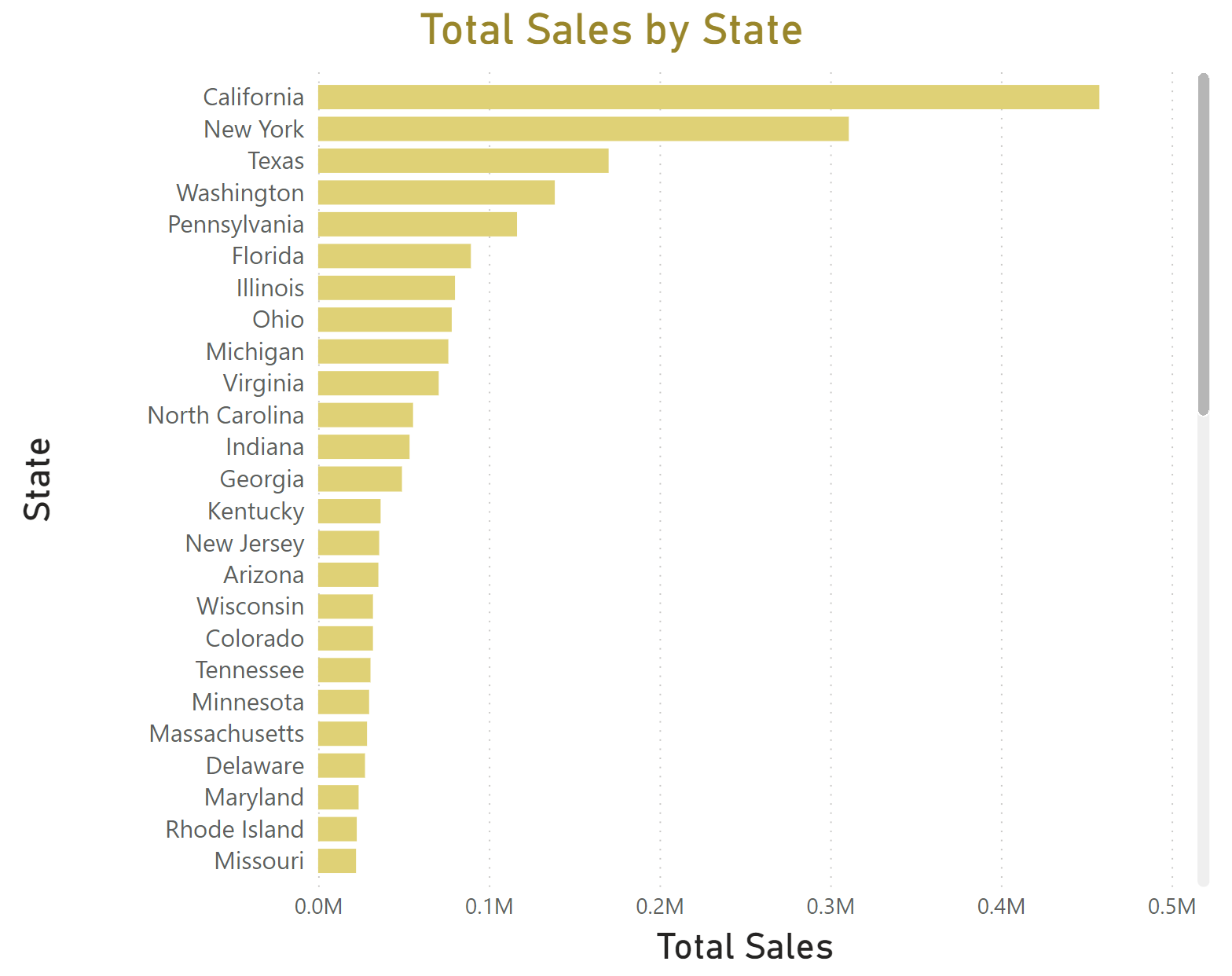
Take a look at our bar chart. Right now, it displays Total Sales on the X-axis and State on the Y-axis. However, I also want to expand the view to include:
- Total Sales by Customer
- Total Profit by State
- Total Profit by Customer
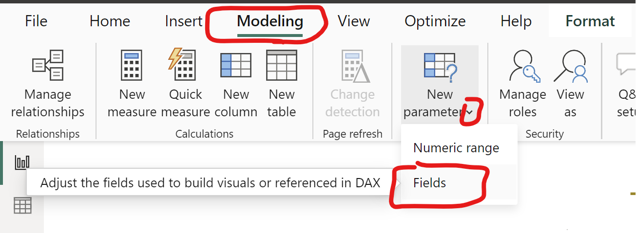
Step 1 - Creating a Parameter for DIMENSION Switching
Navigate to Modeling > New parameter > Fields
Step 2 - Setting Up the Parameter for Dimension
- In the popup window for Parameters, assign a Name to your new parameter.
- Search for your desired dimensions in the Fields section and select them by ticking the checkboxes. These selections will appear on the left in the 'Add and reorder fields' box.
- You can also reorder the dimensions as needed.
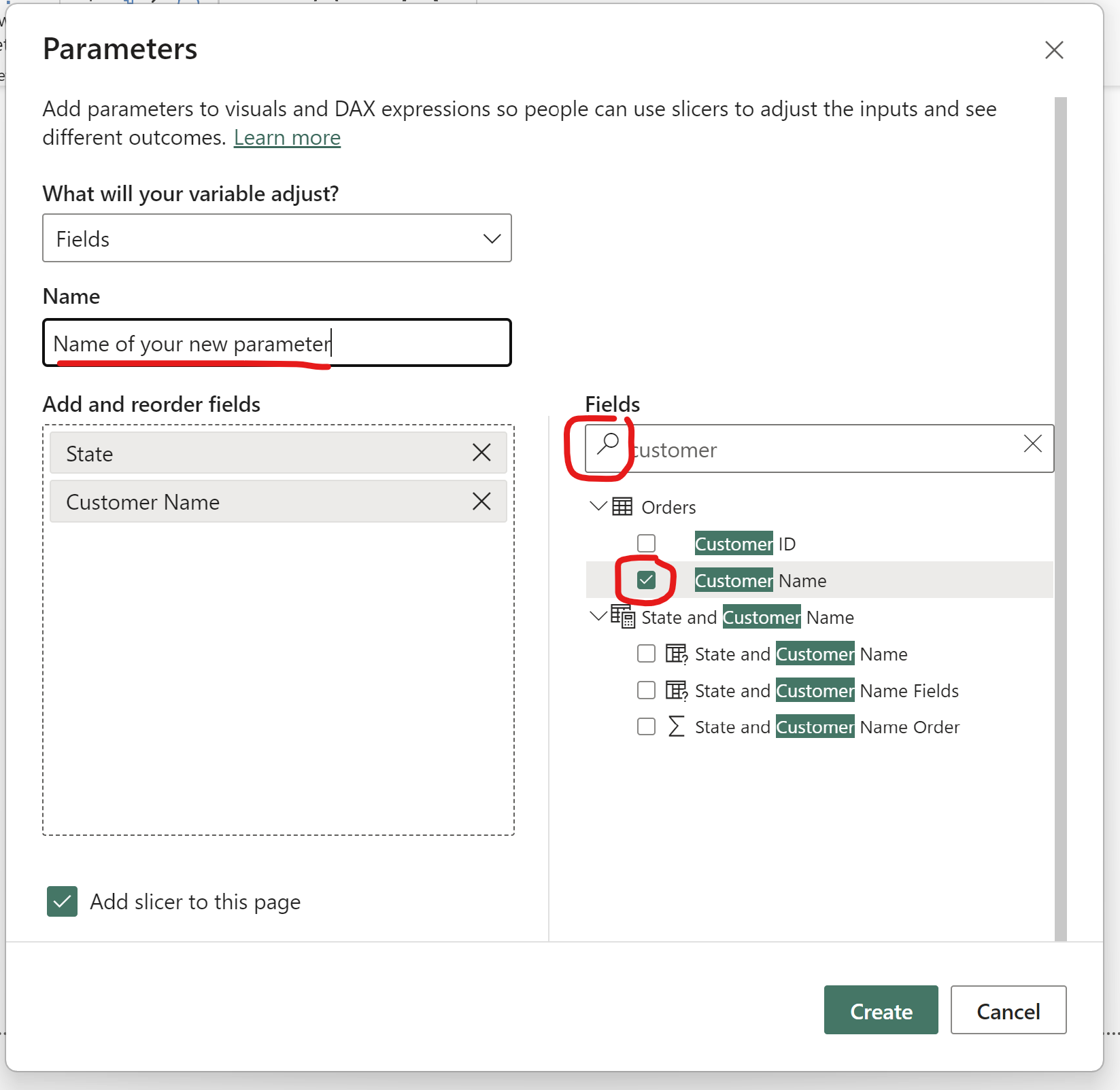
Step 3 - Applying the Dimension Parameter
- Your new parameter will now be available both on your visual and in the Data pane (Field List) on the right side.
- Drag the parameter to the Y-axis of your bar chart and remove the original dimension from the Y-axis.
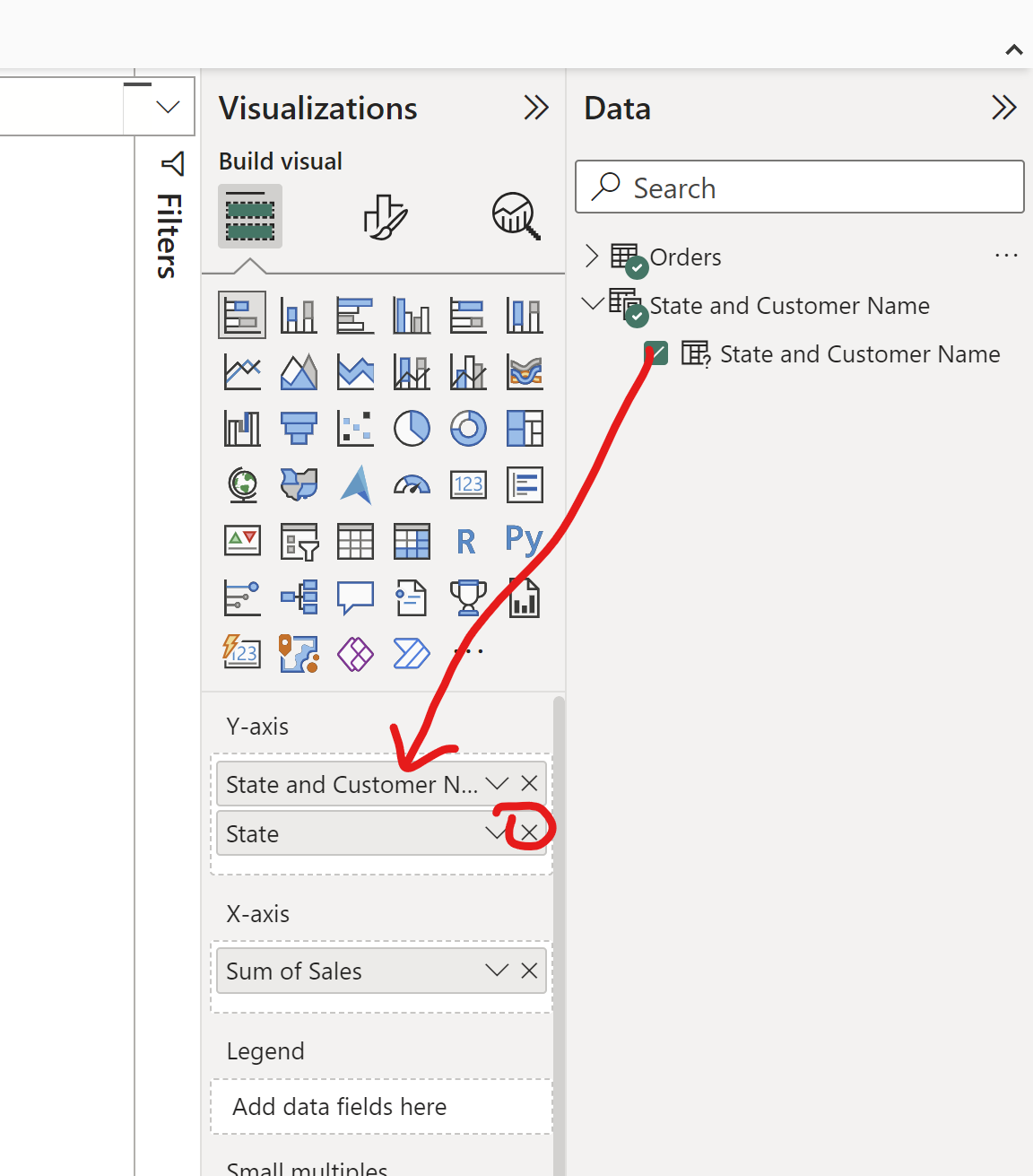
Step 4 - Parameter Formatting
- Select your parameter on the canvas.
- To manage the display, click on the Format your Visual icon.
- Access Slicer settings, choose your preferred style, and activate the Single select option.
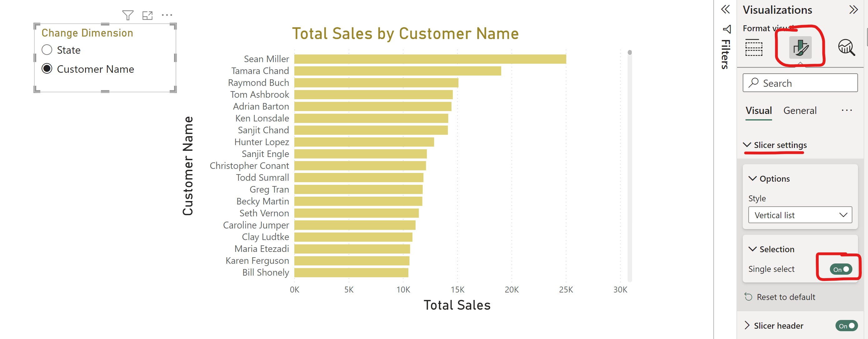
Step 5 - Creating a Parameter for MEASURE Switching
- Follow the same steps as before, but this time, before creating the parameter, create new summarized measures.
- For instance, to switch to Profit or Sales, you'll need to create new measures using DAX expressions:
- Total Profit = SUM(Orders[Profit])
- Total Sales = SUM(Orders[Sales])

Step 6 - Add these new measures as fields in the second parameter.
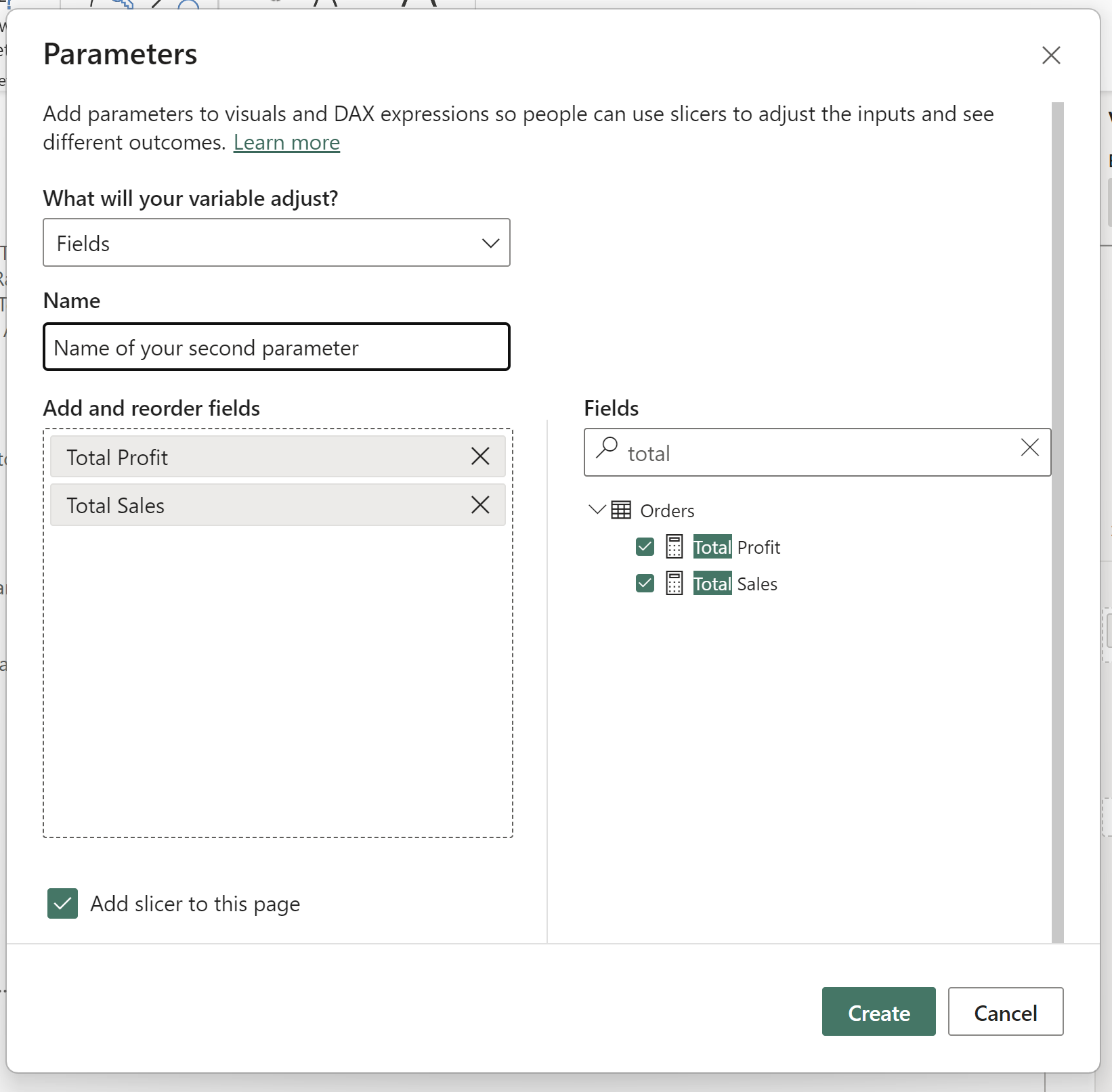
Step 7 - Drag the second parameter to the X-axis of your visual.
Step 8 - Formatting the Measure Parameter
And there you have it! With these steps, you'll be able to offer users the freedom to dynamically alter dimensions and measures on your Power BI visualizations. Your final result could resemble something like this:
