I was excited when we received Jenny's brief on Thursday at 9 am—a rarity in our Dashboard Week as the challenge extended to Friday too! The task at hand was the Data + Movies challenge for our final two days.
However, my excitement took a swift downturn when I realized I wouldn't be available on Friday, leaving me with just a single day to tackle the project.
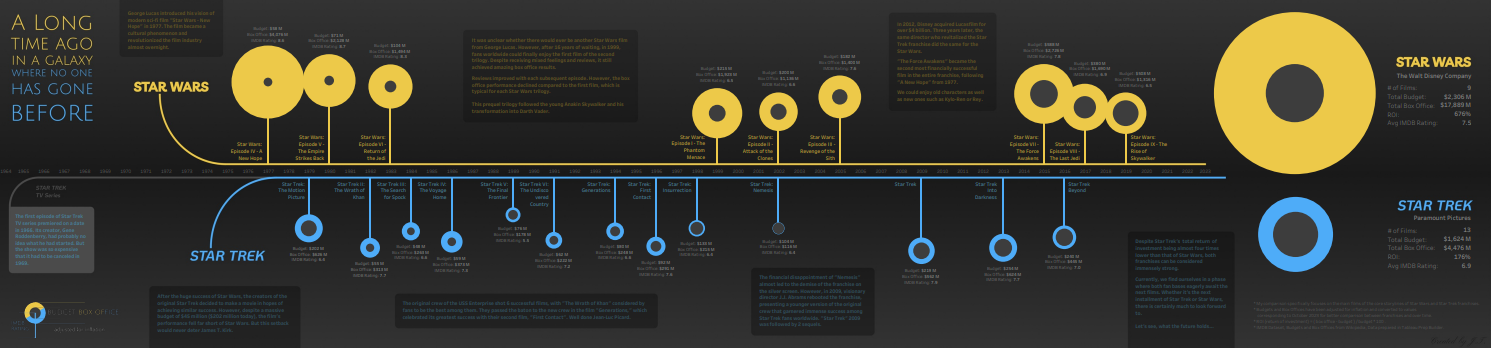
This prompted a rapid decision-making process. I debated between delving into the world of Star Trek films and TV series or exploring Christopher Nolan's films. Unfortunately, the dataset omitted TV shows and any data beyond 2022 (such as Nolan's 'Oppenheimer'). At that moment, it became evident: I decided to focus on Star Trek Films, aiming to compare them against the main Star Wars films. I sketched out my plan in a mere 20 minutes...
Upon receiving feedback and fantastic suggestions from Carl and Jenny, I was all set to start working in Tableau.
The initial challenge revolved around missing budget and box office information, which I managed to retrieve from Wikipedia tables and clean using Tableau Prep Builder. Another obstacle arose when planning to create 'lollypops' as a dual axis, intending to incorporate smaller circles to depict budgets. However, this was resolved by leveraging Measure Values for Size and Measure Names for Color.
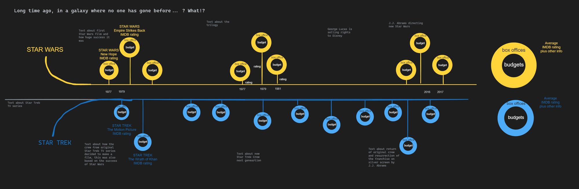
Several Level of Detail (LOD) calculations were necessary for my circle charts, accompanied by additional calculations for the complementary table. But the journey wasn't over yet. It took an additional 3 hours to compose, format all the text, and create a suitable background and legend in Figma :-).
Here is my final Viz: