


After I wrote my blog post about Scatter Plots, I thought it would be great to take one more step further and write about how to visualize changes over time using them.
This is a basic tutorial for those who wish to compare two variables (continuous measures in Tableau) and observe their changes over time in a single view. I will show you how to achieve this using the Tableau Sample Superstore dataset.
- Let's place our Sales on x-axis (Columns) and Profit on our y-axis (Rows) and use our Category dimension for the 'Color' in the 'Marks' shelf.
- We will focus on visualizing changes in time for complete years. Drag the Ship Date pill into the 'Filters' shelf and select only the years 2020, 2021, and 2022, as we do not have complete data for 2023 and 2024 yet.
- Change the 'Marks' type into from Automatic to Line chart, and drag Ship Date into the 'Path'. While holding the Ctrl (Windows) or Command (MacOS) button on your keyboard, also drag YEARS(Ship Date) pill from the 'Marks' to the 'Label'.
- That's it! Now we can observe the time series for each category.
- Feel free to experiment with the 'Size' of the lines, colours of the 'Labels', and other visual properties.
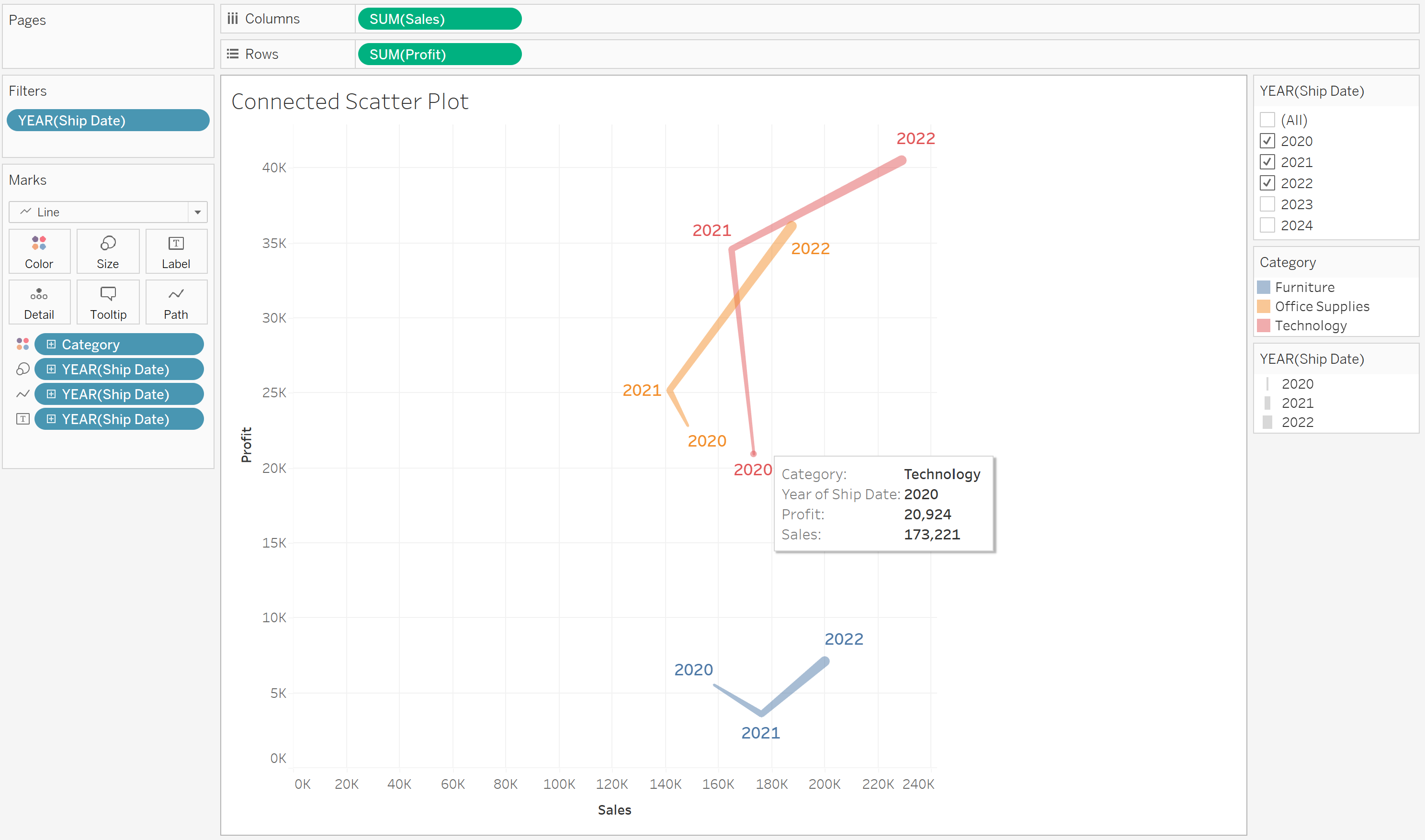
The final result might resemble the example above if you decide to use YEAR(Ship Date) for the 'Size' as well.