


Using my LinkedIn feed as an indicator, I can confidently say that color is one of the most discussed topics in the data viz community. Coming from a fashion design background, the idea that color needs intention is very familiar. To build a collection, designers use color, silhouette, texture, and fluidity to guide the viewer’s attention and tell a unique story. Every choice is intentional and follows an underlying set of rules.
But what are the rules for color in data viz? Let’s look at the big ones everyone needs to know:
1. Encoding: Representing a range of data
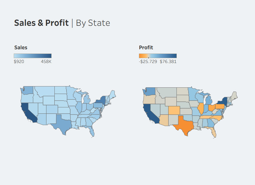
This is where color actually holds the data. A heatmap is the best example: the intensity of the color represents a value within a range. Without color, the map would be literally empty.
To encode a data range effectively, we can use different gradient palettes. Sequential palettes focus attention on one end of the range, while diverging palettes emphasize both opposing ends. By using a neutral mid-value, "normal" values are de-emphasized to let the extremes stand out.
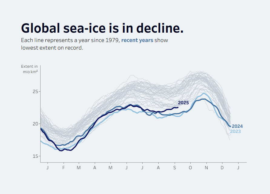
The sequential palette (top) emphasizes the intensification of ice loss.
The diverging palette (bottom) highlights a distict shift, from the higher ice levels of the past to the record-breaking lows we see today.

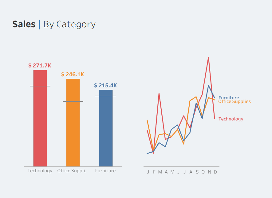
2. Distinguishing: Representing categories
Color can also separate groups like regions or departments. Unlike gradients, this requires categorical palettes where each color is distinct yet carries equal weight. To avoid accidentally implying a hierarchy, these colors should have similar brightness and saturation. The goal is enough contrast to tell groups apart at a glance, creating variety rather than a rank.
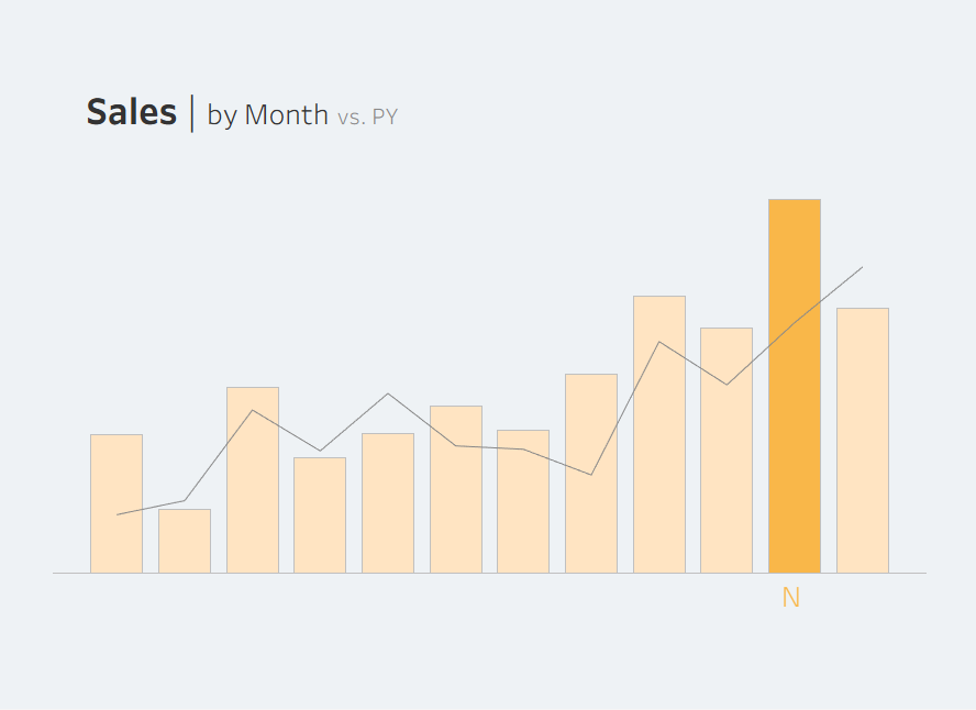
3. Emphasis: Highlighting the story
Color is the fastest way to show exactly where to look. By using a single "Action Color" against a neutral background, the most important data stands out immediately. To make this work, the rest of the chart should stay in a muted grey or a transparent version of the highlight color. This keeps the focus on the takeaway without the rest of the data feeling disconnected.
Notice how your eyes immediately go to the blue lines?
There is much more to consider, such as accessibility or brand identity. But mastering these three foundations provides a solid basis for using color with purpose. When these are in place, color stops being decorative and becomes a deliberate design choice.