Mondays at The Data School come with a special kind of adrenaline: the #MakeoverMonday Challenge. The challenge was originally launched in 2016 by Tableau experts Andy Kriebel and Andy Cotgreave. By today the initiative has grown into a massive community effort, bringing together thousands of data enthusiasts from around the globe to rework existing visualizations and find new stories.
I love friendly competitions, they help me get into a hyperfocus, a good state to create something meaningful under pressure. At the Data School, we add an extra layer of difficulty: we must finish within 90 minutes, and we are restricted to static charts with minimal interactivity (a tooltip at most).
To survive this challenge, I usually split my time into two phases: The "skeleton" and "the fun part". I feel that if I don’t have my "skeleton" in place within the first 45 minutes, the final result will lack depth.
Phase 1: The Skeleton (The First 45 Minutes)
I consider this the most critical part of the process. Before I even think about colors, I focus on:
- Quick Data & Domain Research: Understanding what I'm looking at.
- Picking ONE Story: It’s tempting to show everything, but a great static chart needs one clear, focused narrative and time is also not on our side.
- Choosing the Right Chart: Selecting the visual form that best serves that specific story.
- The MVP Plot: Creating a rough, simple version of the chart (ignoring formatting entirely).
- The Headline: Finding a meaningful, full-sentence title that supports the storytelling.
I try not to move on until this foundation is solid. I prefer to have a simple, well-told story than a beautiful chart that has nothing to say.
Phase 2: The Fun Part (The Final 45 Minutes)
Only once the skeleton is built, I start with the aesthetics and refinements:
- Cleaning Up: Stripping away unnecessary axes and gridlines to let the data breathe.
- Color Concept: Choosing a palette that supports the data and story.
- Layout & Composition: Arranging text and visual elements on the page for a professional finish.
This stage is highly iterative. I play with the details until I’m happy with the result, or, more often: until I run out of time!
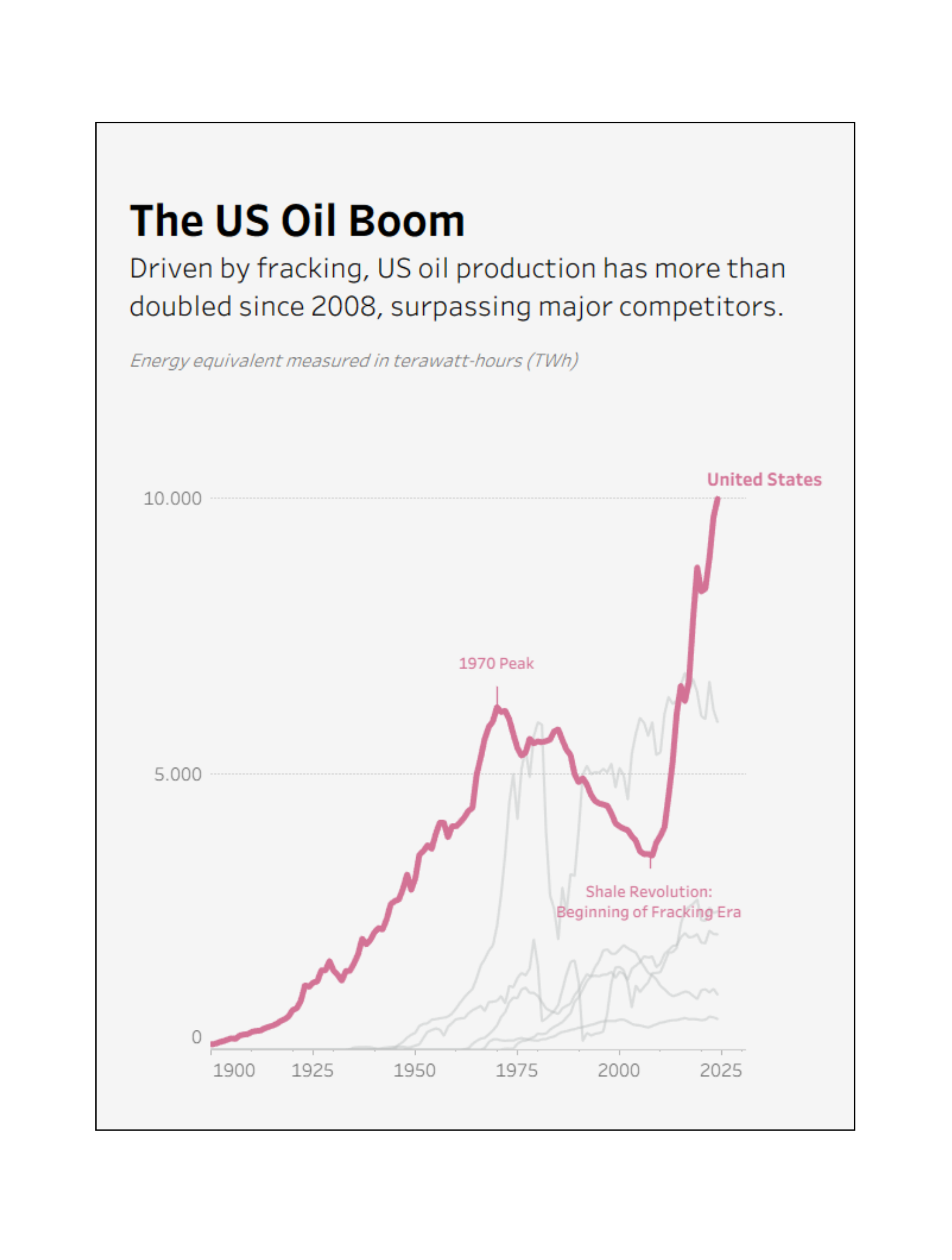
Anyhow, for me, a successful Monday is when a user can look at my chart and understand the "So what?" within seconds. Below is one example I am happy with already after the 90 minutes rush. This is not always the case though and what I do when I feel that it's not good (yet) I will share in tomorrow's blogpost 🪶