


In yesterday’s post, I shared a successful 90-minute #MakeoverMonday draft. But let’s be honest: sometimes, even when you follow your own best practices, the result just feels off... That was exactly what happened with this latest challenge.
The Problem
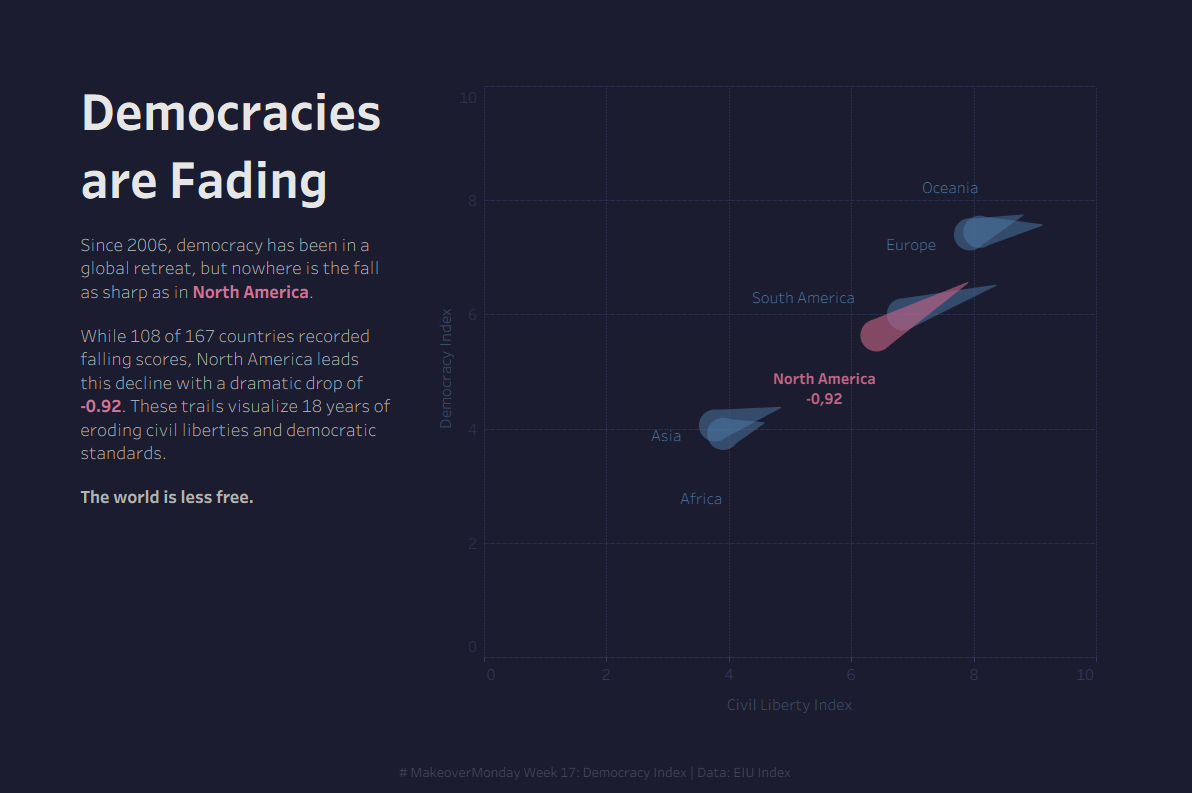
The data covered the Global Democracy Index (2006–2024). I noticed a decline in every single region, with North America leading the drop. I quickly built a chart to highlight this, assuming the trend was mostly driven by the US.
By the 90-minute deadline, I realized the version I had was failing:
- Axis Overload: I tried to mix the Civil Liberty and Democracy Index. It was a mess to read.
- Zero Context: Without labels like "Full Democracy" or "Flawed Democracy," it was impossible to tell how bad the situation actually was.
- Hidden Stories: North America includes 14 countries. While the US declined, the real drama was in Nicaragua, Honduras, and El Salvador. My regional average completely erased those individual stories.
The Fix
To save a version that wasn't working, I took a step back and did these four things:
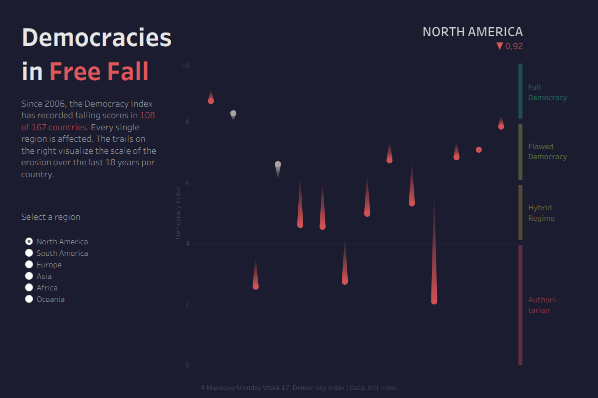
- Cut the Clutter: I stripped everything away to focus on one message: "Democracy has declined in every region." Removing the second index turned the visual into a clean, vertical drop, perfectly capturing the feeling of losing ground.
- Used Color with Intent: I used a direct title and applied red specifically to guide the eye toward the declines.
- Added Real Meaning: I added the regime classifications to the Y-axis. Now, you can actually see the severity of the drops.
- Broke a Rule: At the Data School, we usually submit static charts to these challenges. But showing all countries at once was too cluttered, and showing only regions felt too shallow. So, I broke the rules and went interactive. You can now toggle between regions to see the specific countries within them.
When was the last time you had to break a design rule to tell a better story? Any regrets?
You can check out the interactive chart here.