


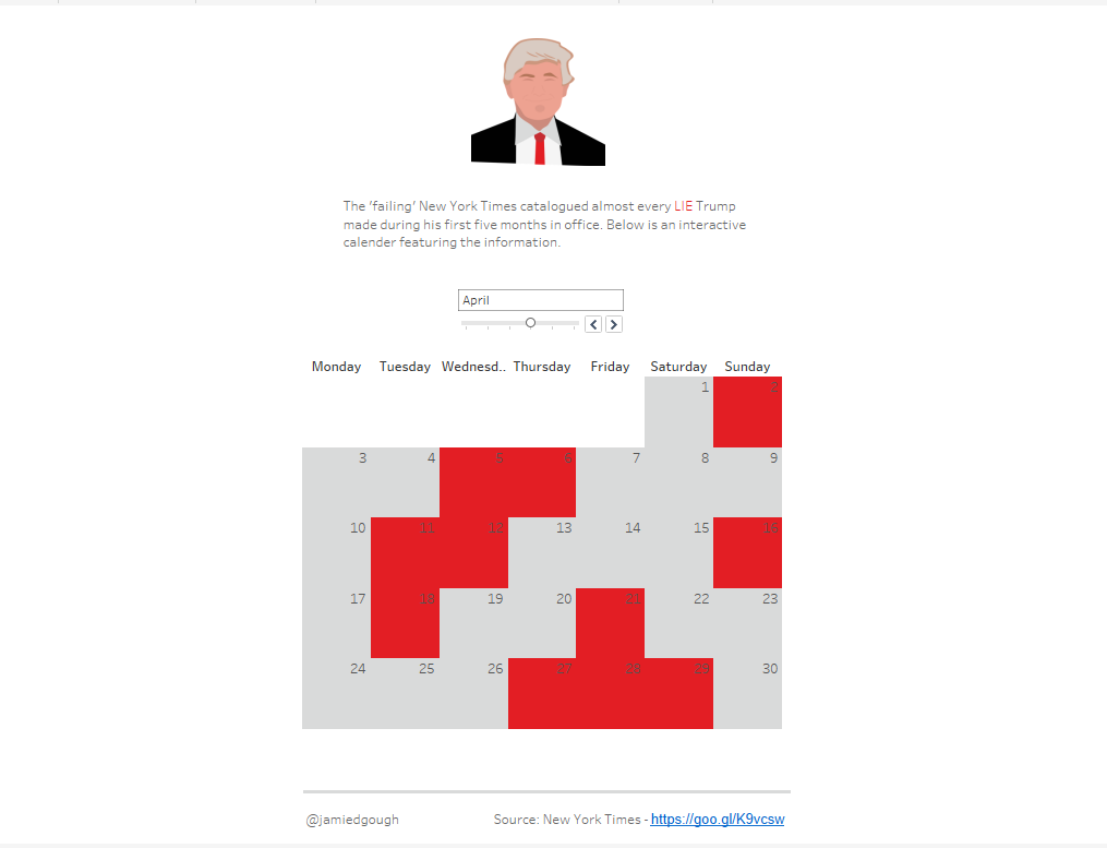
Recently I published a vis created with a scrape of the New York Times website (documented in my last blog). Here’s a snapshot of the vis, which has a brief explanation of the data followed by an interactive calendar I created.
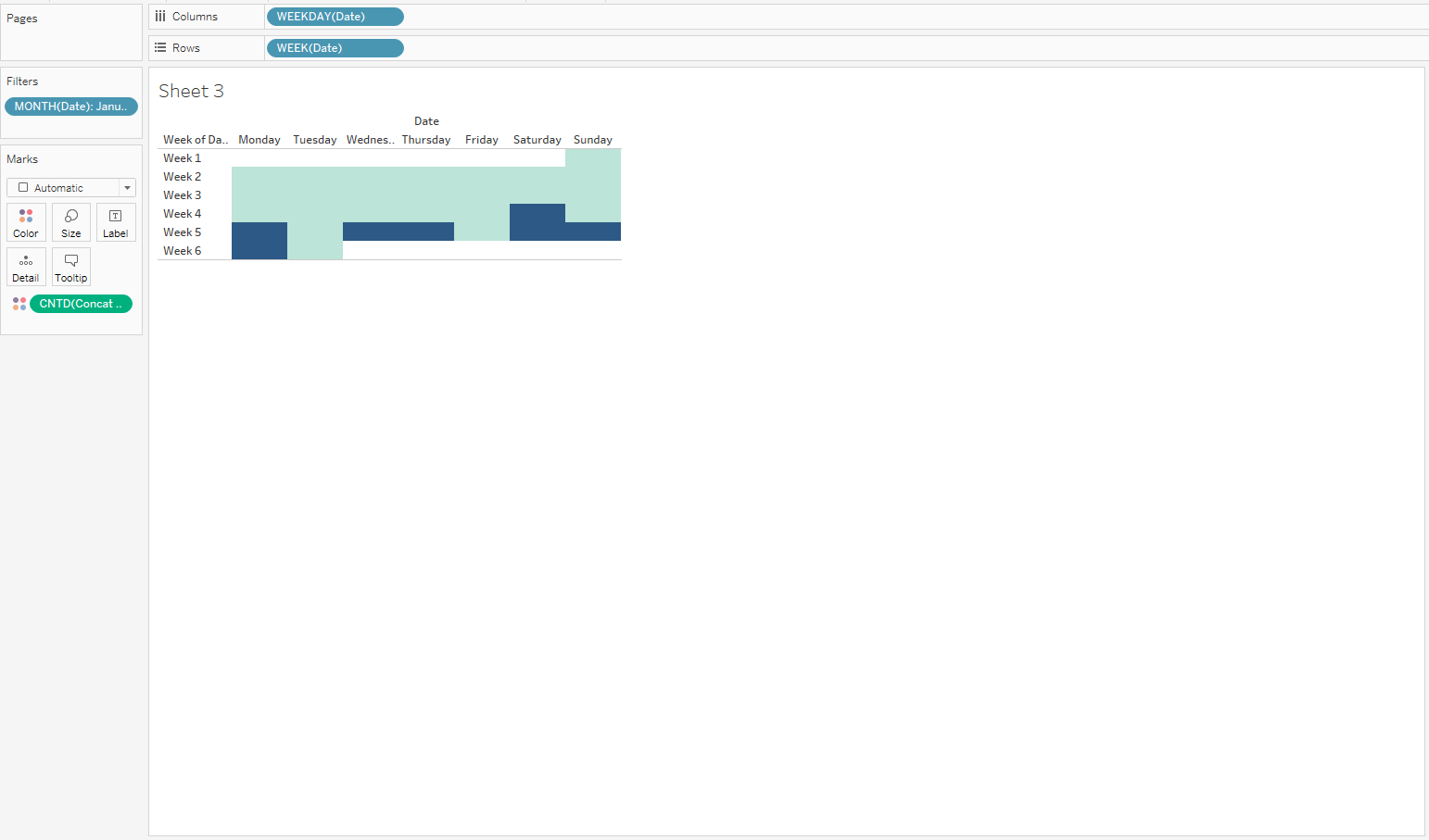
Firstly, this is what I did to create a calendar. I used the date field weekday’s as a column, weeks as a row and months as a filter. I then used the count of lies as colour to make the dates with information distinguish from those with null values.
I’m now going to move onto the tricky part, the dynamic tooltip. I wanted the tooltip to only display when hovering over dates that contained information. This required two calculations, one for the lies and one for the truths, that would be inserted into edit tooltip.
To do this I had to use two varieties of the if statement below.
IF [Concat Lie] = ‘null’
THEN “”
ELSE “Lie(s):
“+ STR([Concat Lie])
END
The “if” part of the statement informs Tableau to return an empty field if the lie column is null on a certain date. This was key to the visualisation as it prevents a tooltip displaying when hovering over empty dates.
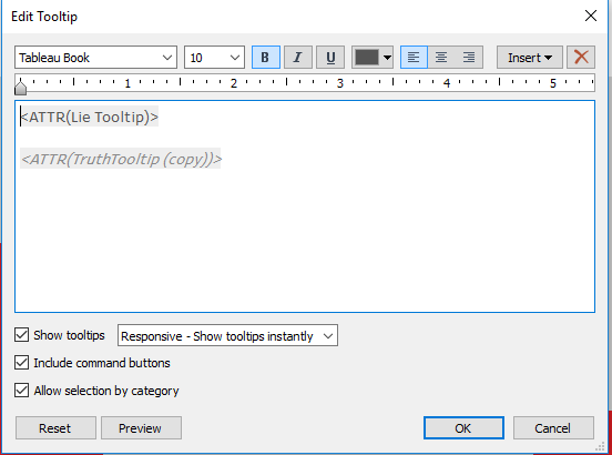
The “else” section returns a string, thus populating the tooltip, if the lie field is populated. It does this by calling the string function to return the text from the lie column. After placing the calculations into the tooltip, I formatted the text to match the article, bold lies and italic truths. Here’s a snapshot of the final edit tooltip.
I hope you guys find these tips as useful as I did. There will be more to follow as I progress through Data School.