


For Dashboard Week Day 2 we were set the challenge of visualising data from historical battles.
After looking at the dataset I predicited that there was potentially alot of work to be done in order to achieve my sketched dashboard. Hence, I decided to iterate through version of data prep and dashboards that would slowly get closer to what I wanted.
The reason I decided to iterate through versions was because I did not want to run out of time aiming for something too complex or hard. By deciding on a minimum viable product I could deliver something, even if I ran out of time.
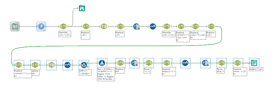
By preparing and cleaning the data at the simplest level I was able to create this workflow:
And this dashboard:
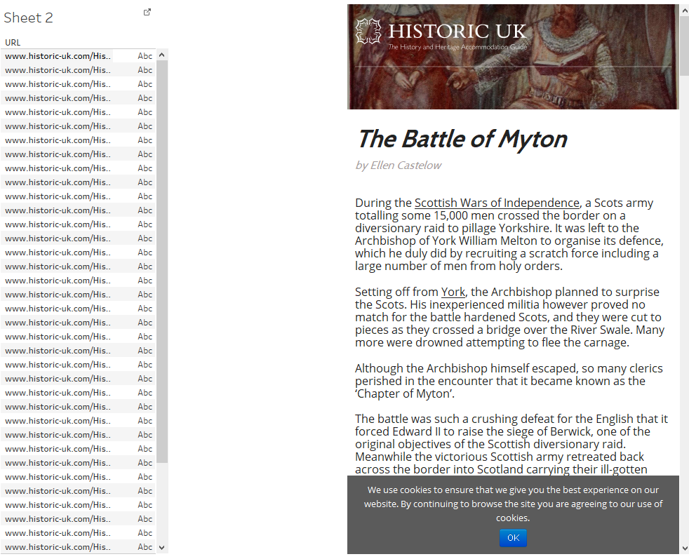
Within a couple of hours. I then tested the functionality with URLs so I knew that my idea would work – and little time would have been wasted if it didn’t.
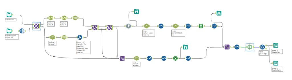
I then moved onto adding location data and cleaning the data further with another, slightly more complex workflow:
Which resulted in a dashboard a little closer to what I wanted.
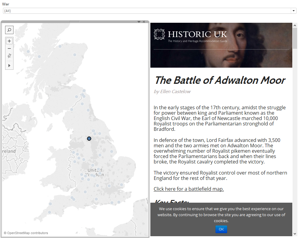
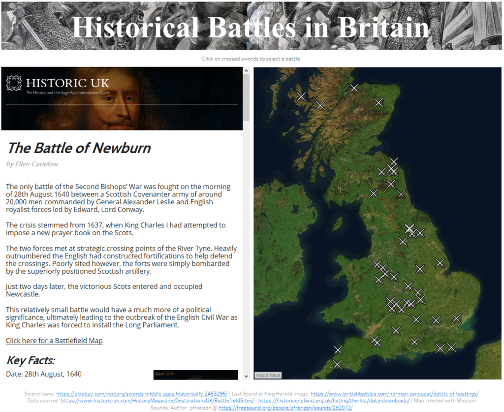
Since I still had a few more hours left I decided to practice some fun functionalities that I hadn’t had a chance to use yet. So I used mapbox (with Kolusma’s blog to help!) to create a mor evisually appealing map.
I added crossed swords instead of dots, as I hadn’t yet used custom shape files.
I finally added sound to play in the background of the dashboard. All of these ended up looking like this:
View the interactive dashboard here: https://public.tableau.com/profile/james3937#!/vizhome/HistoricalBattlesinBritain/MVP2