


Parameters in Power BI can be a very powerful tool to assist your user in data exploration. Recently, I had the opportunity to delve more deeply into the architecture of parameters when completing a Workout Wednesday that measured caffeine concentrations in drinks from various commercial cafes. Feel free to explore my solution below
One of the most difficult parts of this exercise was creating the Drinks Per Day parameter that dynamically alters the length of the bars (based on the drink type and caffeine concentration). Unfortunately, the reason I struggled with this part of the exercise was because I skipped over the most important part of chart generation—sketching! Although I could see what the desired output looked like on the website and the requirements were laid out step-by-step, my confidence got the best of me and I jumped right into Power BI without actually considering the logic of the parameter. So, in this blog, I will show you exactly how this parameter works from a conceptual perspective and you’ll find out, similar to me, how simple the solution actually is.
The Process
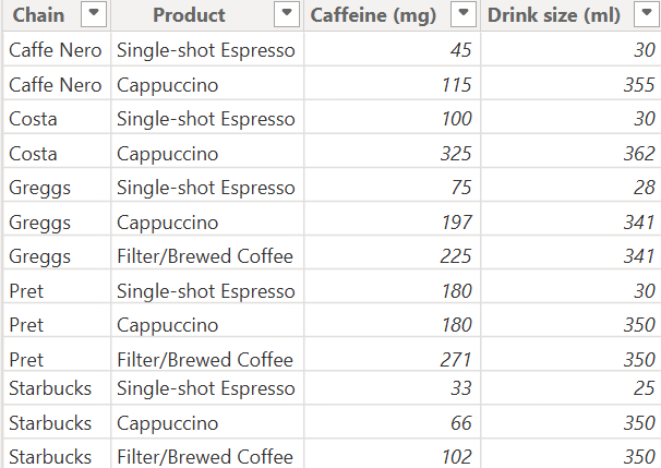
Below is the raw data set we were given.
Step 1: Creating an Explicit Measure
This is arguably the most important step! In Power BI for continuous fields such as caffeine or drink size Power BI automatically aggregates them into an implicit measure that can be used for visualizations. For example, the implicit measure would be the sum of our rows in the caffeine field. However, the downside of using implicit measures in our visualizations and future calculations is that the computation takes place at the row level. For larger datasets, this can be extremely inefficient and troublesome. Therefore, we want to create the measures of interest ourselves, in other words, an explicit measure. Going back to our initial example, we would simply use DAX, specifically the SUM function, to aggregate the values in our caffeine field.
Total Caffeine = SUM(CaffeineSheet[Caffeine (mg)])
Step 2: Creating our Parameter
For our Drinks Per Day parameter we are only interested in one field and that is caffeine (mg) because that is what is changing on the bar plot.
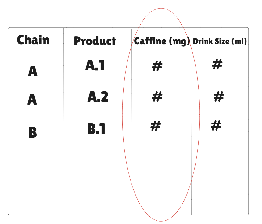
You may notice that Drinks Per Day isn’t even a field on our table so what is it exactly? Drinks Per Day is a numeric range we are defining, where we can use the values in our set to alter the existing values in the table. In this case, the minimum value in this vector was 0 and it incrementally increased by 1 up to 20 because if you’re having more than 20 cups of coffee in a day then you should probably seek medical assistance.
Step 3: Using our Parameter in a Calculated measure
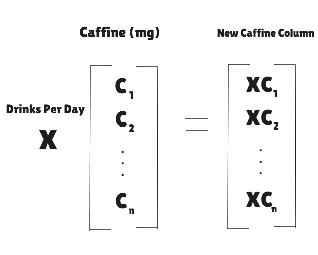
In Power BI, once we create this parameter, we need to input it into a measure—a measure is just a different way of saying mathematical expression—to calculate the new values for caffeine concentration. So, essentially, we are taking the caffeine column from our existing table and multiplying it by whatever the selected value is in our drinks per day parameter. It’s helpful to visualize this expression as scalar multiplication where the caffeine (mg) is a vector and drinks per day is a variable scalar. However, when we make this calculation we will be using our explicit measure for the sake of computational efficiency!
New Caffeine Concentration = [Parameter value] * Total Caffeine
// Note the parameter value comes from our Drinks Per Day numeric range
Build
Lastly, you build your chart with the Chain on the y-axis and your Total Caffeine Measure on the x-axis, then there you have a dynamic bar chart that uses a parameter!