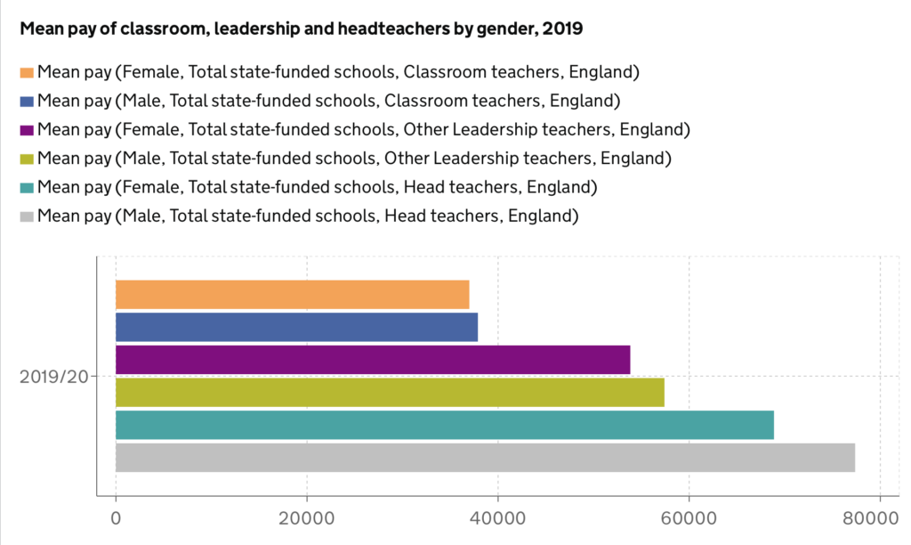
Today Andy challenged us to critique this weeks #MakeoverMonday, and create an improved version. Here is the original visualization:
What I liked:
- The chart is focused on the most recent data
- Categorized by Gender and Grade of teacher for differentiation
- Bar chart makes it easy to identify differences in salary
- Sorted
What I disliked:
- Too many colours
- Grid lines
- Legend is very confusing
- Unnecessary axis
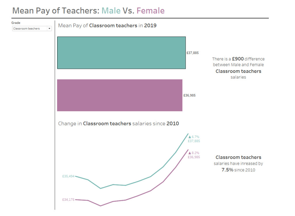
My take on #MakeoverMonday Wk37: