


When an analyst compares averages across two groups, they will virtually always return different. Averages are calculated to several decimal points of precision, so it is unlikely that noisy data will exactly align perfectly, down to the three or more digits after the decimal point! This means that there will always be one group that has a higher mean and one that has a lower mean. As a consultant on the lookout for insight, it is tempting to start making recommendations based on any difference found in the data, but it can be hard to tell if a tiny difference is actually meaningful!
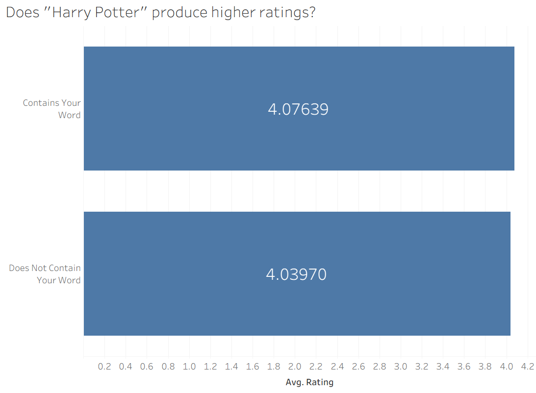
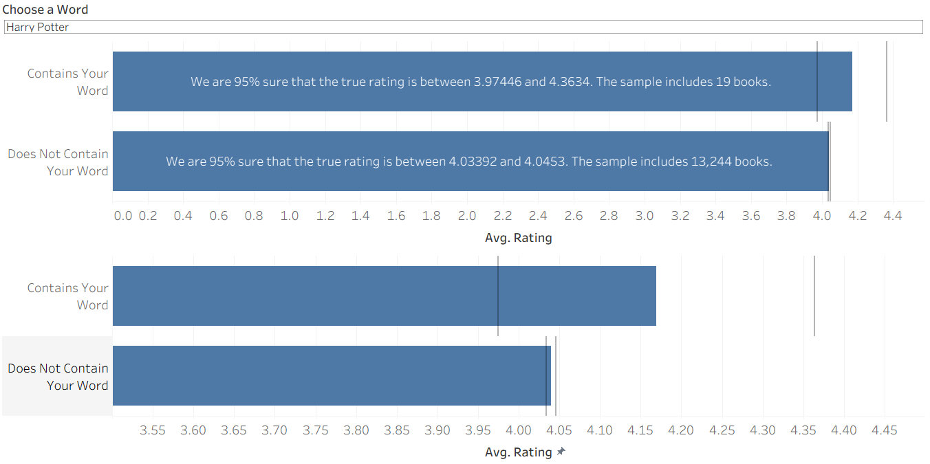
It is always difficult to thing about these things without a concrete example, so I will be using this dataset from Kaggle, which contains the title, average rating, and description for over 13,000 unique books. To replicate an idea I used in my first interview application, I recreated an interactive feature where the user can input any word (or phrase) of their choosing and see if books with their word tend to be higher rated than books without their word. Once implemented, it becomes clear that it is hard to tell what kinds of differences matter. Take this example, where I compare average ratings of books that do and do not have the string "Harry Potter" in their description.
Hmmmm...
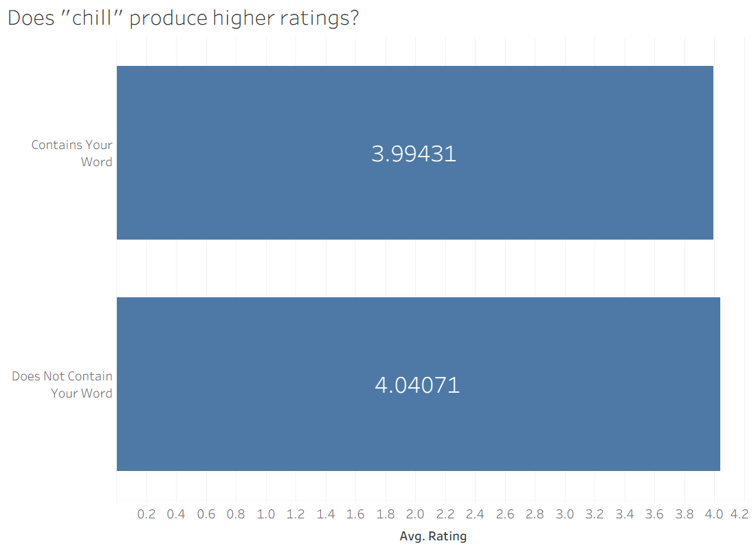
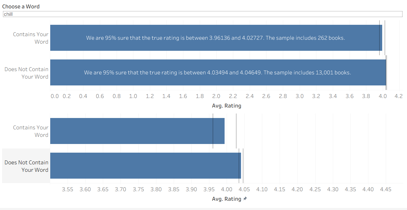
It looks like the books with "Harry Potter" are better, but it's really close. It's hard to say if a difference of 0.04 matters a lot in this case. Similarly, I looked at the word "chill" and found a similar differential:
When we apply statistical techniques, it turns out that one of these differences is meaningful and one of them isn't (stay tuned to find out which!).
Margin of Error
Two metrics that we should consider when deciding if these differences are 'meaningful', are the spread of the data, and the sample size. If the data is extremely spread out, our mean does not give a lot of information about the center of the data – it happens to capture the mathematical middle of a wide field. Similarly, if we have a very small sample size we cannot be very sure about our conclusions – what if the few records we have do not represent the larger trend?
In Tableau, we can calculate an upper and lower bound such that we can be 95% confident that the range between them includes the true mean. The calculations look like this:
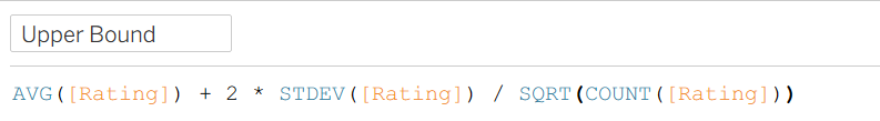
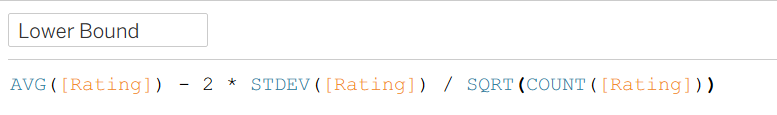
To get each bound, we start from the average, then add or subtract 2 standard deviations in order to approximate a 95% confidence level. We also divide these standard deviations by the sample size. This way, if there is a large sample size and we are therefore more certain, our interval will end up being smaller.
Once we have these ranges, deciding if a difference is 'meaningful' becomes a lot clearer. If the intervals for the two groups do not overlap, we can say we are "95% confident" that their means are different. However, if the intervals do overlap, we cannot say with that degree of certainty that their means are truly different. This is the equivalent of concluding that the difference between them is negligibly small!
Let's apply it to the original examples! It turns out that 'Harry Potter' has a pretty small sample size, so even though it seems to produce higher ratings, this could be a result of randomness. In the end, we cannot conclude that a book's description containing "Harry Potter" has any association with its rating. (Note: The lower bar chart reflects the same information but with a restricted scale for easier viewing.)
The same is not true for our other example. A sample of 262 books gives us enough leverage to conclude that the word "chill" is associated with lower book ratings! It can be somewhat difficult to compare the numbers on the top chart, so the lower chart zooms in to make it a bit more apparent that they are separate.
So you can interact on your own, I have published this (very bare-bones) dashboard on Tableau public here. Enjoy exploring the trends, maybe you will find some surprising associations!